This post contains affiliate links. We may earn a commission if you click on them and make a purchase. It’s at no extra cost to you and helps us run this site. Thanks for your support!
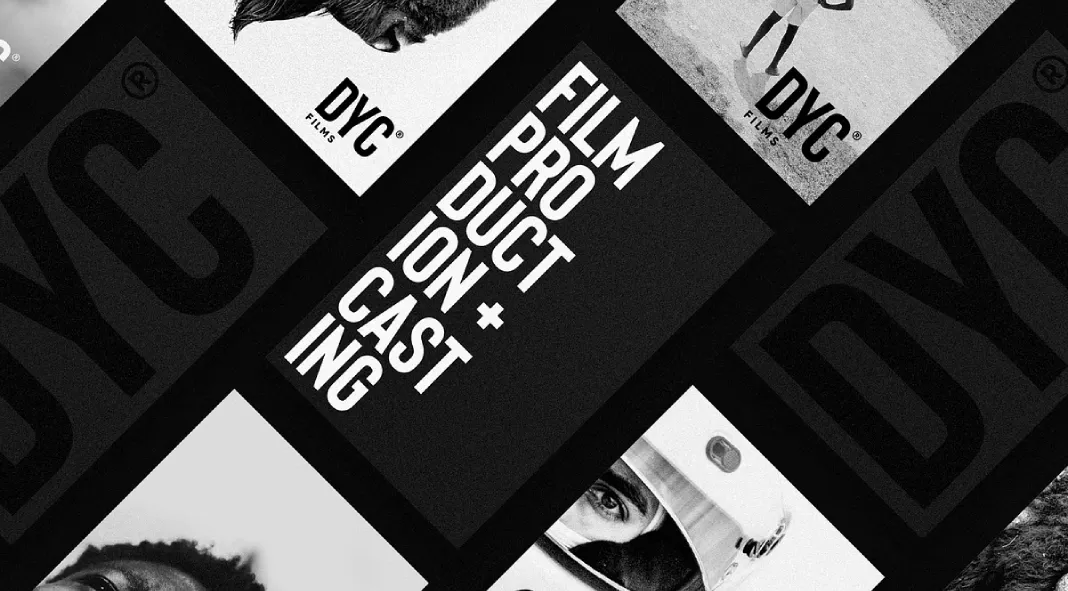
The Bison font family by Ellen Luff is an exceptional contribution to modern typography, embodying both strength and sophistication. Drawing inspiration from the raw power and grace of the animal itself, the font’s design captures the same sense of sturdy, uncompromising structure through its controlled letterforms and contemporary detailing. Each font in the Bison family exudes a balance between hard lines and smooth curves, creating a dynamic, authoritative aesthetic that is both versatile and timeless.
Typeface Structure and Style
At the heart of Bison is its geometric foundation, marked by clean, straight lines and subtle curves that soften its overall presence. This balance creates an appealing contrast, where the rigidity of the forms communicates strength, while the curves add a touch of sophistication and fluidity. These characteristics make Bison particularly well-suited for a variety of uses where both clarity and impact are paramount, such as in branding, logos, editorial layouts, and cinematic design.
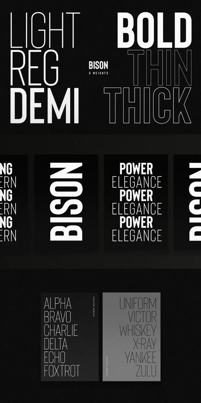
The family consists of ten all-caps fonts: four weights—Bold, Demibold, Regular, and Light—each with accompanying italic versions, and two outlined variations (Thick and Thin). This broad range of weights and styles provides designers with significant flexibility. Whether used in bold headlines or as part of more delicate body text, the font maintains its visual integrity across a wide array of contexts.
Exploring the Weights
- Bison Bold is the commanding force within the family, ideal for applications requiring a bold statement. It is assertive without being overbearing, making it perfect for headlines and logo design.
- Bison Demibold represents the persuasive middleweight, offering a balanced option between the bold and regular weights. Its slightly softer approach retains the font’s inherent strength while providing versatility for subheadings or secondary text.
- Bison Regular stands as a robust midground, delivering a solid option that is neither too light nor too heavy. This weight is practical for longer blocks of text, as it remains legible and impactful without dominating the page.
- Bison Light, while more subdued, retains its confident character. This weight is ideal for subtle emphasis, allowing for a quieter but still present tone within typographic hierarchies.
The Outline fonts—available in Thick and Thin styles—bring a more contemporary edge to the family. These outlined versions are engaging, providing a modern twist that enhances any design with a minimalist, yet edgy, aesthetic. The Outline variants work particularly well in branding or titles that require visual distinction.
Features and Usability
Beyond its stylistic appeal, Bison offers a comprehensive set of features, including extensive language support, numerals, and punctuation, ensuring that the font is functional across global markets. Its four weights, italic versions, and outlined fonts provide designers with ample creative freedom. The italic variants introduce an added dimension of elegance, making the font suitable for more editorial or cinematic contexts, where movement and emphasis are key.
Bison’s design flexibility is one of its standout qualities. Its varied weights and styles make it adaptable for multiple uses—from corporate branding to editorial content, magazine layouts, and even film title sequences. Its bold and dynamic presence ensures that it stands out without losing clarity, making it a compelling choice for high-visibility projects.
Ellen Luff’s Bison font family is a masterpiece in modern typography, where strength and elegance coexist. The controlled, geometric forms of each letter are complemented by subtle curves, creating an authoritative yet refined typeface. Including ten distinct fonts within the family allows designers to explore a wide range of applications, from branding and logo design to editorial and cinematic projects. Whether used in bold, commanding headlines or more understated body text, Bison consistently delivers visual impact with sophistication.
All images © by Ellen Luff. Check out more trending typefaces on WE AND THE COLOR.

