
This post contains affiliate links. We may earn a commission if you click on them and make a purchase. It’s at no extra cost to you and helps us run this site. Thanks for your support!
Let’s explore why the Ater font family, a variable serif typeface, works so well for modern editorial design.
Nicolas Dupuis understood the power of ink when he created the Ater font family. Black ink defines the character of every printed page. Blaze Type released this typeface to solve a specific problem in graphic design. Designers often struggle to find a system that works for both loud posters and quiet pocketbooks. The typeface bridges this gap with remarkable elegance. It refuses to choose between classic serif tradition and modern display aggression. Instead, this typeface inhabits the ambiguity between the two styles. This article examines the technical and aesthetic reasons why the Ater font family deserves attention.
What distinguishes the Ater font family from other serif typefaces?
Most serif typefaces pick a side. They either serve as invisible text faces or demand attention as display fonts. However, the Ater font family rejects this binary limitation. Nicolas Dupuis designed the forms to adapt seamlessly across different media formats. A designer can use the same font file for a billboard or a novel. Consequently, this versatility simplifies the design process significantly. The family unites different media through consistent, evolving forms.
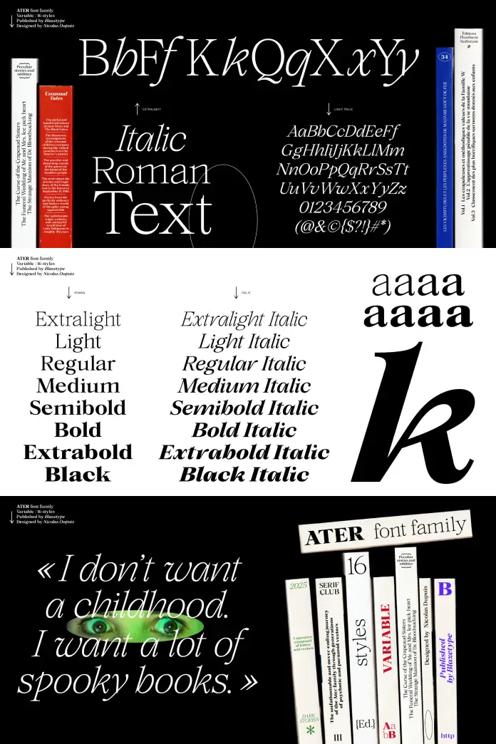
The name itself reveals the designer’s intent. “Ater” translates to “matte black” in Latin. This creates a poetic connection to the printing process. The Ater font family does not hesitate to fill a white page with heavy darkness. It embraces the density of ink. Therefore, the typeface feels grounded and physical, even on digital screens.
Mastering the variable axis for optimal contrast
Variable font technology powers the flexibility of the typeface. The design includes an approach to “blackening” the letters that changes their fundamental character. Lighter weights display delicate features suitable for extended reading. Conversely, the heavier weights push the boundaries of legibility for stylistic impact. The typeface creates a playground of contrast between these finest and darkest styles.
Designers can manipulate this axis to fine-tune the “color” of a text block. A headline might require the extreme density of the Black style. Meanwhile, the body text breathes easily in Extra Light or Regular. This dynamic range opens up countless creative possibilities for layouts. The Ater font family creates visual tension that keeps the reader engaged.

How does Blaze Type ensure legibility across formats?
Blaze Type prioritizes functionality alongside aesthetics. The foundry ensured that the Ater font family performs well at any size. Small sizes require open counters and sturdy serifs to remain readable. Large sizes, however, demand tighter spacing and sharper details. The typeface manages this balance through its variable nature.
The typeface spans from Extra Light to Black. It goes to extremes to ensure optimal readability. Designers rarely find a serif that handles “matte black” density without becoming a blob. Yet, the typeface maintains character distinction even in its darkest forms. This reliability makes it a go-to choice for serious editorial work.
Analyzing the aesthetic ambiguity of Ater
A unique tension exists within the shapes of the Ater font family. It references classical serif structures but executes them with modern precision. This ambiguity allows the font to feel timeless yet contemporary. It fits a historical novel just as well as a brutalist art catalog. The typeface plays with reader expectations.
You might notice the sharp transitions in the stroke width. These high-contrast elements give the Ater font family a display quality even in text sizes. It adds a sparkle to the page. Nicolas Dupuis crafted these details to ensure the font never feels boring. Consequently, the typeface commands authority without shouting.
Why is the Ater font family essential for branding?
Brands today need consistent voices across fragmented channels. A company uses a website, an app, printed stationery, and large-scale advertising. The typeface unifies these touchpoints. Its wide range of weights provides a diverse tonal palette within a single family. Therefore, a brand can whisper, speak, and shout using only the Ater font family.
Blaze Type distributes this font with modern licensing in mind. They understand that designers need flexible tools. The typeface supports this need for adaptability. It functions as a comprehensive design system rather than just a collection of letters. This systemic approach adds significant value for creative directors.
The technical excellence of Nicolas Dupuis
Nicolas Dupuis brings a rigorous standard to type design. His work on the Ater font family demonstrates a deep understanding of optical sizing. Every curve serves a purpose. He did not simply thicken the lines to create bold weights. Instead, he reimagined how the letterforms occupy space. This attention to detail elevates the typeface above standard retail fonts.
The Latin “matte black” concept guides every decision. Dupuis treats the positive space (the letter) and negative space (the background) with equal importance. The typeface shapes the white space as much as it lays down the black ink. This creates a rhythmic texture on the page that pleases the eye.
How to pair the Ater font family effectively?
Designers often ask how to pair such a strong serif. The typeface carries enough personality to stand alone. However, it also pairs well with neutral sans serifs. A clean Swiss-style grotesque highlights the sharp serifs of Ater. Alternatively, a mono-spaced font can create a compelling “code vs. poetry” contrast.
The typeface invites experimentation. Its high-contrast nature allows it to act as the “image” on a text-heavy page. You should let the heavyweights dominate the composition. Then, use the lighter weights to guide the reader through detailed information. The Ater font family rewards bold layout choices.
Future-proofing design with variable fonts
The industry is moving toward variable font technology. The Ater font family represents the forefront of this shift. It offers a level of control that static font files cannot match. Developers can animate the weight axis for web interactions. This capability makes the typeface a favorite for interactive design.
Static fonts limit creativity. Variable fonts like the Ater font family expand it. You get a limitless sliding scale of weight rather than fixed steps. This allows for precise typographic tuning. Designers who adopt the Ater font family equip themselves for the future of digital typography.
The lasting impact of Ater
Nicolas Dupuis and Blaze Type have created a modern classic. The Ater font family successfully translates the concept of “matte black” ink into digital type. It offers extreme versatility, moving fluidly from pocketbooks to posters. The ambiguity between classic and display styles gives it a unique edge. Therefore, this typeface is a design statement.
Designers seeking a typeface that combines history with innovation should look no further. The typeface delivers on every front. It is elegant, robust, and infinitely adaptable. By choosing this family, you ensure your typography remains sharp, legible, and visually arresting.
FAQ
What is the Ater font family?
The Ater font family is a versatile serif typeface designed by Nicolas Dupuis and released by Blaze Type. It features a variable weight axis ranging from Extra Light to Black. The design bridges the gap between text and display usage.
What does the name “Ater” mean?
The word “Ater” is Latin for “matte black.” This name reflects the font’s design philosophy, which focuses on the density of ink and the ability to fill a page with darkness.
Who designed the Ater font family?
Nicolas Dupuis designed the typeface. He is a type designer associated with the Blaze Type foundry. His work often explores the relationship between classical forms and modern utility.
Is the typeface suitable for web design?
Yes, the typeface is excellent for web design. It is available as a variable font, allowing developers to adjust weights dynamically. This ensures fast load times and responsive typography.
Can I use the Ater font family for large posters?
Absolutely. The typeface was specifically created to handle display applications. The high-contrast styles and heavy “Black” weights create a strong visual impact on large formats.
Where can I buy the Ater font family?
You can license the typeface directly from MyFonts. They offer various licensing options for desktop, web, and app usage.
All images © Blaze Type. Check out other popular typefaces on WE AND THE COLOR or take a look at our selection of the 100 best fonts for graphic designers in 2026.
Subscribe to our newsletter!


