")
Why Fix What Isn’t Broken?
Success is often the most dangerous trap for a hospitality brand. Elephant & Co. (ECO) already possessed a loyal following in Pune, India. Locals loved the vibe. The drinks were great. The community felt at home. So, why change anything? This is the central question behind the Elephant & Co. brand redesign. Stagnation often disguises itself as stability. Brands that refuse to evolve eventually fade into the background. Rare Ideas, the strategy and design studio behind this project, understood this tension perfectly. They did not approach this as a rescue mission. Instead, they treated it as a necessary maturation.
The goal was clear from the start. ECO needed to become future-ready without alienating its past. A “community-led ethos” is hard to manufacture. You cannot simply design authenticity. However, you can design a system that amplifies it. The Elephant & Co. brand redesign succeeds because it respects the brand’s origin story. It takes the chaotic energy of a beloved local haunt and gives it structure. This allows the brand to scale. It prepares the business for new markets. Yet, it keeps the soul intact. This delicate balance is what makes this project a case study in strategic restraint.
Decoding the Strategic Narrative
Rare Ideas began with the narrative rather than the visuals. Most agencies rush to the logo design. However, a pretty logo does not solve business problems. The Elephant & Co. brand redesign rests on a solid foundation of repositioning. The studio identified the core truth of the brand. ECO is not just a bar. It is a social anchor. Therefore, the communication strategy had to reflect this role. The narrative needed to shift from “a cool place to hang out” to a “community-driven institution.”
This shift changes everything. It dictates how the menu looks. Furthermore, it influences the tone of voice on social media. It even affects how staff interact with guests. Rare Ideas built a communication system that prioritizes clarity. The messaging is direct yet warm. It invites the customer into the story. Consequently, the brand feels more accessible. It feels less like a business and more like a collective. This is the power of narrative building. It turns customers into advocates. The Elephant & Co. brand redesign leverages this psychological shift effectively.
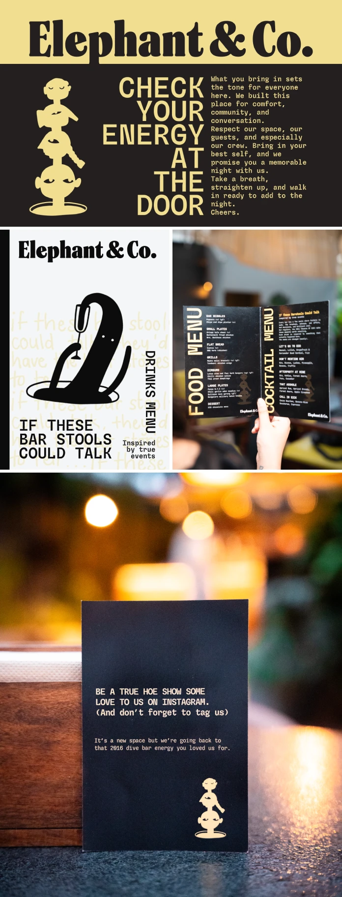
Visual Identity Systems That Breathe
A static identity fails in a dynamic environment. Hospitality is messy, loud, and constantly moving. Therefore, the visual identity must adapt. Rare Ideas created a design system that breathes. The Elephant & Co. brand redesign features a visual language that is both sharp and playful. The typography commands attention without shouting. It feels modern but avoids fleeting trends. This ensures longevity. You want a brand to look good ten years from now.
Consider the color palette and texture. They evoke the earthy, grounded nature of the brand. Yet, they maintain a polished, premium feel. This duality is crucial. It signals that ECO has grown up. However, it also signals that ECO hasn’t forgotten its roots. The design elements work cohesively across all touchpoints. From coasters to digital ads, the experience remains consistent. Consistency builds trust. Trust builds brand equity. Rare Ideas mastered this flow. They provided ECO with a toolkit, not just a static jpeg.

The Role of Cultural Roots in Modern Branding
Global trends often dilute local culture. We see this everywhere. Coffee shops in Mumbai look like coffee shops in Brooklyn. This homogeneity is boring. The Elephant & Co. brand redesign resists this urge. It leans into its Indian heritage. However, it does so without resorting to kitsch. The cultural roots are subtle. They exist in the warmth of the hospitality. They exist in the storytelling.
Rare Ideas managed to modernize the aesthetic while keeping the Indian spirit alive. This is a difficult line to walk. Go too traditional, and you look dated. Go too modern, and you look generic. The Elephant & Co. brand redesign finds the sweet spot. It feels international yet distinctly local. This authenticity resonates with today’s consumer. People crave real connection. They want to know where a brand comes from. ECO now tells that story clearly. The design facilitates this cultural pride.
Lessons for Hospitality Leaders
What can other business owners learn from this? First, strategy must lead design. Don’t hire a designer to “make it pop.” Hire a partner to solve a problem. The Elephant & Co. brand redesign works because it solves for clarity and growth. Second, listen to your community. ECO didn’t ignore its regulars. It built the new identity around them. This ensures the relaunch feels like a celebration, not a betrayal.
Finally, invest in a flexible system. The media landscape changes daily. Your brand needs to work on TikTok, a billboard, and a napkin. Rare Ideas provided a system that scales. This is the difference between a logo and a brand. A logo is a mark. A brand is a living system. The Elephant & Co. brand redesign is a prime example of a living system. It is ready for the future.
A Critic’s Perspective on the Execution
Does this redesign actually work? Yes, it does. It works because it feels effortless. Good design should look like it was always there. The Elephant & Co. brand redesign feels natural. It doesn’t scream “rebrand.” It simply feels like the best version of ECO. Rare Ideas showed maturity in their execution. They avoided over-designing. They let the content and the vibe take center stage.
This project sets a high bar for hospitality branding in India. It proves that you can be professional without being boring. You can be strategic without losing your soul. The Elephant & Co. brand redesign is a triumph of nuance. It is a reminder that the best brands are the ones that know exactly who they are. Rare Ideas helped ECO remember that. Now, the world gets to see it too.
All images © Rare Ideas. Check out WE AND THE COLOR’s Branding and Graphic Design categories to find other inspiring projects.
Subscribe to our newsletter!


