
The “Boiling Point” soup sets, a project by designer and art director Inna Efimova, transform the mundane container into a piece of sculpture. This innovative packaging design does more than just hold a product; consequently, it captures the very essence of the cooking process itself. As consumers increasingly seek products that align with their values, this project serves as a brilliant case study in how to blend sustainability, artistry, and practicality. It’s a vision that speaks to a desire for authenticity in our everyday lives.
The Core Concept: Inspired by the Rhythm of Cooking
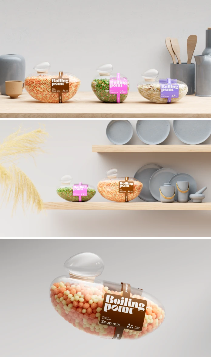
What does cooking feel like? Inna Efimova found the answer in a simple, universal moment: water reaching its boiling point. The design originates from observing the countless bubbles that rise and burst, each with its own unique and irregular form. This natural, ever-changing movement became the central idea. Therefore, the “Boiling Point” packaging avoids perfect, rigid circles. Instead, it embraces soft, fluid contours that echo the spontaneous beauty of boiling water.
This clever, creative decision forges a direct, intuitive link between the product and the act of cooking. It feels authentic. Furthermore, this approach subtly communicates the brand’s commitment to naturalness and sustainability. The chosen textures and finishes evoke an organic quality, which is a message reinforced by the use of environmentally conscious materials. This beautiful form was brought to life in collaboration with 3D artist Vladimir Kuznetsov, who helped translate the fluid concept into a tangible design.
A Closer Look at the “Boiling Point” Packaging Design
Form Follows Feeling: A Sculptural Statement on the Shelf
The most striking feature of the “Boiling Point” packaging design is its sculptural presence. It doesn’t just sit on a shelf; it commands attention. In a sea of uniformity, its organic shape is a conversation starter. This is not merely a container but an object of beauty. Do you ever feel that most products look the same? Efimova’s work is a clear departure from that monotony. The design feels alive, almost in motion, creating an emotional connection before the consumer even reads the label. It proves that practical items can also be artful.
Sustainability as a Foundational Element
Beyond its captivating form, this sustainable packaging design is rooted in environmental responsibility. The packaging is fully recyclable, addressing the growing consumer demand for eco-friendly solutions that do not sacrifice quality or aesthetic appeal. This aligns perfectly with the major trends shaping the market, where sustainability is no longer a bonus but a core expectation. Today’s shoppers are more conscious than ever about their environmental impact. They actively seek brands that demonstrate a genuine commitment to the planet. “Boiling Point” meets this demand head-on, proving that style and sustainability can and should coexist.
Transparency and Practicality for the Modern Consumer
The design thoughtfully incorporates a clear window, the “Boiling point,” which reveals the grains and ingredients inside. This transparency fosters trust and gives consumers confidence in the product’s quality. It also highlights the wholesome, fresh character of each soup set. Practicality was also a key consideration. The soup sets are offered in three carefully selected flavor combinations to cater to diverse tastes:

- Bulgur and Lentil
- Beans, Lentil, and Rice
- Rice and Carrot
These blends are versatile enough to be prepared as quick side dishes or as complete meals, making them an ideal fit for modern, fast-paced lifestyles. To further enhance consumer choice and reduce waste, the packaging comes in three sizes: 300g, 150g, and 75g. This variety allows customers to select the perfect portion for their needs, whether trying a new flavor or stocking up on a favorite.
Why This Award-Winning Packaging Is a Game-Changer
The brilliance of “Boiling Point” has not gone unnoticed. This exceptional packaging design has earned significant international recognition. It received a Bronze at the prestigious Dieline Packaging Design Competition, a Silver at the London Design Awards, and further honors at the Applied Arts Awards and DNA Paris. The Dieline Awards, in particular, are among the world’s most prominent packaging design competitions, celebrating innovation, creativity, and sustainability. Winning here validates a project’s excellence on a global scale.
So, what truly makes this design resonate? From my perspective as a design critic, it’s the powerful storytelling. The packaging doesn’t just sell soup; it sells an experience. It evokes the comforting, familiar ritual of cooking. It connects a simple, everyday product to a larger narrative of natural beauty and mindful living. This is where many brands fall short. They focus on the “what” (the product) but forget the “why” (the feeling, the story). Efimova’s work is a masterclass in creating a brand that feels both innovative and deeply human.
The Future Is Fluid: A Concept Ready for the Market
At present, “Boiling Point” remains a design concept actively seeking opportunities for market implementation. However, its proven appeal, sharp focus on sustainability, and award-winning design position it perfectly to attract partners. It represents a forward-thinking vision for the future of food packaging. This project raises important questions for us all. What do we want from the products we buy? Should packaging just be a disposable wrapper, or can it add value, beauty, and meaning to our lives? Inna Efimova’s “Boiling Point” suggests a clear, inspiring answer.
All images © Inna Efimova. Don’t hesitate to browse WE AND THE COLOR’s Packaging Design category to explore other inspiring projects.
Subscribe to our newsletter!


