
Today, we’re looking at the QuiteLike branding, a masterful refresh by the wizards at Universal Favourite. QuiteLike is on a mission, you see. They want to help Australians sink their teeth into a better meal kit experience. This isn’t just about dinner arriving in a box. Oh no, it’s about reimagining the entire category. They’re serving up meaningful, memorable moments through the simple acts of cooking and eating, and everything delightful in between.
QuiteLike believes mealtimes should be a joyful escape, not a chore. They aim to inject flavour, flexibility, and a generous pinch of that special “pzazz” into our everyday routines. So, how do you translate such a vibrant mission into a brand that truly sings? Universal Favourite stepped in to refresh every single element. We’re talking brand strategy, tone of voice, visual identity, packaging – the whole menu! The result? A new QuiteLike branding identity that beautifully captures the rhythm of cooking. It uses warm photography, expressive illustration, bold typography, and a punchy colour palette. This careful mix balances foodie sophistication with a playful zest. It’s designed to make every step, from prepping ingredients to that first delicious bite, feel incredibly rewarding. Honestly, there’s nothing quite like it. Ready to see how they did it?
The “Deliciously Rewarding” Strategy for QuiteLike Branding
So, what was the secret ingredient behind this transformation? Universal Favourite was guided by a core brand idea: “deliciously rewarding.” This wasn’t just a catchy phrase. It became the promise of meaningful, memorable moments delivered through food. With this compass, they focused on celebrating the joyful “in-between” moments. Think about it: that little pinch of pzazz you add to a weeknight dinner, the satisfying glug of time saved, those small, bite-sized wins when you learn a new cooking trick. Or even the quiet satisfaction of looking at a meal you’ve beautifully made. Universal Favourite understood that cooking is so much more than what ends up on the plate. Therefore, their strategy for the QuiteLike branding was to celebrate the full, rich flavour of the entire cooking experience. They aimed to do this with warmth, confidence, and a generous dash of personality. Don’t you think that’s a refreshing approach in the meal kit world?
Yes, Chef! Crafting a Tone of Voice That Sizzles
Words matter, don’t they? Especially when you’re trying to build a connection. For the QuiteLike branding, Universal Favourite knew the tone of voice had to be just right. They partnered with the talented copywriter Cat Wall to create something truly special. The goal was a warm, flavourful voice that speaks directly to people who genuinely love food. Imagine chatting with a friend who’s a great cook – that’s the vibe.
The QuiteLike voice is confident, but never arrogant. It’s helpful, offering tips and guidance, but it never preaches. And, crucially, it always adds that little “pzazz” we talked about. Whether it’s a cheeky turn of phrase that makes you smile or a bite-sized piece of kitchen wisdom, the QuiteLike branding sounds like someone you’d actually want to cook alongside. It’s inviting and encouraging. How often do you find a brand voice that feels so genuinely engaging? This careful attention to language ensures the brand feels approachable and inspiring.
Morsel Moments: A Design System as Flexible as a Great Recipe
To bring those “deliciously rewarding” moments to life visually, Universal Favourite developed a comprehensive design system for QuiteLike. They called these “Morsel Moments.” Isn’t that a charming name? This system is rooted in the brand’s mission: to create meaningful and memorable food experiences. Functionally, it’s a flexible, modular framework. This means it can adapt seamlessly across all sorts of formats, from a website to an app, to social media posts.

Each layout created using this system prioritizes clarity and engagement. The idea is to let the beautiful content – the food, the recipes, the stories – truly shine. Simultaneously, there’s always room for that distinctive personality and warmth that defines the QuiteLike branding. Think of it like a well-balanced recipe. The system uses simple, high-quality ingredients (design elements) to deliver a rich variety of experiences. Whether you see it as a static image or in motion, this design system captures the joy of learning, cooking, and sharing. It aims to turn every mealtime into a distinctive and emotionally resonant experience. It’s clever, isn’t it, how a system can be both structured and so full of life?
A Logo for Food Lovers: The Heart of QuiteLike Branding
At the core of any visual identity is the logo. For the QuiteLike branding, the wordmark uses the serif typeface ABC Marist. This wasn’t an accidental choice. This particular typeface brings an immediate sense of warmth and considered character to the brand. Now, if you look at the broader meal kit category, it’s often focused on speed, efficiency, and utility. QuiteLike wanted to signal something different.
The choice of ABC Marist hints at a slower, more thoughtful approach. It suggests a brand that values the experience of cooking just as much as the final result on the plate. It’s a quiet, confident signal that QuiteLike is made with true food lovers in mind. It subtly communicates that they offer more than just convenience; they offer an enriching experience. Don’t you think this choice sets a wonderfully different tone from the outset? This logo design is a perfect example of how typography can communicate brand values.
A Zest of Colour: Painting an Appetizing Picture
Colour can make you feel things, can’t it? It can make your mouth water or spark a sense of excitement. The colour palette for the QuiteLike branding was very carefully chosen to do just that. It was led by two standout colours: a rich, inviting cherry red and a playfully distinct pink. This combination strikes a beautiful balance. It feels sophisticated, hinting at gourmet foodie experiences, yet it’s also full of everyday excitement and joy.
But it’s not just about these two stars. The palette is grounded by a selection of versatile neutrals. Then, it’s lifted by vibrant, zesty highlights that add an extra pop. This flexibility allows the QuiteLike branding to move fluidly between feeling premium and feeling playfully accessible. The aim is simple: to spark appetites and create visual appeal in every single application, from the website to the packaging you receive at your door. It’s a palette designed to make you feel good about food.
Well-Seasoned Typography: More Than Just Words on a Page
Beyond the logo, the entire typography system for the QuiteLike branding was built with intention. It needed to be flexible, able to switch between being expressive and purely functional, between feeling premium and utterly approachable. That’s quite a brief, isn’t it? To achieve this, Universal Favourite selected a trio of core typefaces: Neue Montreal, Spezia Serif, and Spezia Sans. These three work together harmoniously to create a dynamic and eye-catching visual hierarchy.
Neue Montreal takes the lead for headlines, bringing a bold, confident energy and a contemporary edge. It grabs your attention. Then, Spezia, used in both its serif and sans-serif forms, introduces warmth, clarity, and a subtle editorial feel. It’s the kind of typography you’d expect to see in a high-quality food magazine. This thoughtful combination ensures that all communications are easy to read and visually engaging, further enhancing the sophisticated yet friendly QuiteLike branding.
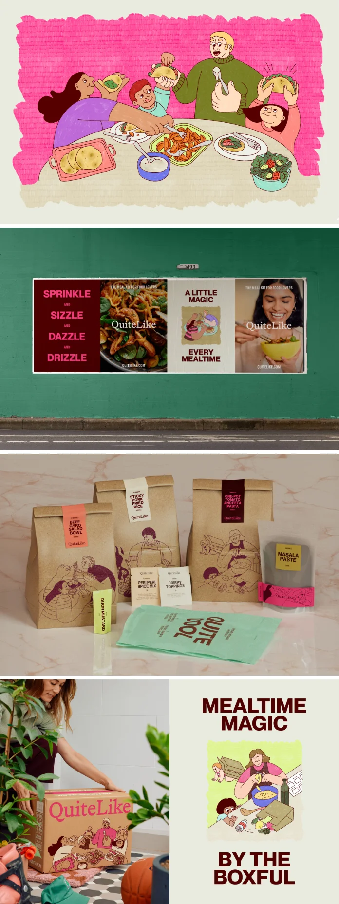
A Side of Illustration: Adding a Human Touch to QuiteLike Branding
Sometimes, photography alone can’t capture the full story. Universal Favourite developed a bespoke illustration style specifically for the QuiteLike branding. This wasn’t about illustrating perfect-looking vegetables or dishes. Instead, the focus is on people and scenes found in and around the act of cooking. These illustrations bring a distinctly human touch to the brand. They celebrate everyday rituals, those lovely shared experiences, and the simple joy found in the “in-between” moments of preparing and enjoying food.
The style itself is textured, expressive, and has an editorial tone. Think charming, but also clear and communicative. These illustrations aim to capture those fleeting food moments with vibrancy and warmth. By focusing on the human element, the QuiteLike branding becomes more relatable and emotionally resonant. It’s about connection, not just consumption. Isn’t it wonderful how illustrations can add such a unique layer of personality? This approach makes the QuiteLike branding feel incredibly authentic.
Shot to Serve: Photography That Captures Real, Delicious Moments
What does food happiness look like? That’s what the photography for the QuiteLike branding aims to capture. Universal Favourite crafted a lifestyle photography direction that focuses on those delicious, memorable moments that make mealtimes special. Imagine the quiet joy of cooking solo, lost in your thoughts and the process. Or picture the lively excitement of sharing dinnertime with loved ones. The photography leans heavily into warmth, spontaneity, and the wonderfully tactile experience of food. It celebrates the beauty in everything – from sauce-smeared plates (we’ve all been there!) to deeply satisfied smiles.
Shot by the talented Parker Blain, the images skillfully blend lifestyle narratives with subtle product storytelling. They are typically set in natural light and have a candid, almost “shot-from-the-hip” feel. This makes them feel authentic and unforced. There’s a focus on lived-in styling – think kitchens that look like real kitchens – and sensorial details that help build scenes that feel homely, modern, and rich with flavour. You can almost smell the food, can’t you? This style of photography is key to making the QuiteLike branding feel both aspirational and attainable.
Stirring Things Up: Motion Design That Brings the Brand to Life
In a digital world, motion is where a brand can truly come alive. For the QuiteLike branding, motion design isn’t just an afterthought; it’s a key ingredient. It’s designed to reveal the magic that happens between each step of the cooking journey. The inspiration for the motion system is fascinating. It comes from reel-like scrolls, unfolding modules, and layered content – all very intuitive digital interactions. This versatile system mimics the rhythm of cooking itself: it’s step-by-step, often surprising, and ultimately, deeply satisfying.
How does it work in practice? Motion enhances storytelling by revealing little “morsels of delight” at every turn. This echoes the brand’s core focus: celebrating the process, not just the finished meal. The result is a motion approach that invites you to explore, to learn, and to delight in the everyday joy of mealtimes. It makes interacting with the QuiteLike branding online a dynamic and engaging experience. It’s like each click or scroll offers a little taste of what’s to come.
Unboxing Joy: Packaging That Starts the Experience Right
Think about the last time you received a package. Did the unboxing experience add to your excitement? QuiteLike’s packaging, thanks to Universal Favourite, was designed to do much more than just hold ingredients. It’s engineered to set the tone for a deliciously rewarding experience, right from your doorstep. The unboxing experience thoughtfully brings together the brand’s typographic framework, those bountiful illustrations we talked about, and the warm, flavourful tone of voice. The aim is to deliver an impact both when the box arrives and as you use it in your kitchen.
To deepen engagement and build that all-important appetite, recipes are cleverly paired with a specific colour from the vibrant QuiteLike branding palette. In a market space where packaging can often feel purely practical and, let’s be honest, a bit bland, this approach adds a significant layer of personality and sensory appeal. It beautifully reflects QuiteLike’s joy-filled take on everyday cooking. It transforms a simple box into the beginning of an adventure. Doesn’t that sound like a much better way to start cooking? This attention to detail in the packaging truly elevates the overall brand identity.
The Result: There’s Truly Nothing QuiteLike It
So, what happens when you combine a deeply insightful strategy with meticulous execution across every brand touchpoint? You get something special. The refresh of the QuiteLike branding by Universal Favourite is a testament to this. Every element, from the thoughtful logo and expressive typography to the warm photography and joyful illustrations, works in concert. The consistent, engaging tone of voice and the dynamic motion design further amplify the brand’s unique personality.
This cohesive approach ensures that the QuiteLike branding effectively communicates its core promise of “deliciously rewarding” experiences. It’s not just about selling meal kits; it’s about fostering a love for cooking, celebrating small victories, and making everyday moments more memorable. The result is a brand that feels fresh, authentic, and deeply resonant with its target audience of food lovers. It stands out in a crowded market by offering something more than just convenience – it offers joy.
Why This Remarkable QuiteLike Branding Resonates So Deeply
What makes this QuiteLike branding so effective, and why should you, perhaps as a brand enthusiast or a marketing professional, pay attention? Firstly, it brilliantly taps into modern consumer desires. People are increasingly seeking joy, meaningful experiences, and genuine connection, even in their daily routines like cooking. The QuiteLike branding delivers on this by focusing on the emotional rewards of the cooking process.
Secondly, it’s a masterclass in cohesive branding. Every single element, from the grand strategy to the tiniest design detail, reinforces the core message. There’s no disconnect. This creates a strong, memorable, and trustworthy brand impression. Finally, there are lessons here for any brand. Understanding your audience deeply, defining a clear and authentic brand promise, and then expressing it consistently and creatively across all channels – that’s the recipe for success. What part of the QuiteLike branding journey do you find most inspiring? It certainly gives us all a lot to think about when it comes to creating brands that people not only use but truly love.
Credits:
- Client: QuiteLike
- Design Studio: Universal Favourite
- Executive Creative Director: Dari Israelstam
- Creative Director: Ali Ozden
- Client Service Director: Laura Brown
- Designer/Illustrator: Joy Li
- Brand Writer: Cat Wall
- Brand Strategy: Untangld
- Photographer: Parker Blain
- Stylist: Jerrie-Joy Redman-Lloyd
- Wardrobe: Oriana De Luca
- H&MU: Gavin Anesbury
- Producer: Rebecca Matthes
All images © Universal Favourite. Feel free to browse WE AND THE COLOR’s Graphic Design, Branding, and Packaging Design categories for more.


