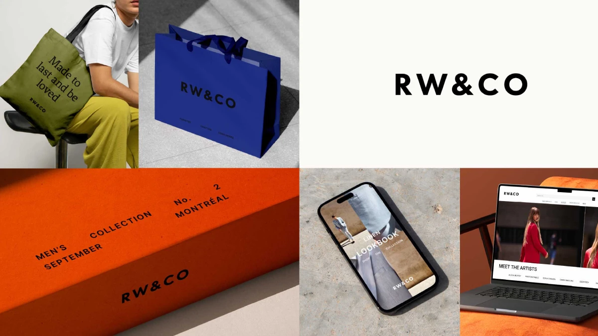
In the fashion retail industry, a brand’s identity is its most valuable asset. It is the silent conversation held with every customer before they even touch a garment. For Canadian fashion retailer RW&CO., a recent, comprehensive graphic design and branding overhaul, developed with the global strategy and design studio Dalziel & Pow, serves as a masterclass in brand evolution. What began as a conversation about new store designs blossomed into a fundamental reimagining of the brand itself. This project is a compelling case study in how strategic design can redefine a legacy brand for a new generation of style-conscious consumers. It demonstrates a profound understanding that a brand is not just what you see, but how it makes you feel.

The Catalyst for Change: More Than Just a Store Redesign
The initial goal was straightforward: refresh the physical store experience. However, both RW&CO. and Dalziel & Pow quickly recognized a deeper opportunity. A new store design would feel hollow without a revitalized brand platform to support it. Consequently, the project’s scope expanded to a complete transformation. The core mission became to position RW&CO. as the most loved and trusted destination for modern, dynamic lifestyles. This strategic pivot aimed to capture a new audience, elevate the brand’s authority in the fashion space, and significantly boost its presence across Canada. Why undertake such a monumental task? The answer lies in future-proofing the brand and building a deeper, more meaningful connection with customers.
Forging a New Brand Identity: The Core Components
At the heart of this transformation is a new visual identity designed for clarity, confidence, and cohesion. It reflects the brand’s core values—trust, quality, and curated style—across every single touchpoint. The new system gives RW&CO. the framework to tell diverse stories with unwavering consistency, while still allowing for moments of bold, expressive personality. This is the essence of modern, effective graphic design and branding.
A Logo That Speaks Volumes
The new logo is a study in precision. By shifting to a clean, black and white wordmark, the brand instantly projects a more confident and considered personality. Dalziel & Pow methodically removed the punctuation of the previous logo and refined the typeface. They carefully adjusted spacing and proportions, creating a calm, balanced feel that is both modern and inclusive. The result speaks confidently to all genders and styles. What seems like a simple change is, in my opinion, a powerful declaration. It strips away the unnecessary to reveal a core strength. Furthermore, this new mark is designed for adaptability, working seamlessly on everything from a tiny garment label to large-scale digital applications and store signage.
The Power of Typography and Color in This Rebranding Strategy
Supporting the new logo is a refined typographic approach that brings elegance to all brand messaging. Simplicity here is key. It ensures that whether the message is promotional or inspirational, it is always clear and on-brand.
Beyond the starkness of black and white, the rebrand introduces a sophisticated and expanded color palette. This is a particularly insightful aspect of the rebranding strategy. Core colors, simple and refined, are used to elevate key communications. However, a supporting palette of richer, more expressive colors is reserved for high-impact moments, such as on shopping bags and packaging. This dual approach adds layers of personality and recognizability where they matter most. It is a clever system that maintains a chic, timeless foundation while allowing for seasonal flair and memorable customer interactions.
Storytelling Through a New Lens: The “How” of Communication
A visual refresh is only half the battle. A truly successful fashion retail rebranding hinges on how the brand communicates its new vision. RW&CO. is now focusing more intently on inspiring storytelling, directly tying into its purpose of empowering people to write their own style story.
Authentic Imagery and a Refined Voice
The new art direction marks a significant departure. Marketing materials now embrace the authenticity of street photography. The imagery aims to capture how people actually live, move, and connect in their clothes. As Ali Shams, Creative Director at RW&CO., explains, “Our imagery captures real life in motion — clear, dynamic, and rooted in how people live today.” This focus on context shows how the garments truly belong in everyday life. Additionally, an increased use of close-up details highlights the high-quality fabrics and finishes, giving shoppers a tangible sense of the product’s value before they even enter a store.
This visual shift is paired with a new tone of voice. The brand now speaks in a self-assured, refined, and conversational manner. The language is empowering, authentic, and uplifting, creating a more personal and inspiring connection with the audience.
Expert Perspectives: Inside the Rebranding Strategy
The success of this project is rooted in deep collaboration. Oliver Ellis, Associate Creative Director at Dalziel & Pow, noted, “This rebrand was a true collaboration with the in-house team – their insight into the brand’s DNA was invaluable.” This synergy is critical. Fashion is in constant flux, so the identity must be robust enough to evolve with the brand while remaining true to its core. Ellis adds, “We wanted the new visual language to reflect the quality and attention to detail that already exists in the product, but wasn’t always visible.”
From the brand’s perspective, this change is foundational. Mathieu Bouchard, Director of Marketing and Partnerships at RW&CO., states, “We’re laying the groundwork for a more focused and ambitious approach to marketing… Our goal is to build a marketing strategy that not only drives growth but also deepens our connection with the audiences that matter most.”
The Future Foundation: Beyond Visuals
This comprehensive graphic design and branding project is more than a cosmetic update; it is the foundation for the brand’s future. With over 80 stores nationwide, RW&CO. is a staple of the Canadian retail scene. The refreshed identity is now paving the way for the next critical step: an evolution of the in-store experience, set to be revealed later this year. This is perhaps the most crucial element. A powerful brand promise made through marketing must be delivered upon in the physical retail space. The new identity sets the stage perfectly for this next act.
Ultimately, the RW&CO. rebrand is a powerful reminder that strategic design is a business imperative. It is about building a cohesive and compelling world that customers want to be a part of. By focusing on clarity, quality, and authentic storytelling, RW&CO. has not just changed its look; it has redefined its future. How will your brand evolve to meet the moment?
All images © Dalziel & Pow. Check out other inspiring projects in WE AND THE COLOR’s Graphic Design and Branding categories.
Subscribe to our newsletter!

