
Is Good Typography Really 90% of Design? You Might Be Surprised!
Think about your favorite brands for a second. What makes them stand out? Is it the logo? The color palette? Those are important, sure. But have you ever really looked at the words they use? The way those words look? What about the last website you visited? Was it easy to read? Did the words feel like they belonged? If so, that’s good typography at work.
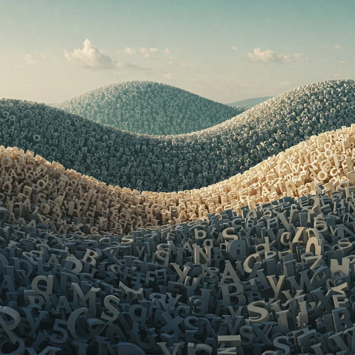
We often overlook typography. It’s subtle. It’s ingrained in everything we read. But, it’s also profoundly powerful. In many cases, you could argue that good typography isn’t just part of design, it is design. It’s the unsung hero, the backbone. We may not always realize it, but typography heavily influences our perception and understanding of information.
Think of it this way: You can have the most stunning visuals, and the cleverest concept, but if the text is illegible, distracting, or just plain ugly, the whole thing falls apart. Right? It can single-handedly turn a beautifully designed website into a frustrating mess. You’ll have readers bouncing off your page in a heartbeat. Let’s explore why typography carries such weight. Why it might just be the most important 90% of design.
The Silent Language of Good Typography
Words aren’t just vessels for information. The way they are presented affects their meaning, too. Typography adds layers of emotion and personality. Consider a bold, sans-serif font versus a delicate, flowing script. Each evokes a completely different feeling, right?
Font choices communicate a message before the words even register.
- Serif fonts (like Times New Roman or Garamond) are often seen as traditional, reliable, and trustworthy.
- Sans-serif fonts (like Arial or Helvetica) feel modern, clean, and approachable.
- Script fonts can be elegant, playful, or even whimsical, depending on the style.
Good typography understands this silent language. It uses it to reinforce the brand’s voice and connect with the target audience.

Type Anatomy: Knowing Your Letters Inside and Out
Before we dive into the art of font pairing and visual hierarchy, let’s brush up on type anatomy. Understanding the different parts of a letter is crucial for making informed decisions about font selection and layout. So, what are we talking about?
Think of terms like:
- Ascender: The part of a lowercase letter that extends above the x-height (like in “b,” “d,” “h”).
- Descender: The part of a lowercase letter that extends below the baseline (like in “g,” “p,” “q”).
- X-height: The height of the lowercase “x” in a font, which significantly affects readability.
- Serif: The small decorative strokes at the end of letterforms (characteristic of serif fonts).
Familiarizing yourself with these terms will empower you to analyze fonts critically. You’ll understand why certain fonts work better in certain contexts. It also improves your ability to communicate effectively with designers or other professionals. Knowing your alphabet inside and out allows you to make conscious decisions.
Font Pairing: Creating Harmony (or Cacophony)
Choosing one font is hard enough, but pairing two or more? Now that’s a challenge! Effective font pairing is crucial for good typography. It’s all about creating a harmonious balance between contrasting styles.
Here are some general guidelines to consider:
- Contrast is key: Avoid pairing fonts that are too similar. Look for fonts with distinct personalities that complement each other without clashing.
- Hierarchy is important: Use different fonts for headings and body text to create a visual hierarchy and guide the reader’s eye.
- Legibility matters: Always prioritize readability, especially for body text. Avoid overly decorative or complex fonts that can strain the eyes.
- Limit your choices: Sticking to two or three fonts is generally a good rule of thumb to avoid overwhelming the design.
There are many great online resources. They can help you find complementary font pairings if you are feeling overwhelmed. Just make sure to choose a good typography and stay consistent in your choices.
Legibility and Readability: The Cornerstones of Good Typography
All the beautiful fonts in the world won’t matter if your text is impossible to read. Legibility refers to the ability to distinguish individual letterforms. Readability, on the other hand, refers to the overall ease of reading a block of text. Both are essential for good typography and user experience.
Here are some factors that influence legibility and readability:
- Font size: Choose an appropriate font size for the intended viewing context (screen versus print).
- Line height (leading): Adequate line height allows the eyes to easily move from one line to the next.
- Line length: Keep line lengths relatively short to prevent eye fatigue.
- Tracking (letter spacing): Adjust the spacing between letters to improve readability, especially at smaller font sizes.
- Kerning (character pairing): Fine-tune the spacing between specific letter pairs to achieve a more balanced and visually appealing appearance.
- Color contrast: Ensure sufficient contrast between the text and background to avoid eye strain.
If you want to implement good typography you have to master these simple things. It will ensure that your content is both accessible and engaging.
Good Typography as a cornerstone of Brand Identity
Typography plays a vital role in shaping a brand’s identity and communicating its values. Think about some big companies. Apple is famous for its clean sans-serif font. This reflects its modern and minimalist design aesthetic. Coca-Cola’s script typeface evokes a sense of nostalgia and tradition.
The fonts a brand uses become synonymous with its image. It communicates personality and establishes recognition. Consistent use of typography across all brand materials strengthens brand identity. It also creates a cohesive and professional impression. When choosing fonts for your brand, consider the brand’s personality, target audience, and overall message. Will your typography stand the test of time?
Ignoring Good Typography? Prepare for Disaster!
What happens when you neglect good typography? The consequences can be far-reaching, impacting everything from user experience to brand perception. Poor typography can lead to:
- Reduced readability: Making it difficult for users to understand your message.
- Negative brand perception: Conveying a sense of unprofessionalism or carelessness.
- Decreased engagement: Causing users to abandon your website or marketing materials.
- Lost sales: Hindering conversions and impacting revenue.
Investing in good typography is an investment in your brand’s success. It demonstrates a commitment to quality, attention to detail, and respect for your audience.
Final Thoughts: Is Good Typography Really 90% of Design?
So, is good typography really 90% of design? Maybe not literally. It’s hard to put an exact number on it. However, we can all agree that typography is undoubtedly a crucial element. It’s the foundation upon which all other design elements are built. Good typography elevates design, enhances communication, and builds brand trust. Do not underestimate it.
Next time you see a great design, take a moment to appreciate the typography. Notice how it contributes to the overall message and experience. Because chances are, it’s doing a lot more than you realize!
Now, go forth and make good typography choices! Your designs will thank you for it.
Don’t hesitate to browse WE AND THE COLOR’s Graphic Design and Fonts categories for more.
Subscribe to our newsletter!


