
Duluth, Minnesota exists as a unique realm, celebrated for its unspoiled landscapes and distinct individuals. Hence, it’s unsurprising that Vikre Distillery calls this place home. This artisanal spirits label possesses abundant character, a devoted following, and a locally nurtured philosophy. In an effort to reimagine its image and fully embrace its distinctive attributes, Vikre joined forces with SMAKK, a branding and marketing agency. Together, they crafted a fresh identity aimed at imparting a taste of Duluth to each and every customer. Please read more below.
Emily and Joel Vikre, a married couple, drive the spirit behind Vikre Distillery. Their ethos revolves around a triple bottom line that prioritizes people, the planet, and prosperity. This commitment involves not just crafting a certified organic, waste-free methodology, but also establishing initiatives for bottle reusability and community contributions. They take pride in sourcing their ingredients locally, whether it’s the untamed botanicals, grains, or water from the Lake Superior watershed. However, in their pursuit of transitioning from local champions to distinguished figures in the industry, they recognized the necessity of articulating these exceptional attributes with greater clarity.
“Vikre needed deeper brand storytelling that would act as a springboard for more national distribution, brand name awareness, and a cult following,” explains SMAKK Founder Katie Klencheski. “We really wanted their brand to be a reflection of their story, their personality, and, most importantly, a sense of place. These are people dedicated to doing things the right way, not just the easy way, across all aspects of the brand — from sourcing, to sustainability, to their dedication to their employees and the experience they give their customers, both in their tasting room and out in the wild. All of that needed to take center stage.“
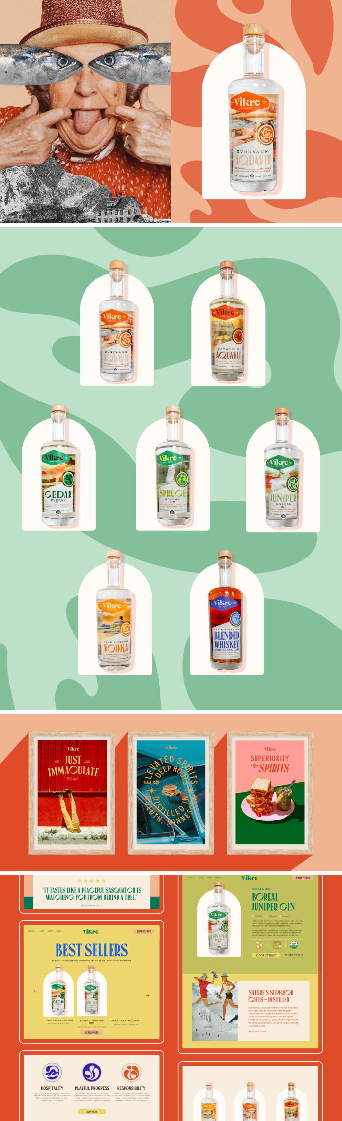
Guiding the strategy and evolution of the brand encompassing fresh identity and messaging, SMAKK employed elements of surrealism to construct a realm for Vikre that mirrors the dynamic Duluth community and its Nordic heritage. Ranging from the logo to symbols and the throwback-inspired set of visuals, the character of the identity exudes allure and idiosyncrasy. Merged visuals referencing local sites (such as Minnesota’s Temperance River), figures (like an untamed Norwegian grandmother), and components (such as pine and juniper berry) signify both Duluth and Vikre’s distillation methods while laying the foundation for a compelling narrative.
This unconventional methodology extends to the bottle packaging. Each flavor takes on an individual persona, ensuring prominent visibility on shelves while maintaining a lucid message and structured information hierarchy. With every product, a distinct story and personality unfold, ready to be explored and celebrated.
All images © by SMAKK. Don’t hesitate to find more inspiring projects in the Graphic Design, Branding, and Packaging Design sections on WE AND THE COLOR.

Subscribe to our newsletter!


