This post contains affiliate links. We may earn a commission if you click on them and make a purchase. It’s at no extra cost to you and helps us run this site. Thanks for your support!
The Touche font family, a sturdy and geometric sans serif typeface with a unique touch.
Type designer Jonny Pinhorn is a member of the renowned Indian Type Foundry. In 2015, he has designed the Touche font family, which is a sturdy and geometric sans serif typeface with a special feel. The family comprises 5 weights ranging from Light to Bold. This sans typeface is intended for the use as display font, whether print media or on screen.
With the Touche typeface, Jonny Pinhorn wanted to create a geometric font away from basic geometric forms, which you can find in many other fonts of the same genre. At first glance the typeface looks familiar, but on closer inspection you can discover many small, rather discreet details that provide a distinctive look. Touche’s internal strokes on the ‘G’ and the ‘Q’ were significantly extended. Jonny Pinhorn added a top stroke to the letter ‘J’, without forcing the glyph to become any wider. Some lowercases like the letter ‘j’ have been reduced to the essentials in order to create a more minimalist touch. The Touche typeface is available as webfont and desktop font. You want to know more? Then follow the link below.
You can get this display font family on Myfonts.
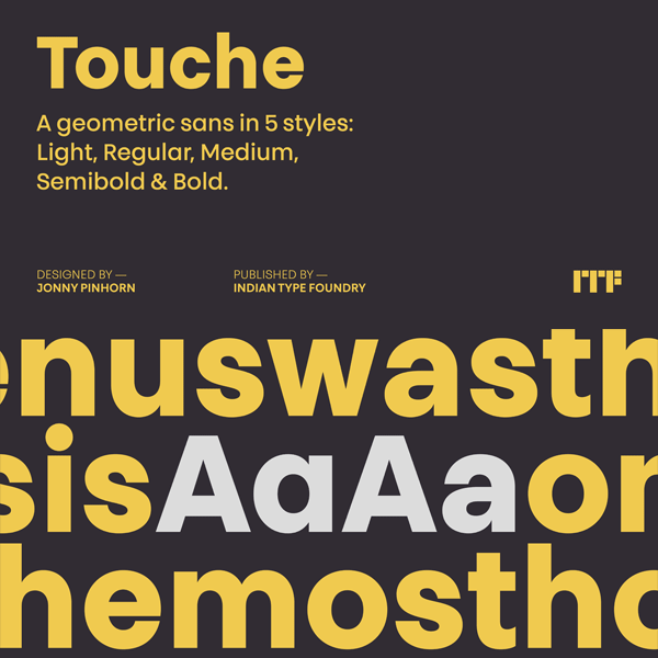
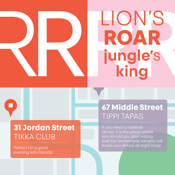
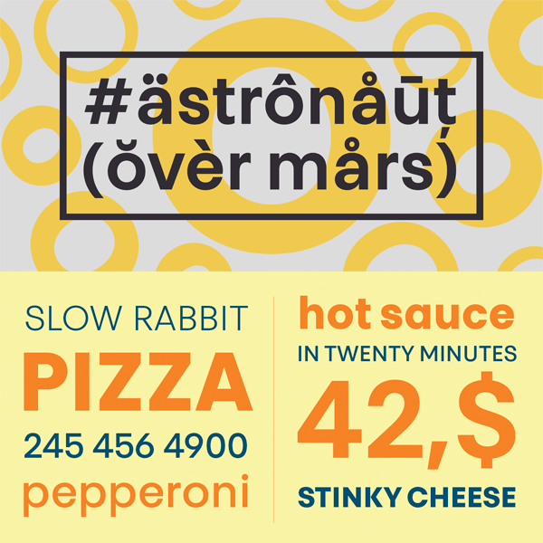
The Touche type family from Indian Type Foundry is available for purchase on Myfonts.com


