
This post contains affiliate links. We may earn a commission if you click on them and make a purchase. It’s at no extra cost to you and helps us run this site. Thanks for your support!
Getting to Know Salford Sans: Clarity Meets Character in this Manchester Typeface
Have you ever stopped to really look at the letters that make up our world? Typefaces are everywhere on websites, in books, on signs, on packaging, and so on. They silently shape our perception, guide our eyes, and convey emotion. It’s pretty amazing when you think about it. Sometimes a font feels serious and commanding. Other times, it’s playful and light. Finding the right typeface is crucial for communication. It’s like choosing the right tone of voice. Get it wrong, and the message falters. Get it right, and everything clicks. Now, imagine finding a typeface that manages to be serious, international, and highly communicative, yet still carries a whisper of stylish, handcrafted personality. Sounds like a tall order, right? Well, let’s chat about a font family that aims to do just that. We’re talking about the Salford Sans font family, a remarkable creation from the Manchester Type Foundry. You might have heard whispers about it, or perhaps seen it in action and felt that unique blend of clarity and character.
What makes Salford Sans stand out in a crowded field? Why is it resonating with designers globally? It feels both rooted in tradition and perfectly suited for today’s diverse design challenges. Let’s explore this fascinating font family together. We’ll uncover the thinking behind Salford Sans, examine its features, and see why it might just be the typographic solution you didn’t know you needed. Ready to get acquainted?
So, What Exactly is Salford Sans?
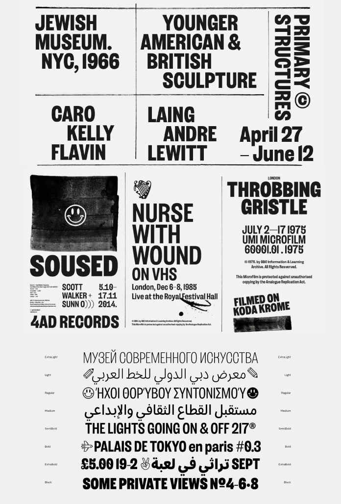
Alright, let’s get down to specifics. What defines the Salford Sans font family? First off, think options. Salford Sans comes equipped with eight distinct weights. This range provides incredible flexibility for designers. You can go from a delicate, airy Thin for subtle moments to a powerful, attention-grabbing Black for maximum impact. This breadth allows for creating clear visual hierarchies within your designs.
But weight is just one dimension. Salford Sans also includes oblique and slanted styles. These offer different ways to add emphasis or stylistic variation compared to a true italic. It gives designers more tools in their typographic toolkit.
Perhaps most impressively, Salford Sans boasts extensive language support. It covers four major scripts. These are Extended Latin, Monotonic Greek, Arabic, and Cyrillic. Think about the implications. Have you ever faced the challenge of maintaining brand consistency across different regions and languages? Finding a single typeface family that handles this smoothly can be difficult. Salford Sans is designed to tackle this very problem, making it a truly international typeface.

The Vibe: Where Function Meets Personality in Salford Sans
Okay, we know Salford Sans is technically robust. But what does it feel like? What’s its personality? The creators at Manchester Type Foundry designed it with specific applications in mind. Picture those commanding headlines in a magazine or on a website. Think about the clear, readable text needed for editorial content. Consider the impact required for effective advertising. Salford Sans was built for these demanding environments.
It needs to project seriousness and clarity. It needs to communicate effectively across cultures. Yet, crucially, it manages to avoid feeling cold or impersonal. There’s an underlying warmth, a hint of that stylish, almost handcrafted character mentioned earlier. It achieves a sophisticated balance. Salford Sans feels professional, but approachable. It’s highly functional, yet retains a distinct identity. Striking this balance is a real design feat, wouldn’t you agree? Salford Sans navigates this territory with elegance.
Going Beyond the Basics: Features Packed into Salford Sans
Salford Sans isn’t just about the basic letterforms. It’s packed with thoughtful features that enhance its usability. For starters, it includes a comprehensive set of symbols. This is incredibly practical for designers working on complex layouts or interfaces. No need to hunt for matching symbols elsewhere!
Furthermore, Salford Sans incorporates tidy OpenType features. These features unlock advanced typographic capabilities, allowing for things like stylistic alternates, ligatures, and more refined spacing. Ever wished for more control over the angle of your slanted text? Salford Sans delivers with a variable slant axis. This provides designers with nuanced control, letting them fine-tune the slant precisely to their needs.
And the attention to detail doesn’t stop there. The typeface includes a range of features specifically designed for localized languages. This demonstrates a deep understanding of and respect for linguistic diversity. These aren’t just fancy extras; they are practical tools that empower designers to create better, more effective communication. They elevate Salford Sans from a simple font to a comprehensive typographic system.
A Nod to Tradition: The British Sans-Serif Roots of Salford Sans
Every great design often has roots in what came before. Where does the aesthetic of Salford Sans originate? Its design DNA is firmly planted in the tradition of British condensed sans-serif typefaces. Think about those classic, hardworking fonts often seen in industrial settings, on public transport signage, or in informational contexts. They needed to be incredibly legible, space-efficient, and robust.
Salford Sans takes this strong, functional heritage as its starting point. It embraces the clarity and practicality of those traditional forms. However, it doesn’t just replicate the past. It updates and refines this concept for contemporary use. Manchester Type Foundry infused it with a modern elegance and expanded its capabilities significantly. This blend of dependable tradition and forward-thinking design is key to its appeal. It feels both familiar and fresh. Does that combination of history and modernity resonate with your own design sensibilities?
Meet the Minds: Lewis McGuffie, David Williams, and Manchester Type Foundry
A typeface doesn’t just appear out of thin air. It’s the result of skill, vision, and hard work. So, who are the creators behind Salford Sans? The design credits go to Lewis McGuffie and David Williams. These talented individuals are the architects of this versatile font family.
The typeface was brought to the world by Manchester Type Foundry. This foundry, based in Manchester, UK, is steadily building a reputation for producing high-quality, well-considered typefaces. Their catalogue often reflects a deep appreciation for typographic craft and history, combined with a keen eye for contemporary needs. Recognizing the designers and the foundry behind Salford Sans is important. It acknowledges the expertise and dedication poured into its creation. Their work provides the design community with powerful tools like Salford Sans.
Salford Sans Arabic: A Notable Option
There’s a specific aspect of the Salford Sans family worth highlighting, particularly for projects involving Middle Eastern languages. The Salford Sans Arabic component is meticulously designed. It harmonizes beautifully with the Latin, Greek, and Cyrillic scripts, ensuring visual consistency across multilingual documents.
Importantly, Manchester Type Foundry offers Salford Sans Arabic as a separate purchase. This version includes the upright styles but omits the oblique/slanted variations. This provides flexibility for users whose primary focus is the Arabic script or who don’t require the slanted styles for Arabic text. It’s a thoughtful offering that caters to specific user needs and project requirements, demonstrating the foundry’s understanding of diverse typographic demands.
Is Salford Sans Right for Your Next Project?
After exploring its various facets, the question becomes: why should Salford Sans be on your radar? Let’s quickly summarize its key strengths.
First, its versatility is undeniable. The eight weights and multiple styles offer a vast expressive range.
Second, its extensive multi-script support makes Salford Sans a powerful choice for global branding and international communication.
Third, it masterfully balances a serious, professional tone with a subtle, stylish personality.
Fourth, the rich feature set, including symbols, OpenType extras, variable slant, and localized language support, provides designers with exceptional control and flexibility.
Fifth, its foundation in the robust British condensed sans tradition lends it a timeless reliability, updated for modern aesthetics.
Are you working on projects involving headlines, editorial design, branding systems, advertising campaigns, or user interfaces? Do you need a typeface that performs reliably across different languages and platforms? Salford Sans presents a very strong case. It’s a functional, elegant, and highly communicative typeface family. Consider Salford Sans a modern workhorse infused with character, ready to tackle demanding design challenges.
Salford Sans is a Typeface for Today and Tomorrow
So, let’s sum things up. The Salford Sans font family represents a thoughtful, comprehensive typographic system crafted with care by Lewis McGuffie, David Williams, and Manchester Type Foundry. It successfully merges a respect for typographic tradition with the complex demands of contemporary global design. Its ability to be both a functional workhorse and a carrier of subtle personality is its defining characteristic. The extensive language support, combined with its rich feature set, makes Salford Sans an invaluable asset for designers aiming for clarity, consistency, and style. Could Salford Sans be the missing piece in your typographic puzzle? It’s certainly a font family worthy of serious consideration and exploration. Its blend of strengths suggests Salford Sans is not just a typeface for now, but one poised for enduring relevance in the design landscape.
Hungry for more typefaces? If so, feel free to check out WE AND THE COLOR’s popular Fonts category.
Subscribe to our newsletter!


