
This post contains affiliate links. We may earn a commission if you click on them and make a purchase. It’s at no extra cost to you and helps us run this site. Thanks for your support!
Push the Boundaries: A Deep Dive into Christine Gertsch’s Versatile Font Family
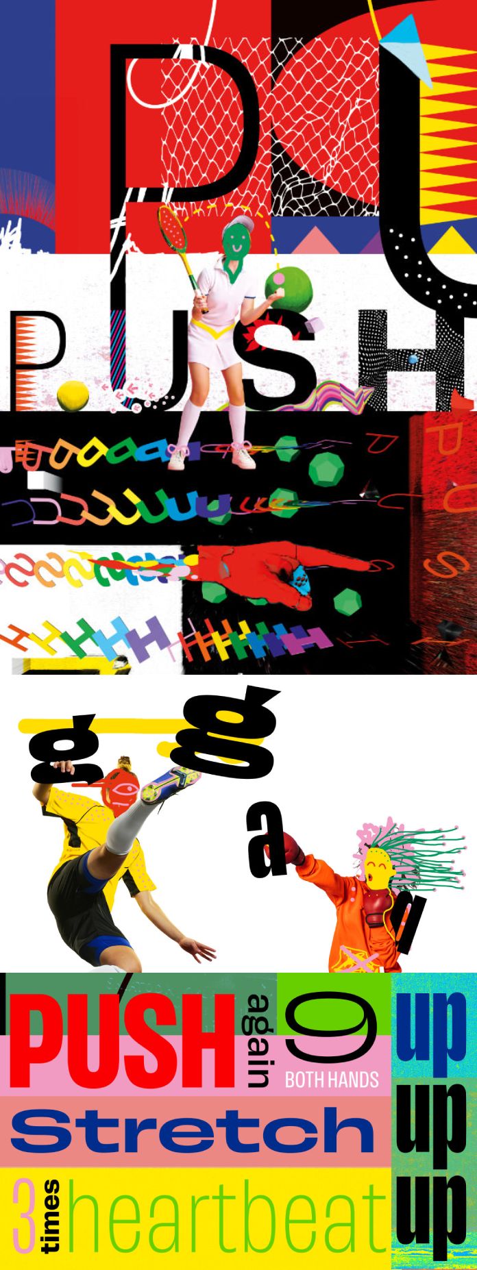
Swiss design maven Christine Gertsch doesn’t just create fonts, she crafts typographic toolkits. Her Push font family is a testament to this, offering a comprehensive and undeniably cool system for designers.
Push boasts a hefty eight weights across seven widths, a testament to its ambition. But Gertsch isn’t one for overwhelming choice. This expansive family is meticulously crafted, with a cleverly designed curvature transformation that ensures each weight and width sings in harmony. The result? A font that exudes confidence and leaves a lasting impression.
The design itself is a fascinating conversation with history. Push’s letterforms echo the early days of sans serifs, a century of innovation whispering through its curves. Yet, it’s resolutely modern, its bold stance firmly planted in the here and now. Look closer, and you’ll find playful winks to the past. The capital ‘G’ borrows its strength from Thorowgood’s 1830 design, while the lowercase ‘a’ echoes the spirit of 1930’s Plak. The character set even embraces international influences, offering a looped Anglo-American ‘g’ alongside its European Grotesk and Danish counterparts.
Gertsch’s dedication to detail is inspiring. Rather than relying on automated interpolation, she meticulously crafted the extremes of the weight spectrum first. This ensured complete control over curvature, avoiding the pitfalls of compromise.
This focus on curvature is what truly sets Push apart. Across the family, a subtle transformation unfolds. The extra-condensed and extra-light weights exude a tense, almost delicate energy, while their extra-wide and extra-bold cousins radiate massive confidence. Nestled between these extremes sits Push Regular, a calming presence that ties the family together.

But Push isn’t just about width and weight. The transitional nature of its design creates contrast beyond the obvious. Shapes and counter-shapes dance in a sophisticated interplay, a feature that elevates any typographic project, regardless of medium. As a delightful finishing touch, a Stylistic Set allows accents and punctuation to subtly pirouette around the main characters, adding a touch of visual intrigue.
Christine Gertsch’s Push is more than just a font; it’s a carefully considered system, a tribute to design history, and a powerful tool for the modern designer. With its confident presence and clever curvature transformation, Push compels you to push the boundaries of your creativity.
All images © by Fontwerk. Feel free to find more typefaces in the Fonts category on WE AND THE COLOR.


