
This post contains affiliate links. We may earn a commission if you click on them and make a purchase. It’s at no extra cost to you and helps us run this site. Thanks for your support!
ContestDesign’s minimalist portfolio presentation template proves something radical. Professional branding doesn’t need complexity to command attention. This Adobe Illustrator kit, available through Adobe Stock, strips away visual noise. What remains? Pure communication power.
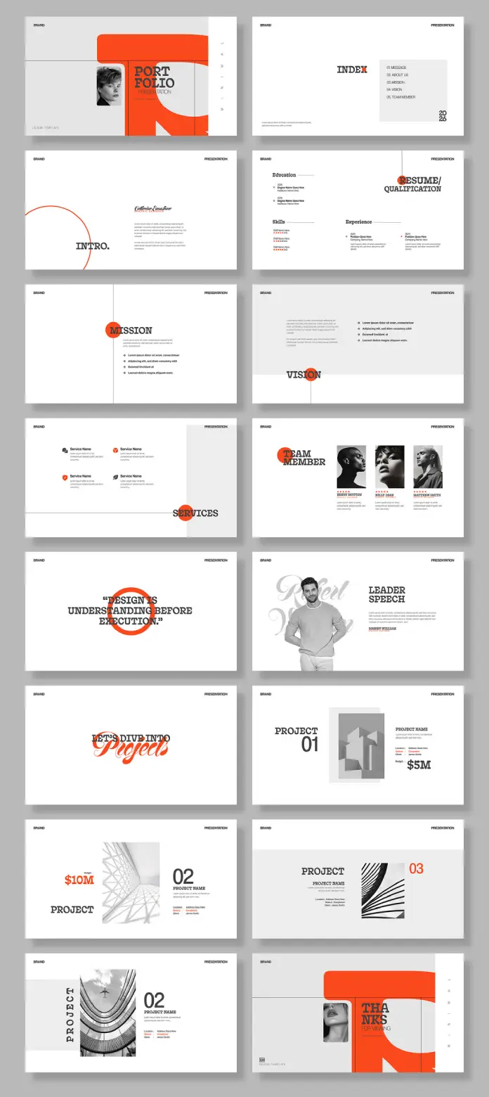
The template delivers 16 fully customizable slides at 1920 x 1080 pixels. Each slide demonstrates what I call Reductive Visual Authority—the practice of achieving maximum impact through minimal design elements. This isn’t just another presentation deck. It represents a fundamental shift in how creative professionals communicate value.
Please note that to edit this template, you need professional graphic design software like Adobe Illustrator installed on your computer. You can get the latest version from the Adobe Creative Cloud website. Just have a look here.
What Makes This Portfolio Presentation Template Different From Generic Alternatives?
Most portfolio templates suffer from Design Feature Creep. They pile on gradients, shadows, and decorative elements. ContestDesign takes the opposite approach. The template employs what designers call Strategic Negative Space Architecture—using white space as an active design element rather than leftover area.
The color palette reveals intelligent restraint. A bold coral-orange accent punctuates crisp black typography on white backgrounds. This three-color system creates what I term Chromatic Anchoring. The eye knows exactly where to land on every slide.

Typography drives the entire visual system. The template combines serif and sans-serif fonts to establish hierarchy without decoration. Bold headers contrast with refined body text. This creates Typographic Tension—enough visual interest to engage viewers without overwhelming core content.
The Screen-Optimized Dimensions Advantage
The 1920 x 1080 pixel format matters more than most realize. This aspect ratio aligns perfectly with modern display standards. Your portfolio presentation template displays correctly on monitors, projectors, and video conferencing platforms. No awkward black bars. No stretched layouts. Just a clean, professional presentation.
Traditional print-oriented templates force creators into constant reformatting. This digital-first approach eliminates that friction. You create once and present anywhere.
Breaking Down the 16-Slide Framework
ContestDesign structures this portfolio presentation template around what I call Narrative Progression Architecture. Each slide serves a specific purpose in your brand story. Let’s examine how they work.
Opening Impact: The Cover Slide System
The template opens with a visual punch. Bold typography announces “PORTFOLIO” while geometric shapes frame professional photography. This establishes immediate credibility. The design says: I understand visual communication before speaking a word.
The cover employs Asymmetric Balance Dynamics. Elements cluster on one side while negative space breathes on the other. This creates movement that pulls viewers into your presentation.
Content Organization Through the Index Slide
Smart presenters guide their audience. The index slide provides clear navigation through your portfolio sections. Simple typography. Clean hierarchy. No confusion about what comes next.
This slide demonstrates Information Cartography—mapping content in a visually digestible format. Viewers grasp your entire presentation structure at a glance.
Personal Introduction: The Credential Builder
The introduction and resume slides work together as Dual Qualification Modules. One slide presents your personal philosophy. The other displays concrete achievements. This combination builds trust through both vision and evidence.
Notice how the template separates education, skills, and experience into distinct visual zones. The layout prevents information overload while ensuring nothing gets overlooked.
Mission, Vision, and Values: Strategic Positioning Slides
These slides embody what I call Philosophical Framing Architecture. They transform abstract concepts into visual statements. The mission slide uses circular geometry to suggest completeness and purpose. The vision slide mirrors this approach with subtle variations.
Most portfolio presentation templates treat mission statements as afterthoughts. ContestDesign gives them visual weight equal to project work. This matters because clients increasingly want to understand your values before hiring you.
The services slide extends this framework. It presents capabilities without overwhelming viewers. Each service gets a dedicated space. Clear icons or graphics support text descriptions. The result? Instant comprehension of what you offer.
Team Member Showcase: The Collaboration Signal
Modern creative work demands collaboration. The team member slide acknowledges this reality. It provides space for multiple profiles with consistent formatting. Professional headshots align with brief biographies.
This slide uses what I term Collective Identity Visualization. It shows individual expertise while maintaining unified brand presentation. Clients see both specialized skills and cohesive teamwork.
Project Presentation: The Portfolio Core
The project slides represent the template’s strategic center. They employ Progressive Disclosure Design—revealing project information in carefully sequenced layers. Each slide shows one project at a time.
Visual Hierarchy in Project Documentation
Project slides balance multiple elements simultaneously. Project numbers provide easy reference. Bold project names command attention. Budget figures demonstrate scale. Meanwhile, supporting imagery illustrates outcomes.
The layout creates what designers call Information Zoning. Financial data occupies one area. Visual evidence takes another. Descriptive text fills a third zone. This prevents cognitive overload while ensuring a comprehensive project presentation.
Additionally, the template alternates layout patterns across project slides. Slide one might place imagery left with text right. Slide two reverses this arrangement. This variation maintains visual interest through repetition with difference.
Design Philosophy: Typography and Geometric Integration
ContestDesign’s approach reveals a sophisticated understanding of Geometric Minimalism Theory. The template uses circles, curves, and straight lines as primary design elements. These shapes frame content without competing with it.
The circular motifs appear strategically throughout slides. Sometimes they contain text. Other times, they bracket headings. Occasionally, they simply add visual weight to asymmetric layouts. This repetition creates Geometric Continuity—a visual thread connecting all slides.
Typography receives equal attention. The template combines strong sans-serif fonts for headers with more traditional serif options for body text. This creates Typographic Counterpoint—contrasting styles that enhance rather than conflict with each other.
Color as Strategic Emphasis
The coral-orange accent color functions as Visual Punctuation. It appears sparingly but powerfully. A circle around mission text. A block behind a heading. A number beside project information. Each instance draws the eye exactly where it needs to go.
This restrained color use demonstrates maturity. Amateur designers often flood templates with color. Professionals understand that limiting color increases its impact. ContestDesign clearly grasps this principle.
Customization Capabilities: Adapting the Template to Your Brand
This portfolio presentation template ships fully customizable in Adobe Illustrator. Every element exists as editable vector artwork. Change colors, swap fonts, adjust layouts—the template accommodates your specific brand requirements.
Working with Vector-Based Design Elements
Vector graphics offer crucial advantages over raster images. They scale infinitely without quality loss. This matters when you need to adjust slide elements or repurpose designs for different outputs. Moreover, vector files maintain small file sizes despite visual complexity.
The template’s Illustrator format means professional designers can integrate their existing brand assets seamlessly. Import your logo. Match your brand colors. Apply your typography standards. The template becomes truly yours.
Why Minimalist Design Wins Client Attention
Minimalist portfolio templates succeed for psychological reasons. Human attention spans continue shrinking. Visual noise increases across all media. Consequently, clean design cuts through clutter more effectively than ever.
This portfolio presentation template demonstrates what I call Cognitive Load Optimization. It presents only essential information per slide. Viewers process content easily. They remember key points. They focus on your work rather than fighting your layout.
Clean design also signals professional competence. When your presentation looks polished and intentional, clients assume your work exhibits similar quality. First impressions happen in seconds.
The Screen Presentation Advantage for Remote Collaboration
Remote work transformed how creatives share portfolios. In-person meetings decreased dramatically. Screen-sharing became standard. Therefore, presentation templates optimized for digital display gained importance.
This template’s 1920 x 1080 pixel format displays perfectly in Zoom, Teams, and Google Meet. Your portfolio looks professional regardless of platform. Details remain sharp. Layouts stay balanced. Nothing gets lost in digital translation.
Practical Applications Across Creative Disciplines
Graphic designers obviously benefit from this portfolio presentation template. However, its utility extends further. Photographers can showcase projects with supporting context. Illustrators can present commercial work alongside personal pieces. Art directors can demonstrate campaign thinking.
The template’s flexibility supports Cross-Disciplinary Portfolio Architecture. Whether you create brand identities, editorial layouts, motion graphics, or multi-channel campaigns, these slides accommodate your content. They provide structure without imposing rigid constraints.
Adapting Slides for Different Presentation Contexts
Consider how presentation contexts vary. Client pitches demand a different emphasis than award submissions. Job interviews require distinct information from new business presentations. This template supports all scenarios through intelligent slide selection and sequencing.
You might use all 16 slides for a comprehensive portfolio review. Alternatively, select 8 slides for a focused capability presentation. The modular structure permits endless combinations while maintaining visual coherence.
Technical Specifications and File Management
The template ships as an Adobe Illustrator file containing 16 artboards. Each artboard represents one slide at 1920 x 1080 pixels. This organization makes slide management intuitive. Select the artboards you need. Export them individually or as a batch. Your workflow stays efficient.
Adobe Illustrator’s layering system keeps design elements organized. Text layers are separate from image layers. Graphic elements occupy distinct layers from the backgrounds. This structure simplifies editing and reduces mistakes.
Export Options for Different Delivery Formats
Modern portfolio presentation requires multiple formats. You might need a PDF for email distribution. JPEG for social media sharing. PNG for website embedding. The template exports cleanly to all formats while preserving design integrity.
For interactive presentations, export slides as high-resolution images. Import them into PowerPoint, Keynote, or Google Slides. Add transitions and animations if desired. The template provides the design foundation. You control the presentation dynamics.
The Future of Portfolio Presentation Design
Portfolio presentation templates will continue evolving toward greater simplicity. As visual culture becomes more saturated, minimalist design offers a competitive advantage. This template positions you ahead of that curve.
I predict increased demand for what I term Adaptive Minimalism—design systems that maintain clean aesthetics while accommodating diverse content types. ContestDesign’s template exemplifies this approach. It handles photography, typography, data visualization, and conceptual content with equal grace.
Furthermore, expect growing emphasis on screen-optimized formats. Print portfolios serve niche purposes. Digital presentation dominates. Templates designed for digital-first workflows will outcompete print-oriented alternatives.
Investment Value: Cost Versus Utility Analysis
Adobe Stock offers this portfolio presentation template at competitive pricing. Compare that investment against hiring a designer for custom template development. The cost difference proves substantial.
However, price alone doesn’t determine value. This template saves time beyond money. You skip the design phase entirely. Focus on content instead. Populate slides with your best work. The professional presentation framework already exists.
Additionally, the template includes 16 slides. That’s 16 different layouts ready for immediate use. Calculate the per-slide value. The economics become even more favorable.
Critical Perspective: Template Limitations and Considerations
No portfolio presentation template serves every need perfectly. This design prioritizes minimalism. If your brand demands ornate decoration or complex visual layering, this template might feel restrictive. Understand your brand aesthetic before committing.
The template also requires Adobe Illustrator proficiency. Basic editing proves straightforward. However, advanced customization demands vector graphics knowledge. Budget time for learning if you lack Illustrator experience.
Moreover, the template’s strong visual identity could overshadow weak portfolio content. Clean design amplifies both excellence and mediocrity. Ensure your work quality matches the presentation quality. The template showcases content—it can’t replace it.
Best Practices for Template Implementation
Start by gathering all content before opening the template. Collect project descriptions, images, credentials, and supporting information. This preparation streamlines the customization process.
Next, establish your brand color palette. The template uses coral-orange as its accent. Decide whether that aligns with your brand or requires adjustment. Change colors early in the process. This prevents repetitive editing later.
Then, customize typography to match your brand standards. Select fonts that complement the template’s design language while expressing your unique identity. Maintain the hierarchy relationships that the template establishes. Change specific fonts without disrupting visual structure.
Image Selection and Preparation
Choose portfolio images carefully. The template provides generous space for visual content. Use high-resolution images that represent your best work. Avoid filler images that dilute impact.
Prepare images at appropriate dimensions before import. The 1920 x 1080 pixel slide format accommodates various image orientations. However, optimize file sizes for smooth file management. Balance quality against file bloat.
Frequently Asked Questions
Can I use this portfolio presentation template for commercial client presentations?
Yes, Adobe Stock’s standard license permits commercial use. You can customize the template and present it to clients as part of your professional services. However, you cannot resell the template itself or distribute it to other designers.
Does this template work in PowerPoint or Keynote?
The template ships as an Adobe Illustrator file. However, you can export slides as high-resolution images. Then import those images into PowerPoint or Keynote. This preserves the design while enabling those platforms’ presentation features.
How do I change the accent color throughout all slides?
Adobe Illustrator’s global color feature makes this simple. The template likely uses global swatches for the accent color. Modify the swatch once, and the change propagates across all slides. Otherwise, use Find and Replace to update specific color values throughout the file.
Can I add or remove slides from the 16-slide structure?
Absolutely. Duplicate existing artboards to create additional slides. Delete artboards you don’t need. The template provides a framework, not a rigid requirement. Adapt the slide count to your specific presentation needs.
What if I don’t have Adobe Illustrator?
Adobe offers Illustrator through a Creative Cloud subscription. Alternatively, some vector graphics programs can open Illustrator files with varying compatibility. However, for full editing capability, Adobe Illustrator remains the recommended software.
How do I maintain visual consistency when adding my own content?
Study the template’s existing layouts carefully. Note how elements align, how white space functions, and how typography creates hierarchy. Apply these same principles when adding content. Consistency comes from understanding and replicating the underlying design system.
Can I customize the typography beyond the provided fonts?
Yes, the template supports complete font customization. Replace the default fonts with your brand typography. Maintain the size relationships and hierarchy established in the template. This preserves readability while expressing your unique brand voice.
Is this template suitable for motion design portfolios?
The template works well for any creative discipline. Motion designers can use project slides to showcase still frames from animations. Include project descriptions explaining motion work. Consider adding QR codes linking to video reels for enhanced digital presentations.
How often should I update my portfolio presentation?
Update your portfolio whenever you complete significant projects. Replace weaker, older work with stronger recent pieces. Refresh slides quarterly at a minimum. Your portfolio should reflect current capabilities, not past achievements alone.
Can multiple team members use the same template for brand consistency?
Yes, this creates powerful brand coherence. All team members use an identical visual framework while showcasing individual work. This demonstrates both collaborative culture and personal expertise. Just ensure each person customizes content while maintaining design standards.
ContestDesign’s minimalist portfolio presentation template represents design thinking at its finest. The modern layout eliminates unnecessary elements. It amplifies essential content. The customizable design demonstrates that professional presentation doesn’t require complexity—just clarity, intention, and intelligent structure. Your portfolio deserves a presentation that matches its quality. This template delivers exactly that.
Check out other cool graphic design templates here at WE AND THE COLOR.
Subscribe to our newsletter!


