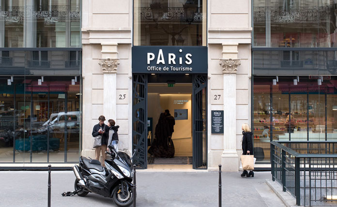
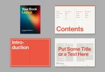
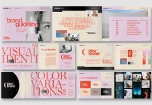
Brand design by agency Graphéine for the Paris Convention and Visitors Bureau.
Because of their outstanding expertise, French agency Graphéine was featured a couple of times on WE AND THE COLOR. Here comes another example that underlines their inventiveness and graphical capabilities. After a long consultation in July 2015, Graphéine was commissioned to develop a new brand design for the Paris Convention and Visitors Bureau. Read more below or visit the Graphéine website.

Brand identity case study.
At the very beginning, they asked themselves whether or not to use a symbol of the iconic Eiffel Tower. After an extensive briefing they came to the conclusion that the “great lady” is the most essential part of the Parisian visual identity. The design team opted for simplicity, which was realized by a typographic solution that refers to the Eiffel Tower as well as the silhouette of the city.

Development of the communication materials.
The official tourist pass called “Paris Passlib” was one of the first applications they had to design. With this pass, tourists get easily access to over 50 museums and monuments in Paris and the surrounding area. It serves as one ticked for all main attractions. Visitors can purchase the pass together with a book that contains all useful information. The Paris Passlib logo adaptation is based on the idea of traveling between several locations. A simple and sober map of Paris with all accessible sights has been used as distinctive background.


A clean and yet friendly brand identity based on simple typography and colorful illustrations.
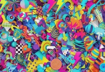
Graphéine teamed up with Séverin Millet, a Lyon-based illustrator who is well known for his vibrant, colorful work. He was asked to create a series of illustrations that perfectly match the vision of the project. The use of illustrations allowed them to step aside from the stereotypical postcard pictures of Paris. The result offers a fresh, colorful, and poetic look.


