
Graphic design and brand development by Studio Pros for NNNEURON Cosmetic.
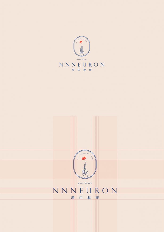
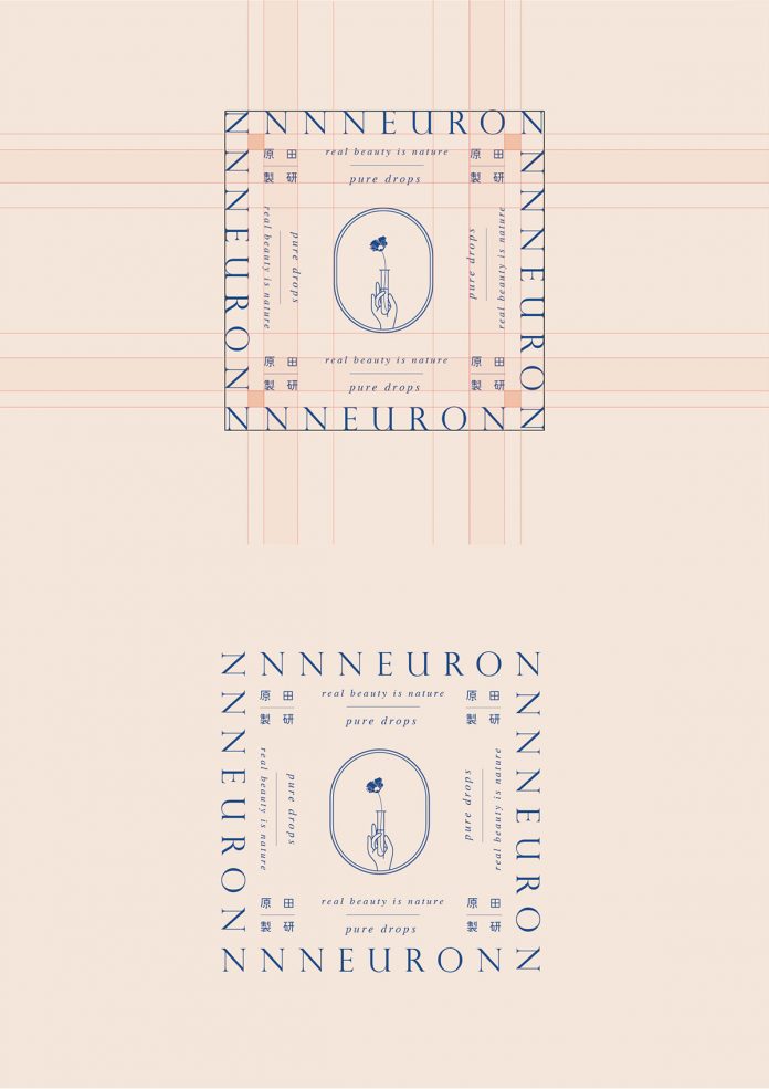
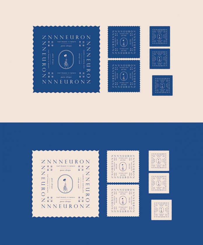
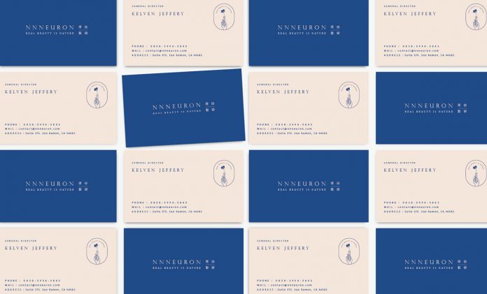
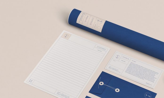
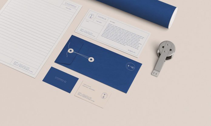
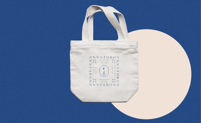
Studio Pros is a Taipei-based graphic design studio focusing on both print and screen design including branding, typography, packaging, and any form of digital design. Already completed in 2017, the studio was commissioned to work on a sophisticated brand identity for NNNEURON Cosmetic. They came up with a design that masterfully symbolizes the brand’s innovative spirit. Using a duotone color scheme, the peachy tone represents the skin while the blue color represents pure nature. The two colors complement each other and build the brand’s unique beauty and style. To emphasize the brand’s aesthetics and profession, the elements and characters inside the logo comprise a set of brand symbols.
Just have a look at the images below. For more of Studio Pros’ creative work, please visit their portfolio.
All images © by Studio Pros. Check out other inspiring work in our Graphic Design and Branding categories.


