
San Diego, CA-based studio Mubien created a new brand identity for Neara.
Australian utility SaaS business, Neara (formerly known as Power Lines Pro), commissioned branding studio Mubin to work on a new visual identity to serve as the umbrella company under which the different products and services would live. The new brand name reflects how the company brings partners ‘nearer’ to their assets, environments, and businesses. The new visual identity also reflects the brand’s diversifying growth ambitions into new infrastructure sectors with the symbol serving as the starting point to integrate the services and products under this umbrella. By using the negative space, it generates a dynamic way to create up to 256 product logotypes.
Below you can see a few images of the new brand identity. For those who want to see more of Mubien’s creative projects, feel free to take a look at their website or follow them on Instagram and Behance. Full credits of the Neara project can be found at the end of the article.

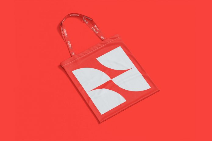


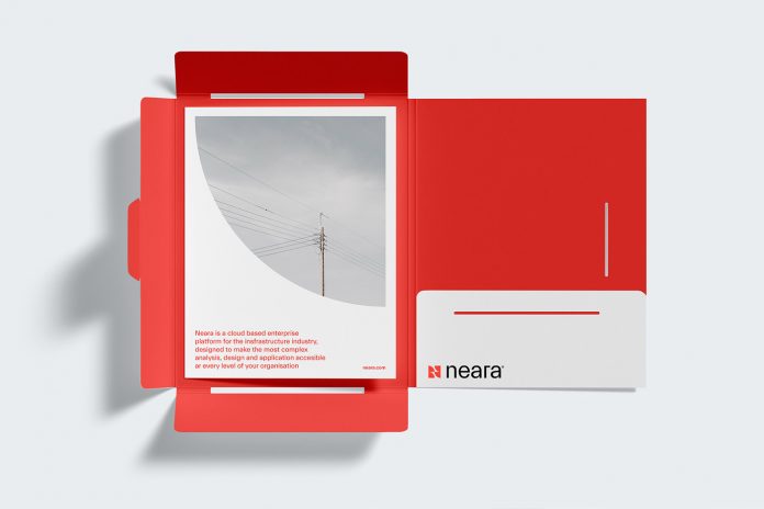
All images © by Mubien.
Agency: Mubien Brands/Workshop Built
Brand Consultant: Tenielle StoltenkampCreative Direction: David Mubien
Art Direction: Javier Ochoa, Daniel Iglesias, David MubienDesign: Carlos Almagro, Patricia Orden
UI/UX: Javier Ochoa


