This post contains affiliate links. We may earn a commission if you click on them and make a purchase. It’s at no extra cost to you and helps us run this site. Thanks for your support!
Let’s get one thing straight before we go further. The Maltique font from Zarma Type isn’t trying to whisper. It’s built to shout across a supermarket shelf, a poster wall, or an Instagram grid, and after two weeks of testing it inside real layouts, I can tell you it mostly succeeds. This is my hands-on review of the Maltique font, its glyph set, its OpenType behavior, and where it actually earns its keep in a working designer’s toolkit.
You can download the typeface for a very low budget from these platforms:
No, I didn’t just open the specimen PDF and call it a day. I used Maltique in different packaging mockups, ran it through logo tests, stress-tested the lowercase at small sizes, and compared it against a handful of chunky retro sans competitors I already own. Some of what I found matches the marketing copy. Some of it doesn’t.
You can download the typeface for a very low budget from these platforms:
What Exactly Is the Maltique Font?
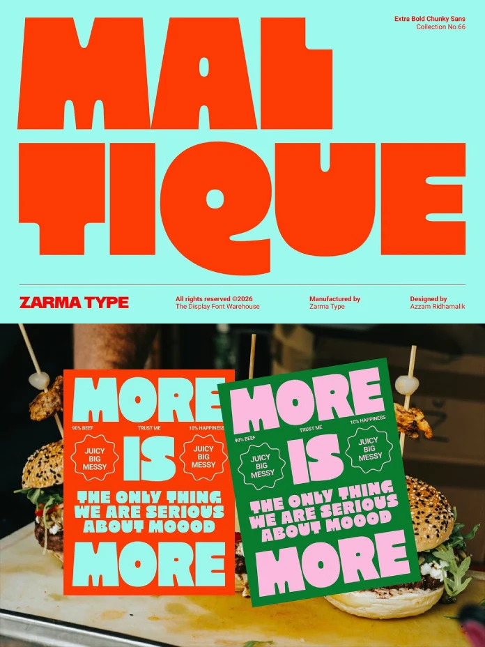
Maltique is an extra-bold, super chunky retro sans-serif display typeface designed by Zarma Type, sold through Creative Market. It ships with uppercase and lowercase letters, numerals, punctuation, symbols, multilingual support, and a PUA-encoded alternate set. Files come in OTF, TTF, WOFF, and WOFF2, so it covers both desktop layout work and web use.

The core idea behind Maltique is a contrast most display fonts don’t attempt. Sharp outer corners give every letterform a confident, almost architectural silhouette. Then, right inside those same letters, the counters and joins soften into rounded, melty curves. It’s a font that looks tough from a distance and friendly up close. I’d call that its whole personality in one sentence.
Where Maltique Fits in a Type Library
If you already own a few grotesque display faces, Maltique doesn’t compete with them directly. It sits in a narrower lane: bold, retro-leaning, food-and-beverage-friendly display type. Think snack packaging, diner signage, and playful logotypes rather than editorial body copy or long-form headlines.
The Chunk Threshold: How Bold Is Too Bold?
I want to introduce a term here, because I think it’s genuinely useful for evaluating fonts like this one. Call it the Chunk Threshold: the point at which an extra-bold typeface stops reading as confident and starts reading as illegible sludge. A lot of chunky sans fonts cross that line the moment you go below 60 pt or cram more than six or seven characters into a tight column.
Maltique stays on the right side of the Chunk Threshold longer than I expected. The compact counters, the small enclosed spaces inside letters like “e,” “a,” and “g,” hold their shape even when the type gets small. I tested it at 24pt in a mock product label and the letters still separated cleanly. Push it below 18pt for body-adjacent text, though, and the counters start closing in. That’s not a flaw. That’s just what the extra-bold display type does. Use it for headlines, not paragraphs.
Uppercase vs. Lowercase Performance
The uppercase set is where Maltique feels most at home. Every capital letter carries that sharp-corner, soft-curve tension the description promises, and it reads instantly as retro without tipping into pastiche. The lowercase set is good too, but slightly less distinctive. Letters like “n,” “m,” and “r” lean closer to a generic chunky sans than the uppercase does. Not a dealbreaker, just something to know going in.
The Melt Curve Ratio: Measuring Warmth in a Bold Font
Here’s a second framework I built while testing this typeface, because I think it explains why Maltique feels friendlier than most chunky sans fonts despite its aggressive weight. I’m calling it the Melt Curve Ratio: the proportion of a letterform’s interior geometry that uses soft, rounded transitions versus hard right-angle joins.
Most extra-bold retro sans fonts pick one lane. Either they go full brutalist with sharp joins everywhere, or they go full bubble-letter soft. Maltique splits the difference on purpose. The outer contour of each letter stays sharp and confident. The inner curves, where strokes meet and counters form, go soft and rounded. That combination is why the description calls it “surprisingly friendly,” and honestly, that’s accurate. It doesn’t feel aggressive the way some ultra-bold display fonts do.
Why This Matters for Food Branding
This ratio isn’t just a design detail. It’s a strategic one. Food and beverage branding needs type that feels bold enough to grab attention on a crowded shelf but warm enough not to feel cold or industrial. A high Melt Curve Ratio, like Maltique’s, does exactly that job. It’s part of why the typeface is positioned so heavily toward snack packaging and restaurant identity work, and in my testing, that positioning holds up.
Hands-On Test: Packaging, Logos, and Posters
I ran Maltique through three practical scenarios that mirror how most people will actually use it.
Packaging Labels
I built a mock snack bag label using Maltique for the product name. At a large scale, it dominated the layout the way good packaging types should. The compact counters kept the word legible even with a busy background photo behind it. This is genuinely one of the strongest use cases for the font, and it matches Zarma Type’s own recommendation.
Logo and Wordmark Testing
For a single-word logotype, Maltique performs well. I tested a five-letter brand name, and the letterforms held together as a unit without looking cramped. Where it gets trickier is longer wordmarks. Past eight or nine characters, you’ll want to add letter spacing, or the extra-bold weight starts to feel visually heavy in a way that competes with itself.
Posters and Editorial Headlines
On a poster layout, Maltique earns its “unmistakable display impact” tagline. Large-scale headline use is where extra-bold fonts like this one make sense structurally, not just aesthetically. I’d avoid pairing it with another loud display font in the same layout, though. Let Maltique be the loudest voice in the room, and pick a quieter sans or serif for supporting text.
The Shelf Distance Test
One more framework, and I promise this is the last one. I call it the Shelf Distance Test: how legible a display font stays from roughly three to six feet away, which is the realistic viewing distance for packaging on a store shelf or a poster on a wall.
Maltique passes this test comfortably. The sharp outer silhouette does most of the work here. Even when the intricate inner curves blur slightly at distance, the overall letter shape stays readable. That’s the entire point of a display typeface, and it’s the clearest sign this font was designed with real-world application in mind rather than just looking good in a static specimen image.
OpenType Features and Technical Notes
Maltique includes PUA-encoded alternates, which means you’ll need a program with proper Glyphs panel support; Adobe apps or CorelDRAW work well to access the full alternate character set. If you’re opening this font in a basic text editor or a program without OpenType feature support, you’ll only see the default glyphs and miss the variations entirely. Worth knowing before you buy if alternates were part of your decision.
The multilingual support is a genuine plus for a display font at this price point. Many chunky retro sans typefaces skip extended Latin character support entirely, which becomes a real problem the moment a client needs an accented character in a European market campaign.
Maltique Font at a Glance
| Category | Details |
|---|---|
| Foundry | Zarma Type |
| Style | Extra-bold, chunky retro sans-serif display |
| Character set | Uppercase, lowercase, numbers, punctuation, symbols |
| Special features | PUA-encoded alternates, multilingual support |
| File formats | OTF, TTF, WOFF, WOFF2 |
| Best use cases | Food packaging, restaurant branding, logos, posters, product labels, editorial headlines, social graphics |
| Chunk Threshold | Holds legibility down to roughly 18- 24 pt at display sizes |
| Melt Curve Ratio | High, sharp outer corners with soft inner curves |
| Shelf Distance Test | Passes comfortably at a 3-6 feet viewing range |
| Recommended software | Adobe apps or CorelDraw for full Glyphs panel access |
Who Should Actually Buy Maltique?
If you design packaging, restaurant menus, or bold social campaigns on a regular basis, Maltique earns a spot in your library. It’s less useful if your work leans editorial or corporate, where subtler type usually wins. This is a specialist font, not a generalist one, and that’s fine. Not every typeface needs to do everything.
I’d also point out that Maltique rewards designers who commit to it fully. Half-measures, small sizes, tight tracking, and cramped layouts undercut what makes it work. Give it room to breathe at a large scale, and it delivers exactly what the specimen promises.
My Honest Take
I’ve tested a lot of chunky retro sans fonts over the years, and most of them either go too soft or too aggressive. Maltique threads that needle better than average. The Melt Curve Ratio concept I built while reviewing it isn’t just theory. You can see the design decision in every letter. That’s rare in a display font at this price point, and it’s the reason I’d recommend it for food and beverage branding work specifically over more generic bold sans options.
My prediction: expect to see more retro-modern chunky sans fonts adopt this same sharp-outer, soft-inner approach over the next year or two. It solves a real problem: bold type that still feels approachable, and once one foundry nails it convincingly, others tend to follow.
You can download the typeface for a very low budget from these platforms:
Frequently Asked Questions About the Maltique Font
What is the Maltique font best used for?
Maltique works best for food and beverage packaging, restaurant branding, bold logos, posters, and social media graphics where oversized, attention-grabbing type is the goal.
Does the Maltique font include lowercase letters?
Yes. Maltique includes a full uppercase and lowercase character set, along with numbers, punctuation, and symbols.
What file formats does Maltique come in?
The Maltique font is available in OTF, TTF, WOFF, and WOFF2 formats, covering both desktop design software and web use.
Do I need special software to access Maltique’s alternate glyphs?
Yes. Because Maltique is PUA-encoded, you’ll need software with OpenType feature support and a Glyphs panel, such as Adobe applications or CorelDRAW, to access all alternate characters.
Is Maltique good for small text or body copy?
No. Maltique is a display typeface built for headlines, packaging, and large-scale use. Legibility drops once you push it below roughly 18 to 24 points.
Does Maltique support multiple languages?
Yes. Maltique includes multilingual support, making it usable across European market campaigns that require accented characters.
Check out other trending typefaces here at WE AND THE COLOR.
Subscribe to our newsletter!