This post contains affiliate links. We may earn a commission if you click on them and make a purchase. It’s at no extra cost to you and helps us run this site. Thanks for your support!
What separates a convincing hand-drawn typeface from one that reads as a digital filter? That question drives this whole review of the Little Vintage Shop font.
What Is the Little Vintage Shop Font Actually Trying to Evoke?
Nicky Laatz built this typeface around a specific mood board, not a vague “vintage” brief. The official description points to French flower shops, quirky Parisian bookshops, and cozy autumn walks through Central Park. That mix sounds scattered on paper.
In practice, it reads as one consistent voice. The Little Vintage Shop font stays warm, slightly imperfect, and confident enough to leave the wobble in. The letterforms carry a subtle textured edging, like ink that bled just a touch into slightly rough paper. It still holds body, though. Thin, wispy script fonts often collapse at small sizes. This one doesn’t, because the strokes keep enough weight to survive a shrink.
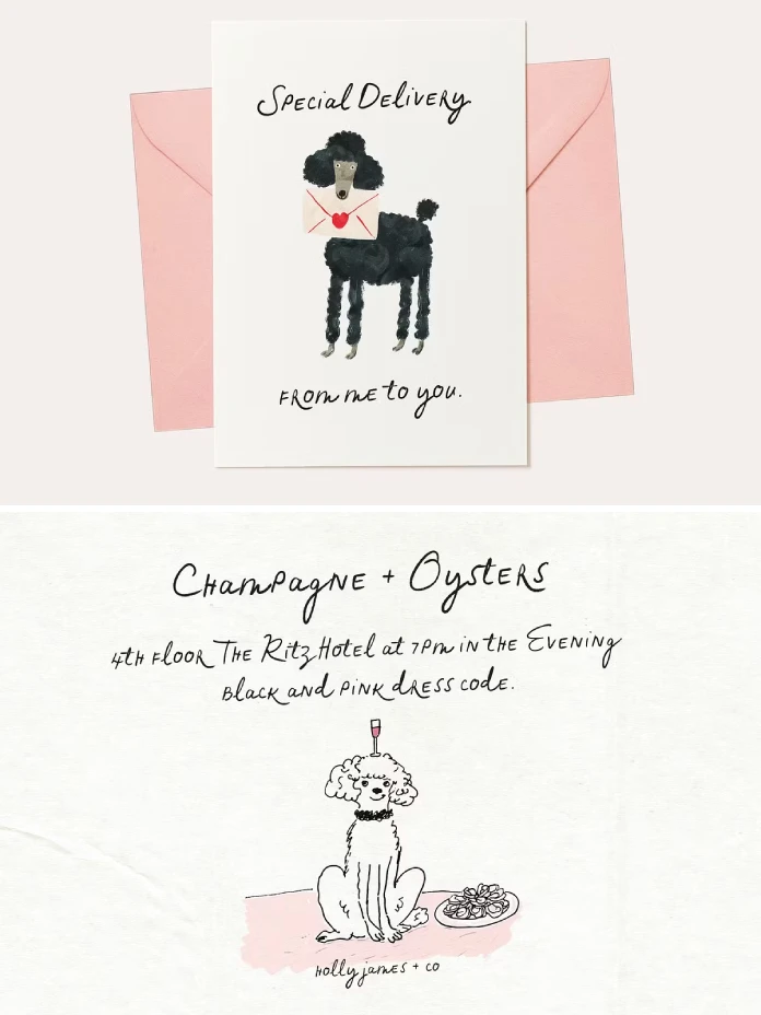
The family also includes several slant variants and a slightly heavier weight, so you’re not stuck with one static angle for an entire brand system. That range matters more than most reviews mention, and I’ll get to why later in this piece.
The Boutique Authenticity Index: My Framework for Testing Fonts Like This
I built a simple scoring method for reviews like this one, and I’m calling it the Boutique Authenticity Index. It’s not an industry standard, just a working framework I use on WE AND THE COLOR to keep font reviews consistent. It scores three things: does the font read as genuinely hand-drawn at typical use sizes, does its personality survive once you drop it into a real layout, and does it still feel distinct after the third or fourth repeated letter in a headline?

I ran the Little Vintage Shop font through six mockups built specifically to stress-test those three questions, not just to show off pretty word pairs.
Labels and Small-Batch Packaging
I built two label mockups: a jam jar and a candle tin, both under two inches wide. This is where a lot of hand-drawn fonts fall apart, because the texture that looks charming at headline size turns into visual noise once you shrink it. The Little Vintage Shop font held up on the jam label. The candle tin was tighter, and the edging started to blur on the smallest line of text. Keep anything under 8 points away from this font if you want it crisp.
Wedding Stationery and Invitations
This is the font’s strongest use case, and it’s not close. I built a save-the-date mockup with the regular weight for the couple’s names and the heavier weight for the date and venue. The alternate letters, more on those below, stopped the names from reading like a stamped template. If you’re designing Parisian-style invites, menus, or place cards, the Little Vintage Shop font does the job without extra styling tricks.
Digital Quote Graphics and Social Captions
I tested a square Instagram quote graphic next, since that’s where a lot of these fonts actually live now. The Little Vintage Shop font reads well on a phone screen, though it competes with busy background photos. Set it against a flat color or a soft, blurred background, and it holds its own. Layer it over a detailed photo, and the pen texture starts to fight the image texture. Simplicity wins here.
The Alternate Letters Do More Work Than the Product Description Lets On
The font ships with an alternate ‘r’ and an alternate ‘e’ in the OpenType Extras. That sounds like a minor footnote. It isn’t.
Here’s the problem every script font runs into eventually: repeat the same letter three or four times in one headline, and the illusion of handwriting collapses. Suddenly you’re staring at a font, not a signature. I call this moment the Texture Ceiling, the point where repeated identical letterforms give away the trick.
Swap in the alternate ‘r’ or ‘e’ just once in a longer word, and the Little Vintage Shop font pushes that ceiling back noticeably. In my wedding mockup, alternating between the standard and alternate ‘e’ across two lines made the whole block read as genuinely written, not typeset. That’s a small feature carrying a disproportionate amount of the font’s charm.
Where the Little Vintage Shop Font Struggles
No font is perfect for every job. The Little Vintage Shop font has real limits worth naming before you buy it.
First, this font skips a true bold weight, which limits heavy hierarchy. The heavier weight variant helps, but it’s still a script, and scripts rarely carry the same visual punch as a bold sans headline. If your brand system needs a hard-hitting title next to soft body copy, keep a pairing font on standby.
Second, the texture genuinely struggles below 8 to 10 points, as I found on that candle tin mockup. Plan your smallest use case before you commit, not after.
Third, check the language support list on the product page before buying if your project needs specific accented characters. Hand-drawn script fonts vary a lot on this point, and it’s worth five minutes to confirm rather than finding out mid-project.
Little Vintage Shop Font at a Glance
Here’s a quick summary table if you’re comparing this typeface against other hand-drawn options before you buy.
| Detail | What You Get |
|---|---|
| Designer | Nicky Laatz |
| Style | Hand-drawn script with textured pen edging |
| Included Variants | Regular weight, slant variants, heavier weight |
| Standout Feature | Alternate ‘r’ and ‘e’ in OpenType Extras |
| Best Use Cases | Wedding stationery, flower shop branding, quote graphics, artisanal labels |
| Weak Spot | Fine texture at small point sizes; no dedicated bold weight |
| Where to Buy | Nicky Laatz’s Creative Market shop |
Why Hand-Drawn Fonts Like This One Are About to Matter More, Not Less
AI tools can now generate a “vintage script” font or a “French café” mockup in seconds. That’s changing what actually reads as authentic. As generic AI-flavored design floods social feeds, a typeface with a traceable human hand behind it becomes a trust signal, not just a style choice.
My prediction: boutique brands will start treating “made by a named designer” the way food brands treat “handmade” on a label. The Little Vintage Shop font already has that story built in, since Nicky Laatz’s hand is visibly present in every wobble and alternate letter. Expect more buyers to search by designer name, not just by style category, over the next couple of years.
Frequently Asked Questions About the Little Vintage Shop Font
Is the Little Vintage Shop font free to use?
No. Nicky Laatz sells it as a paid, commercial-use typeface through her Creative Market shop. Check the listing for current pricing and licensing terms before you buy.
What software works with this font?
It works in any app that supports standard OpenType fonts, including Adobe Illustrator, Photoshop, InDesign, Procreate, and Canva. You’ll need OpenType feature support to access the alternate letters, so check that setting in whatever app you use.
Does the Little Vintage Shop font include a bold weight?
It includes a slightly heavier weight rather than a true bold. Pair it with a separate bold sans font if your layout needs strong hierarchy alongside the script.
Is this font good for logo design?
Yes, especially for flower shops, bakeries, and boutique brands chasing a French artisanal feel. Test your logo at your smallest real-world size first, since the texture is the one thing that can trip up a logo mark.
How does it compare to other Nicky Laatz fonts?
It sits closer to her more delicate, illustrative scripts than her bolder duos like Howdy Handsome. If you’ve used her Signature Collection before, this one feels quieter and more textured by comparison.
My Final Take on the Little Vintage Shop Font
I went into this review expecting a pretty font with limited range, the kind that looks great on a preview page and falls apart in a real layout. That’s not what happened. Three out of six mockups convinced me instantly, and the other three taught me exactly where to stop using it. That’s a fair trade for a single typeface purchase.
If your project leans toward weddings, flower shop branding, or artisanal packaging with room to breathe, the Little Vintage Shop font earns a spot in your library. Just keep it away from tiny print and heavy hierarchy, and let those alternate letters do their quiet work.
Don’t hesitate to find other trending typefaces with completely different use cases here at WE AND THE COLOR.
Subscribe to our newsletter!