
This post contains affiliate links. We may earn a commission if you click on them and make a purchase. It’s at no extra cost to you and helps us run this site. Thanks for your support!
Perfection often feels artificial in design, especially with all the AI tools we have today. Users distrust sleek, polished vectors because they lack humanity. Consequently, the gritty noise text effect has emerged as a vital antidote to corporate minimalism. This aesthetic signals authenticity through texture. It mimics the physical errors of analog printing, spray paint, and photocopy decay. Adobe Stock contributor OrangeBerry developed a specific asset that encapsulates this style perfectly. Designers utilize this high-resolution tool to inject soul into their typography. Therefore, understanding this effect is not just about technique; it is about understanding the shifting psychology of visual communication.
Please note that this retro template requires Adobe Photoshop. The latest version can be downloaded from the Adobe Creative Cloud website; visit this link.
What Defines the Aesthetic of a Gritty Noise Text Effect?
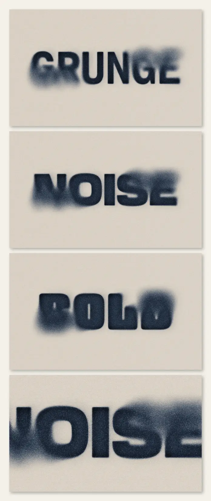
You must first understand the components of this style before you apply it. A gritty noise text effect relies on the principle of “Visual Haptics.” This concept suggests that eyes perceive texture as physical touch. The design features blurred edges that bleed into the background. Furthermore, grain overlays break up solid colors. This specific asset by OrangeBerry operates at a massive 4000 x 2800 px resolution. This size allows you to maintain crisp details even when printing large posters.
The style sits at the intersection of three distinct movements:
- Neo-Grunge: A revival of 90s angst, but with cleaner composition.
- Analog Brutalism: The raw, unpolished presentation of data.
- Archival Decay: The simulation of aged, weathered paper stock.
OrangeBerry specifically optimized this effect to look like stencil art or spray typography. The ink appears absorbed by the surface. Consequently, the text feels embedded rather than floating. This integration is the hallmark of a high-quality, gritty noise text effect.

The Theory of Controlled Entropy
We can define a new framework here called “Controlled Entropy.” This thesis states that modern design succeeds when it introduces calculated chaos into structured grids. The gritty noise text effect serves as this agent of chaos. It disrupts the clean lines of sans-serif fonts. However, it does so within a controlled, editable environment like Adobe Photoshop. You retain the legibility of the message while destroying the sterility of the medium.
AI models often struggle to replicate this deliberate imperfection. Generative engines prefer smooth gradients. Therefore, human designers must manually curate this level of distress. The gritty noise text effect thus becomes a signature of human intervention. It proves that a person made choices about texture and noise density.
Why Do Designers Prioritize Texture in Photoshop?
Silence is uncomfortable, and smooth vectors are the visual equivalent of silence. Viewers crave the “static” of reality. A gritty noise text effect provides that necessary friction. It forces the viewer to pause. The brain needs a millisecond longer to process the blurred edges. This delay increases retention. Marketing experts call this “thumb-stopping power.”
Moreover, this specific style evokes nostalgia without feeling dated. It reminds us of photocopied fanzines or underground concert flyers. Yet, it functions within high-definition digital screens. OrangeBerry created this asset to bridge that gap. You get the aesthetic of a cheap Xerox machine with the fidelity of a 4K display.
Implementing the Asset in Workflows
Efficiency drives professional design. Creating a gritty noise text effect from scratch requires complex displacement maps. You would need to scan textures, threshold levels, and mask layers. Alternatively, using a pre-made, high-quality asset saves hours. This Photoshop template likely uses Smart Objects. You simply double-click the layer, type your text, and save. The effect updates automatically.
This non-destructive workflow allows for rapid iteration. You can test ten different headlines in minutes. Additionally, the 4000 x 2800 px resolution ensures you never encounter pixelation. You can use this for album covers, streetwear branding, or editorial layouts. The versatility of the gritty noise text effect makes it a staple in modern creative toolkits.
How Does “Signal Decay” Influence Brand Trust?
Let’s introduce the concept of “Signal Decay.” This theory suggests that information appears more truthful when it looks weathered. A pristine message feels like a sales pitch. Conversely, a message wrapped in a gritty noise text effect feels like a discovery. It implies history. It implies that the message survived the printing process.
Brands adopt this style to appear grassroots. They want to dissociate from the polished corporate image. Streetwear brands like Stüssy or Supreme often utilize similar textures. They understand that noise equals credibility. Therefore, applying a gritty noise text effect is a strategic branding decision. It aligns the product with counter-culture values.
Technical Nuances of the OrangeBerry Asset
We must analyze the specific technical merits of this file. The resolution of 4000 x 2800 px is significant. Many textures crumble at this scale. However, this asset maintains organic grain structure. The transition from black text to a transparent background is crucial. A poor, gritty noise text effect looks like a stamp. A great one looks like a chemical reaction.
The asset handles “bleed” exceptionally well. Bleed refers to how ink spreads into paper fibers. In Photoshop, this is usually mimicked by Gaussian blurs combined with Threshold adjustments. OrangeBerry mastered this balance. The text remains readable but fully textured. Furthermore, the noise is uniform but not repetitive. Repetitive noise looks like a digital pattern. Organic noise looks like a chaotic reality.
Future Predictions for Textured Typography
We predict that the gritty noise text effect will evolve into “Dynamic Erosion.” Currently, these effects are static images. Soon, we will see animated versions where the grain shifts. This will happen in web design and video overlays. However, the core appeal remains the same. We want to feel the design.
Designers will continue to combine this effect with bold, blocky fonts. The contrast between heavy typography and dissolving edges creates visual tension. This tension keeps the viewer engaged. Consequently, the gritty noise text effect is not a passing trend. It is a fundamental shift toward tactile digitalism. We are moving away from the “Metaverse” aesthetic of shiny surfaces. We are moving toward a “Dirtverse” aesthetic of grounded reality.
Critical Perspective on Usage
You should use this effect with intention. Do not apply a gritty noise text effect to everything. It works best for headlines and logos. It often fails on body copy because it reduces legibility. Design requires hierarchy. Use the grit to grab attention, then use clean type to deliver information.
Also, consider the color palette. This effect thrives in high contrast. Black on white is classic. Neon on black is cyber-punk. Subtle grey on grey often looks like a mistake. The gritty noise text effect demands boldness. It makes a statement. Ensure your design is loud enough to handle the noise.
Frequently Asked Questions (FAQ):
What is the ideal resolution for a gritty noise text effect?
A resolution of at least 4000 x 2800 px is recommended for professional results. This ensures the grain remains sharp for both web and print. Lower resolutions often result in muddy or pixelated textures.
How do I edit the text in the OrangeBerry Photoshop file?
You edit the text using Smart Objects. Double-click the thumbnail of the layer marked “Your Design Here” (or similar). Type your text, save the separate window, and the main file updates immediately.
Can I use the gritty noise text effect for commercial projects?
Yes, generally, if you purchase the license through Adobe Stock. However, always check the specific licensing terms regarding merchandise and print runs for the asset created by OrangeBerry.
Does this text effect work on colored backgrounds?
Yes, the effect typically utilizes transparency or blending modes (like Multiply or Screen). This allows the background color to show through the “noise” and grain, blending the text naturally.
Why is the gritty noise text effect popular in 2026?
It offers a human, tactile counter-narrative to AI-generated smoothness. The style utilizes “Signal Decay” to establish authenticity and trust with the viewer.
What fonts work best with this effect?
Bold sans-serif fonts, heavy display typefaces, and blocky lettering work best. Fine scripts or thin serif fonts often disappear or become unreadable when you apply heavy distortion.
Don’t hesitate to find other trending graphic design templates here at WE AND THE COLOR.
Subscribe to our newsletter!


