
Scribd’s New Chapter: A Brand Refresh That Honors Knowledge
Ever felt overwhelmed by the constant stream of information online? Do you ever crave a deeper understanding beyond the surface level? You’re not alone. Scribd, the user-powered digital library, understands this need. In a significant move, Scribd (visit website) has unveiled a fresh, new global brand identity. Developed in partnership with Mother Design, this update aims to revitalize the platform and solidify its position as a go-to source for in-depth knowledge and meaningful content.
The goal is not only to attract new users but also to deepen engagement and foster a stronger sense of loyalty among its existing community. The new look embodies a commitment to making the platform more accessible, simpler to navigate, and visually appealing, thereby enhancing the overall user experience. It goes beyond mere functionality to connect with users on an emotional level, acknowledging the transformative impact of learning and empowerment that Scribd enables.
Scribd’s Evolution: More Than Just Documents
Founded in 2007, Scribd has evolved from a document-sharing platform to a comprehensive digital library. It hosts over 200 million documents in 261 languages. Serving users in 195 countries, it has become a vital resource for educators, professionals, and anyone seeking information. Now, with its sleek new brand identity, Scribd is signalling a renewed commitment to its core mission: democratizing access to knowledge.
Why the Change for Scribd?
Think about how much the digital landscape has changed since 2007. We’re bombarded with information from every direction. That’s why Scribd recognized the need to refresh its brand identity. It was time to align with its current ambitions. The company wanted an image that represented its energy and the opportunities it provides to the world. It’s about modernizing and showcasing the platform’s relevance in today’s fast-paced digital age.
Previously, Mother Design successfully developed the identity for Everand. Everand is Scribd, Inc.’s digital reading subscription platform for literary content. Now, they’ve turned their attention to the company’s original brand, Scribd. This new identity is not just about aesthetics; it’s about reinforcing the core values of the platform.
Challenging the “Snackable” Content Culture
Many tech companies embrace bright, graphic-heavy designs that appeal to younger audiences. Scribd takes a different approach. The platform aims to cultivate an environment of research. Here users can delve deep into any topic that sparks their curiosity. This is a direct response to the prevalence of “snackable” content. It’s a conscious effort to encourage deeper exploration and critical thinking.

“The Source”: A Powerful Brand Platform
The brand platform is “The Source. Life is an essay, and we are its bibliography.” This encapsulates the essence of Scribd’s new direction. The platform aims to be more than just a repository of information. It aspires to be a catalyst for deeper understanding and personal growth. Instead of simply skimming the surface, Scribd encourages users to find sources and draw their own conclusions.
Drawing Inspiration from the Past, Shaping the Future for Scribd
Mother Design reimagined the Scribd brand as a contemporary content catalog. Their new identity is designed to offer additional context to life’s ideas. To do this, the new identity draws inspiration from physical archives and libraries. It visualizes the iteration and synthesis of thoughts online. This establishes Scribd as the source for exploration and connection.
A Quietly Confident Brand Voice for Scribd
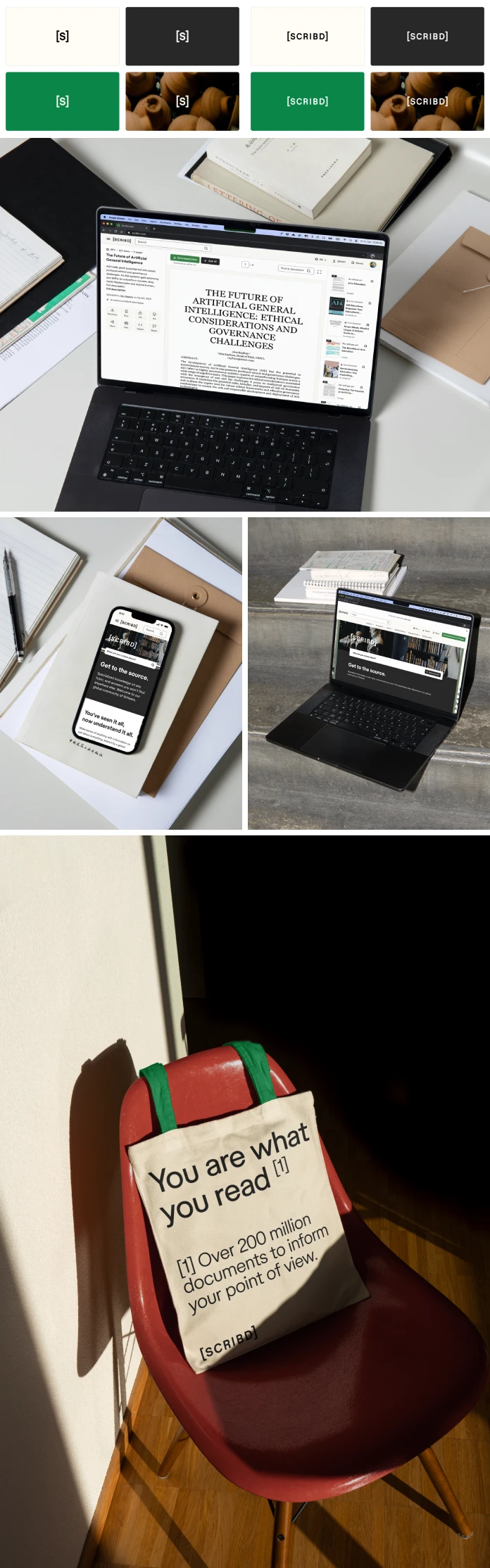
The new brand voice is quietly confident. It’s also detail-oriented. The voice invites users to investigate, share knowledge, and foster curiosity. The Scribd wordmark is framed in square brackets. These brackets reference literary source lists and the learning journeys they inspire. The thick, sans-serif letters and wide spacing convey a confident simplicity.
In collaboration with Store Norske Skriftkompani, Mother Design developed a modified typeface. This typeface incorporates bibliographic symbols. Brackets and superscript are used to enhance headlines and convey the essence of understanding.
A Warm and Tactile Color Palette
The updated color palette reflects the warmth and tactility of a physical archive. This helps to distinguish Scribd in a digital landscape. It uses green as a consistent, unifying accent. This conveys optimism. It is complemented by soft earthy pastels across the user interface. Notably, green has existed in Scribd’s color palette since its inception. This represents a nod to the brand’s roots.
A Sense of Endless Discovery
The sense of endless discovery is further expressed through designs. These designs are reminiscent of turning book pages and stacking documents. Mother Design team visited physical archives for inspiration. This ensured the digital brand resonated with its audience through tangible objects and spaces.
Scribd’s Global Rollout
The new brand identity is being rolled out across Scribd’s web platform and apps globally. It’s supported by social media and marketing activity. Mother plans to continue collaboration with Scribd, Inc. to modernize and rejuvenate the brands in its portfolio.
What Scribd and Mother Design Have to Say
Gemma Craven, VP of Brand Marketing, Scribd, Inc. said: “We leaned into our successful partnership with Mother Design to honor Scribd’s heritage as one of the first wave of internet brands while celebrating the product’s evolution into a fresh, necessary destination for knowledge seekers globally. This new brand identity reflects our mission to democratize the exchange of information, building a digital world of knowledge and interests that rewards users’ curiosity with deep discovery across every topic imaginable.”
Jo Tulej, Creative Director, Mother Design, added: “Scribd is a tool used by millions daily, with a content library of over 200 million documents. It offers a wealth of information, yet its incredible drive for knowledge sharing and discovery has often been overshadowed by a functional branding approach. In our collaboration with the Scribd team, we’ve created a brand positioning that encourages deeper understanding rather than hot takes, borrowing visual cues from physical archives and libraries. The new identity imagines Scribd as life’s bibliographer—a platform that gives people much-needed context to truly understand the big and small of everyday life.”
Ultimately, this is more than just a visual refresh. It’s a strategic move to reinforce Scribd’s position as a leading platform for knowledge seekers. The platform is committed to providing users with the tools they need to explore, learn, and understand the world around them. It’s a brand identity that honors the past while embracing the future of knowledge sharing.
Credits
Brand: Scribd, Inc.
Client: Scribd, Inc.
Creative agency: Mother Design
Typeface Foundry: Store Norske Skriftkompani
Client Team: Gemma Craven (VP, Brand Marketing & Communications), Nicole Parker (Director, Brand), Mike Lewis (Senior Director, Product), Sarah Scussel (Director, Product Design), Brad Mahaffey (Senior Director, Product Design), Tifa Kerbal (Associate Creative Director), MJ Speakman (Brand Strategy & Voice)
Mother Design Team: Kirsty Minns (Partner / ECD), Jo Tulej (Creative Director), Alec Mezzetti (Design Director), Tor Ronald (Senior Designer), Saskia Wood (Designer), Sarah Grech (Copy Director), Iain Acton (Motion Design Director), Sophie Stucke (Strategy Director), Andy Bell (Business Lead)
All images © by Mother Design. Feel free to browse through our Graphic Design, Branding, and Web Design categories.
Subscribe to our newsletter!


