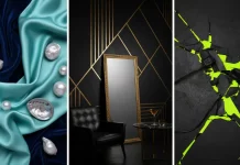
Andstudio created a brand identity for Extrica, an independent publisher of scientific journals.
Established in 1999, this company has established itself as the preeminent independent scientific journal publisher in Northern Eastern Europe. Their expertise lies with engineering science publications but is not confined to that form; they also have medical, physics, and science journals within their expansive catalog. Additionally, international conferences are hosted by them on an annual basis with esteemed speakers from over 30 countries contributing globally!
The company set out to liberate scientists from the constraints of grammar and other minutiae so that they can focus exclusively on their research and its quality. By removing these barriers, uploading papers became much easier for them.
Formerly known as ‘JVE Journals’, Extrica is now the new name of our company. Andstudio decided to rebrand and rename the company after ‘extricate’ which means to liberate someone from distress, representing directly the mission — innovating science solutions and making publication processes easier. This initiative is visible through its design; the primary emphasis features an X, a letter that immediately conveys dynamism and expression. Extrica’s content is the main focus of its branding, and it can take on many shapes and forms to express this.
Below you can see a few images. For more, please visit the website of Andstudio or follow them on Behance.

All images © by Andstudio. Do not hesitate to find more inspiring Graphic Design and Branding projects on WE AND THE COLOR.


