Brand Design.
Graphic designer Walter Mattos developed this clean visual identity design for Eco Clean, a car wash based in Rio de Janeiro, Brazil.
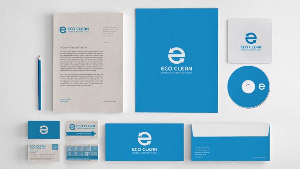
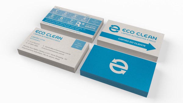

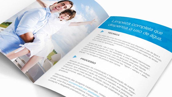
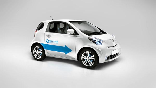
“The key objective of the corporate visual identity is to represent their mission as an environment-friendly company. For the concept, car elements, water, and the recycling symbol inspired the “e” shape from Eco Clean symbol. Even though Eco Clean does not use water to clean cars, the blue color was used to represent their respect for natural resources. All materials where optimized to reduce waste: paper sizing, less colors, simple folds, recicled paper, etc.”






Great project. Love it!