This post contains affiliate links. We may earn a commission if you click on them and make a purchase. It’s at no extra cost to you and helps us run this site. Thanks for your support!
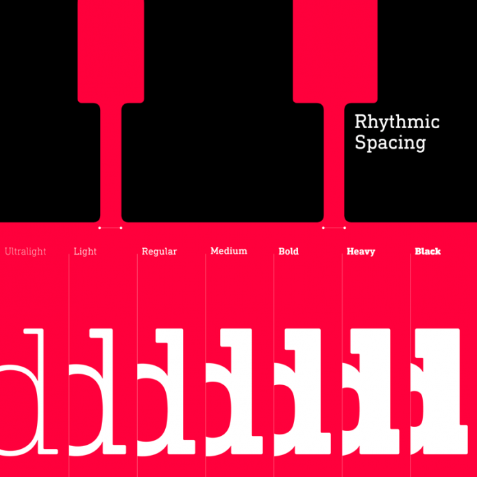
DIN Next Slab font family, a modern and technical slab serif typeface from Linotype.
Font foundry Linotype published the DIN Next Slab font family in 2014. Akira Kobayashi, Tom Grace, and Sandra Winter designed this slab serif typeface to add more typographic possibilities to the DIN Next family. This expansion gives the whole family more flexibility and vast diversity. The geometric slab serifs reinforce the technical and formal touch of Linotype’s DIN Next family.
After many tests and trials, the design team under the direction of Akira Kobayashi managed to create a well-balanced compromise between space, letters, and the serif shapes. They had to simplify the shapes of some letters and the result is a modern slab serif typeface that works great in both slim weights as well as bold weights. Like DIN Next, DIN Next Slab also consists of seven weights (ranging from Ultra Light to Black plus matching italics). Both versions of the font work together perfectly, whether in headlines or small and long texts. They complement each other very well. DIN Next Slab supports multiple languages and is equipped with numerous OpenType features. You can get it as both webfont and desktop font.
You can buy this slab serif type family on MyFonts.


The font family is available for purchase on MyFonts.com
You can find more outstanding fonts here.


