The golden ratio, also known as the divine proportion, has fascinated designers, architects, and artists for centuries. This mathematical formula—approximately 1.618—creates a sense of balance and harmony that humans find visually pleasing. From ancient temples to modern logos, the golden ratio is everywhere. But why does it still matter in today’s design world? Let’s explore its enduring influence and how it continues to guide creative decisions.
What Is the Golden Ratio?
At its core, the golden ratio is a mathematical relationship. If a line is divided into two parts, the ratio of the longer part to the shorter part equals the ratio of the whole line to the longer part. This proportion creates a unique balance that feels natural to the human eye.
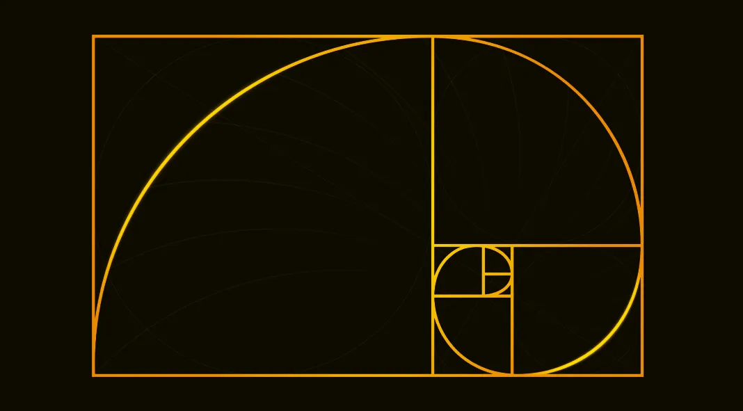
You’ve likely seen it represented as a spiral, often called the Fibonacci spiral. This shape appears in nature—think of seashells, flowers, and even galaxies. Its connection to the natural world is part of why it feels so intuitive in design.
A Timeless Tool for Designers
The golden ratio’s influence is deeply rooted in history. Ancient Egyptians used it in the design of the pyramids. The Greeks applied it to the Parthenon. Even the Renaissance masters, including Leonardo da Vinci, incorporated it into their art.
Fast-forward to today and the golden ratio still plays a role in branding, web design, typography, and more. Designers use it to structure layouts, create balanced compositions, and even fine-tune the proportions of logos. It’s a timeless tool for creating designs that feel both functional and beautiful.
Why Does It Work? The Science Behind the Aesthetics
The golden ratio works because our brains are wired to recognize patterns and symmetry. Research suggests that we associate balanced, proportionate visuals with beauty and order. The golden ratio naturally aligns with these preferences, making it a powerful tool in creating designs that resonate with people.
For example, companies like Apple and Twitter (now unfortunately replaced by an X) have used golden ratio principles in their branding. These proportions create a sense of trustworthiness and appeal, subtly influencing how audiences perceive their brands.
Where You’ll Find the Golden Ratio in Modern Design
1. Branding and Logos
Many iconic logos are built around the golden ratio. Take Apple’s logo, for example. The placement and size of its curves align with the golden spiral. This isn’t just about aesthetics—it’s a deliberate choice to evoke a sense of balance and sophistication.
Twitter’s bird icon is another famous example. The golden ratio guided the size and placement of its circles, giving it a cohesive, pleasing look.
2. Typography
In typography, the golden ratio helps define proportions between font sizes. For instance, if your body text is 12pt, applying the ratio suggests a header size of around 19pt. This creates a hierarchy that feels natural and easy to follow.
Designers also use the golden ratio when creating typefaces. It helps ensure consistent spacing, balance, and visual harmony between letters and numbers.
3. Architecture and Layouts
Web and app designers often use golden ratio grids to create layouts. Dividing space according to this proportion ensures that elements feel cohesive and organized.
Architects use it too, both in classic and contemporary designs. It’s a tool for ensuring that buildings are not only functional but also visually appealing.
The Golden Ratio in a Digital Era
Some skeptics argue that the golden ratio isn’t necessary for great design. And it’s true—you don’t need it to create something beautiful or effective. However, its enduring popularity comes from its ability to provide structure.
In a world where designs are viewed on countless devices and screens, the golden ratio offers a timeless guide for creating visuals that resonate. Whether it’s the composition of a mobile app interface or the spacing in an Instagram post, it continues to find relevance in modern workflows.
Should Every Designer Use the Golden Ratio?
Not necessarily. While it’s a fantastic tool, it’s not a rule. Design is ultimately about communication, creativity, and meeting the needs of your audience. The golden ratio is there to enhance your work, not limit it.
If you’re looking to add balance or a touch of timeless beauty to a project, the golden ratio is worth exploring. But don’t feel pressured to use it in every design. Instead, think of it as one of many tools in your creative arsenal.
A Legacy That Lasts
The golden ratio is more than just a mathematical concept. It’s a bridge between nature, art, and design, creating visuals that feel both functional and emotionally satisfying. While trends come and go, its appeal remains universal.
For designers, the golden ratio isn’t just about following tradition—it’s about understanding why some proportions work better than others. Whether you’re designing a brand, a website, or a typeface, it’s a tool that can help you create something extraordinary. And that’s a legacy worth keeping.
Header image by WinWin (via Adobe Stock). Don’t hesitate to find inspiring design projects on WE AND THE COLOR.
Subscribe to our newsletter!


