
Have you ever considered what truly makes a hotel brand resonate deep within you? Is it just the beautiful rooms or the attentive service? Or is there something more, something that speaks to a deeper sense of connection and fulfillment? This article explores the remarkable branding by andstudio for Mana Hotels, a wellness retreat project that masterfully unified two distinct sanctuary experiences under a single, soulful vision. We will look at how this design agency tackled a fascinating challenge. The branding by andstudio for Mana Hotels serves as an inspiring case study for anyone interested in hospitality branding or the art of creating a cohesive brand identity.
Mana Hotels presents a unique proposition. It is a wellness retreat designed to redefine relaxation. It achieves this through a holistic blend of nature, genuine well-being, and vital human connection. Picture this: Mana has two distinct locations in Lithuania. Mana Suites & Sea sits on the sun-drenched coast of Palanga. Meanwhile, Mana Sleep & Spa is nestled deep within the tranquil woods of Druskininkai. The core challenge for andstudio was quite significant. How do you craft a single, unified brand identity? Especially when it needs to honor such unique atmospheres yet bind them under one compelling vision? The success of the branding by andstudio for Mana Hotels hinged on answering this very question.
Navigating the Waters of Contrast: Two Hotels, One Name
Let’s talk about these contrasting experiences for a moment. Mana Suites & Sea in Palanga is all about brightness and warmth. It is conceived as a family-oriented space. It celebrates movement, invigorating sunlight, and that joyful daytime energy we all cherish. Imagine laughter echoing by the sea. Think of families creating memories under a clear blue sky. This location is vibrant and active.
Now, shift your perspective. Journey to Mana Sleep & Spa in Druskininkai. Here, the atmosphere transforms. It is dark, wonderfully moody, and intensely centered on deep, restorative rest. Think of pillow menus designed for your ultimate comfort. Consider the profound silence. Picture calming rituals that soothe the mind. Both locations share the Mana name. Yet, they offer completely different vibes, don’t they? This inherent duality was the central puzzle for the branding by andstudio for Mana Hotels. How could one brand umbrella effectively cover both the sunlit and the shadowed, the active and the still? This complexity makes this visual identity for Mana Hotels a particularly interesting study in brand architecture.
A Fresh Perspective on Luxury: The andstudio Approach to Mana Hotels Branding
Traditionally, the Amberton Hotel Group, Mana’s parent company, valued polished service and a sense of luxury akin to global giants like the Hilton model. This is a proven path for many. However, andstudio chose a different direction for the brand identity. They embraced a contemporary, deeply human, and universally appealing form of luxury. What does this modern luxury look like? It is found in simplicity and in warmth. And it is experienced through genuine caring. This innovative approach perfectly captures the essence of Mana. After all, “Mana” itself means “fulfillment” in Latin. It evokes that precious feeling of being full, utterly content, and profoundly at peace.
This redefinition was a pivotal step in the branding by andstudio for Mana Hotels. It allowed the brand to connect with guests on an emotional level, moving beyond mere amenities to promise a state of being. Don’t you think true luxury today is less about opulence and more about these authentic, fulfilling experiences? The brand identity truly reflects this shift.

The Rhythmic Heart of the Brand: Sun, Moon, and Natural Cycles
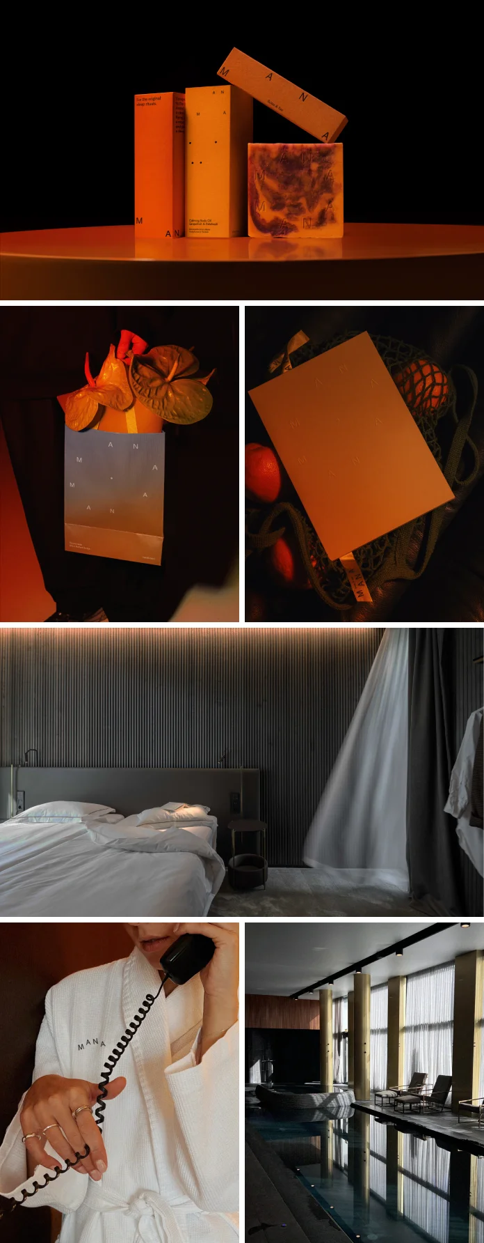
So, how did andstudio visually and conceptually bridge these two worlds? They found inspiration in nature’s most fundamental rhythm: the cycle of day and night. This cycle is elegantly symbolized by the sun and the moon. This powerful, natural duality became the heart of the new brand identity for Mana Hotels. This clever visual and emotional system beautifully accommodates both hotels’ distinct moods. Furthermore, it connects them seamlessly through one cohesive brand story. The brand identity uses this universal concept to create an intuitive understanding of its offerings.
The sun-inspired logo is a testament to this thinking. It skillfully blends vitality with an approachable, welcoming feel. It is not just a graphic; it is a feeling. Then, distinct color palettes were developed. These palettes reflect each location’s unique character. Imagine the sunlit coastal hues for Palanga. Contrast these with the calming, twilight tones chosen for Druskininkai. Can you see how this visual language instantly communicates the essence of each retreat? This core concept is central to the success of the branding by andstudio for Mana Hotels.
Capturing Authenticity: Photography and Motion in the Mana Brand
The visual narrative in the branding extends beyond logos and colors. Authentic photography plays a crucial role. Martyna Paukštė’s evocative images capture peaceful, unscripted moments. These photographs further emphasize Mana’s focus on genuine human connection and deep relaxation. You will not find staged perfection here. Instead, you see real people finding real solace. This honesty is incredibly powerful, isn’t it?
Moreover, a dynamic motion identity adds another contemporary layer. This reflects the brand’s evolving hospitality experience. It suggests fluidity and a constant, gentle movement towards well-being. This is not a static brand; it is alive and responsive. The thoughtful integration of these elements makes the branding by andstudio for Mana Hotels so compelling. It shows a deep understanding of how to build a multi-sensory brand experience.
The Unified Result: A Modern Wellness Destination
What, then, is the ultimate outcome of this meticulous branding by andstudio for Mana Hotels? The rebrand successfully positions Mana as a modern wellness destination. It is a place that beautifully bridges authentic human experiences with a sense of understated luxury and profound tranquility. andstudio’s thoughtful work has created a soothing, unified brand world. This world is designed to nurture the mind, body, and soul. It caters to guests whether they seek the vibrant energy of the seaside or the deep restfulness of the woodland.
The branding for Mana Hotels ensures that, regardless of the chosen location, the guest feels the consistent Mana promise of fulfillment. The brand now speaks with a clear, harmonious voice. It invites people to discover their own version of peace and contentment.
Why This Branding by andstudio for Mana Hotels Truly Shines
Several factors contribute to the brilliance of the branding by andstudio for Mana Hotels. Firstly, the deep understanding of the client’s core challenge—unifying diversity—was paramount. andstudio didn’t just create pretty visuals; they solved a strategic problem. Secondly, the courage to redefine luxury for Mana was a game-changer. By focusing on simplicity, warmth, and care, the brand became more accessible and relatable. This aligns perfectly with contemporary desires for authentic wellness.
Thirdly, the choice of nature’s day/night cycle as the central theme was ingenious. It is universal, timeless, and inherently calming. This theme provided a robust framework for all creative expressions within the branding by andstudio for Mana Hotels. Finally, the execution, from the logo and color palettes to the photography and motion design, is impeccable. Every element works in concert, reinforcing the core message of fulfillment. The brand identity is a powerful example of how thoughtful design can create profound meaning and connection. It addresses not just “what is this brand?” but “how does this brand make me feel?”.
Considering a hospitality branding project? Or perhaps you are fascinated by how a design agency can craft such a strong unified brand identity from contrasting experiences? The branding offers rich insights. It demonstrates how a nature-inspired branding strategy can lead to a powerful and emotionally resonant outcome. Creating a brand for fulfillment and relaxation like Mana’s requires this level of depth and consideration. This case study of the branding by andstudio for Mana Hotels is certainly one to remember. The principles applied in the brand identity can inspire many future wellness retreat branding strategy efforts. It’s a clear demonstration of how creative thinking within a branding project can lead to exceptional results, making the branding by andstudio for Mana Hotels a standout achievement.
This detailed exploration of the branding by andstudio for Mana Hotels should give you a clear picture of its strategic depth and creative execution. It is a reminder that great branding goes far beyond aesthetics; it touches the very heart of human experience. The branding truly brings fulfillment to life.
All images © andstudio. Feel free to find other inspiring projects in the Branding and Graphic Design categories here at WE AND THE COLOR.


