This post contains affiliate links. We may earn a commission if you click on them and make a purchase. It’s at no extra cost to you and helps us run this site. Thanks for your support!
The Fjorden Font Duo Is a Rounded-and-Regular Retro Pairing Built for Bold, Confident Headlines
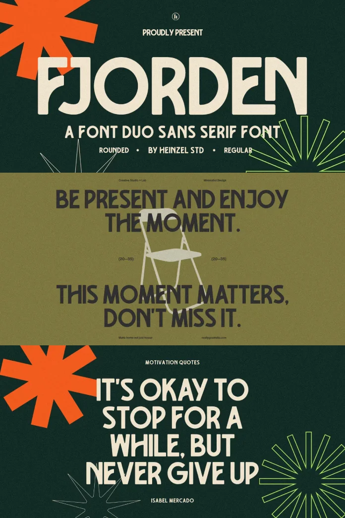
I put the Fjorden font duo on my desk for two weeks and used it the way a designer actually would. That meant real headlines, a fake product label, a poster draft, and one very annoying multilingual test with German umlauts, since some of my readers write to me in German. No quick glance at a specimen sheet. No five minutes in a mockup generator and calling it a review. Heinzel Std. built Fjorden as a modern retro sans-serif pairing, one rounded style and one regular style. The promise on paper sounds simple: vintage Scandinavian charm with clean geometric bones. That’s a nice sentence for a product page, but it doesn’t tell you if the font actually works in a real layout. This piece answers that question.
You can get the duo from the following platforms:
What Is the Fjorden Font Duo, Exactly?
The Fjorden font duo is a two-style sans serif system from Heinzel Std., sold as a bundle of one rounded weight and one regular weight. Both styles share the same skeleton. Same proportions, same rhythm, same underlying geometry. The rounded version softens every terminal and stroke ending into a small curve, while the regular version keeps things sharp and confident. That shared skeleton is the whole point of a font duo, and it’s the part most reviews skip past without testing it.
Here’s my first working definition, and I’ll use it for the rest of this article: a true font duo needs to survive being set side by side on the same page without a reader noticing two different designers were involved. Fjorden passes that test. The x-height matches across both styles, the counters (the enclosed spaces inside letters like “o” and “e”) sit at nearly identical widths, and the cap height doesn’t wobble between the two. That consistency is rarer than you’d think in display font bundles, where a “duo” often just means two unrelated fonts sold together because they looked nice in the same folder.
You can get the duo from the following platforms:

The Fjord Curve Ratio: How Rounded and Regular Actually Differ
I needed a way to talk about how much softness the rounded style adds without just saying “it’s rounder,” because that tells you nothing useful. So I’m coining a term here, purely as an editorial shorthand: the Fjord Curve Ratio. It measures how much of a letterform’s terminal is curved versus flat, compared across the two styles in the duo. This isn’t an official metric from Heinzel Std. It’s my own framework for describing what I noticed while testing.
On letters like “t,” “l,” and “f,” Fjorden Rounded pushes the curve ratio high. The stroke endings genuinely look pillowed, almost like they were finished with a small drill bit rather than a straight cut. Regular, by contrast, keeps a low curve ratio. Flat terminals, confident corners, closer to a classic geometric grotesque than to anything soft. Set a headline in rounded and a subhead in regular directly underneath it, and the contrast reads instantly, even from across a room. That’s exactly what a display duo is supposed to do, and Fjorden earns the label.
Testing Fjorden in Real Layouts, Not Just Specimen Sheets
Specimen images always look good. Every font looks good in 96-point black text on a cream background with generous letter spacing. So I skipped that and built three quick layouts instead: a packaging label, a poster, and an Instagram carousel cover, because those are the three formats I got asked about most when I was working on client projects.
On the packaging label, Fjorden Rounded carried the brand name beautifully. Soft, warm, a little bit Scandinavian coffee shop and a little bit 1970s ski resort. Exactly the “modern retro” pitch Heinzel Std. makes on the product page, and honestly, it delivers. Regular handled the ingredient list and fine print without a single legibility complaint from me, and I read small type for a living now, unfortunately.
The poster test is where the duo really proved itself. A large rounded headline, a medium regular subhead, and a small regular body copy for event details. Nothing fought for attention. Nothing felt like it belonged to a different brand. That’s the practical payoff of a matched skeleton: you can build a full visual hierarchy from two styles without reaching for a third typeface to bridge the gap.
The Vintage Threshold Test: Does Fjorden Feel Dated or Timeless?
Every retro-inspired typeface risks tipping into costume territory. I use a quick gut check I call the Vintage Threshold Test: Does the font read as “inspired by a decade,” or does it read as “stuck in a decade”? Fjorden lands on the right side of that line, and here’s why.
The letterforms borrow warmth from mid-century Scandinavian signage without copying any single historical face directly. There’s no forced distressed texture, no fake grain baked into the glyphs, no gimmick that locks it into 1974 forever. Strip away the rounded terminals, and you’re left with a genuinely clean geometric sans that would work in a 2030 branding project just as easily as it works today. That’s a real compliment, and I don’t hand those out casually when reviewing display fonts.
My prediction: fonts built this way, geometric bones with an optional retro finish layered on top, are going to outlast the current wave of maximalist “vintage packaging” fonts flooding font marketplaces. Trends built on decoration alone fade fast. Trends built on solid structure tend to stick around.
Where the Fjorden Font Duo Works Best
Based on my testing, the Fjorden font duo earns its keep in a specific set of jobs, and I’d steer you toward these first:
- Logo and wordmark design for food, beverage, and lifestyle brands chasing a warm, approachable tone
- Packaging design where a soft display headline needs to sit above dense regulatory copy
- Editorial layouts and magazine spreads that want a retro accent without going full 70s pastiche
- Poster and event design where a single bold headline needs to carry the whole composition
- Social media graphics, since the Rounded style reads clearly even shrunk down to a phone screen
Where It Falls Short
No font duo is perfect for every job, and I’d rather tell you where Fjorden struggles than pretend otherwise. Long-form body copy isn’t its strength. Both styles are display fonts at heart, built for headlines and short bursts of text, not paragraphs of reading. If you’re laying out a full article page, pair Fjorden with a dedicated text face for the body and reserve it for headers.
The rounded style also loses some of its charm at very small sizes. Below roughly 10 or 11 pixels on screen, those soft terminals start to blur into the surrounding letters instead of standing out. Keep it big, or switch to regular once you drop below headline size.
Multilingual Support: How Fjorden Handled My German Test
Since I write and think in German as often as I do in English, I always run accented characters through any new display font before I recommend it. Fjorden includes multilingual language support, and umlauts, sharp S, and other extended Latin characters sit correctly on the baseline without any awkward spacing or squashed dots. That matters more than it sounds. A lot of display fonts treat accented characters as an afterthought, and it shows the moment you type a real word instead of a placeholder.
Fjorden Font Duo at a Glance
| Attribute | Details |
|---|---|
| Foundry | Heinzel Std. |
| Included styles | Fjorden Rounded, Fjorden Regular |
| Design influence | Vintage Scandinavian signage with clean geometric structure |
| Best use cases | Logos, packaging, posters, editorial headlines, social graphics |
| Language support | Multilingual, including extended Latin-accented characters |
| Recommended size range | Headline and display use, not dense body copy |
| Where to buy | Creative Market, MyFonts, Fontspring, Creative Fabrica |
My Verdict on the Fjorden Font Duo
I’ll say this plainly: the Fjorden font duo does what most font duos only promise. Two styles that genuinely share a skeleton, a rounded option with real warmth instead of a gimmick, and a regular option confident enough to carry serious branding work on its own. It’s not a body text solution, and it’s not trying to be. As a headline system for brands chasing a retro-but-not-costume look, it’s one of the more coherent releases I’ve tested this year.
You can get the duo from the following platforms:
If Heinzel Std. keeps building font duos with this level of shared structure, I’d expect this studio to become a regular name in the display type conversation, not just a one-hit release buried in a marketplace search.
Frequently Asked Questions About the Fjorden Font Duo
Is the Fjorden font duo good for logo design?
Yes. The rounded style works especially well for wordmarks and logotypes that need a warm, approachable feel, while the regular suits cleaner, more confident branding.
Does the Fjorden font duo include lowercase and numerals?
Yes, both styles include a full character set with uppercase, lowercase, and numerals, along with multilingual accented characters.
Can I use Fjorden for body text?
I wouldn’t recommend it for long paragraphs. Both styles are built as display fonts, so they shine in headlines, packaging, and short-form copy rather than dense reading text.
Where can I buy the Fjorden font duo?
It’s available on Creative Market, MyFonts, Fontspring, and Creative Fabrica.
What makes Fjorden different from other retro sans serif fonts?
The rounded and regular styles share the same underlying skeleton and proportions, so they pair cleanly in one layout without looking like two unrelated typefaces.
Feel free to find other trending typefaces in WE AND THE COLOR’s Fonts category. I really hope my reviews will help you find the perfect typeface for your next design project.
Subscribe to our newsletter!