This post contains affiliate links. We may earn a commission if you click on them and make a purchase. It’s at no extra cost to you and helps us run this site. Thanks for your support!
The GC Furion Font Family Brings Precision Engineering to Futuristic Sans Design
Most “futuristic” fonts lean on one trick: sharp corners and a sci-fi label. The GC Furion font family by Glyphonic does something harder. It builds futurism out of structural discipline, not decoration. After running it through headline tests, UI mockups, and multilingual body copy, I can say this typeface earns its positioning. It doesn’t just look forward-facing. It behaves that way under pressure.
You can download the complete family from the following platforms:
This review covers what actually happens when you put GC Furion to work: how its geometry holds up at small sizes, how the variable axis performs across a real hierarchy, and where the typeface genuinely outperforms its category. I’ll also flag where it falls short, because a font review that only praises isn’t a review. It’s marketing.
You can download the complete family from the following platforms:
What Is the GC Furion Font Family Actually Built For?
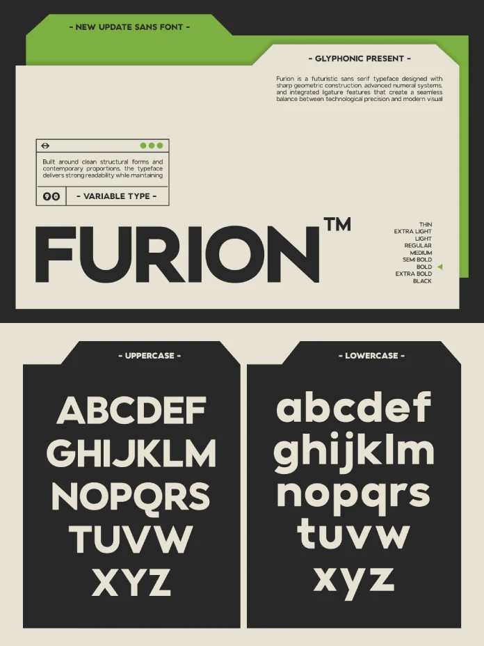
The GC Furion font family is a variable sans serif designed around geometric precision and a controlled futuristic voice. Glyphonic built it for brands that need to signal progress without shouting about it. Think technology, gaming, automotive, architecture, and UI/UX systems. Consequently, the letterforms avoid the exaggerated flourishes that date a “futuristic” typeface within a year.

Instead, GC Furion relies on tight geometric construction. Circles read as true circles. Terminals cut at consistent angles. The x-height sits high enough for screen legibility but doesn’t crowd the ascenders. As a result, the family reads as confident rather than gimmicky, even at display sizes.
What separates GC Furion font family releases from typical geometric sans-serif fonts is the variable axis. Because the weight range shifts smoothly, designers can build a full visual hierarchy from one file. That matters more than it sounds. Most “futuristic” typefaces ship as three or four static weights, forcing awkward jumps between headline and body text. GC Furion avoids that trap entirely.
Testing the Geometry: How Sharp Is Too Sharp?
Sharp-angled fonts often sacrifice readability for edge appeal. So I tested GC Furion across paragraph-length body copy, not just hero headlines, because that’s where geometric sans fonts usually break down.
The result surprised me. GC Furion’s angles stay sharp in display sizes but soften just enough at smaller sizes to remain comfortable in long-form reading. This isn’t accidental. It reflects a deliberate structural decision, and it’s the reason I’m introducing a framework for evaluating typefaces like this one.
The Angle Consistency Index (An Editorial Framework)
I’m calling this the Angle Consistency Index, a metric I use to describe how well a typeface’s sharp geometric cuts hold visual consistency between display and body sizes. This isn’t an industry-standard term. It’s an editorial framework I’ve developed for evaluating geometric sans fonts specifically.
On this scale, GC Furion scores high. The angle logic in the “F,” “K,” and “R” carries through from 96 pt headlines down to 14 pt body text without losing its identity. Many futuristic sans fonts fail this test because their sharp terminals blur or round off at smaller sizes. GC Furion doesn’t.
Variable Weight Performance Across Real Layouts
A variable font is only as good as its weight transitions. Therefore, I built a five-tier hierarchy using GC Furion alone: hero headline, subheadline, section label, body copy, and caption text. No secondary typeface. No workaround.
The transitions held up cleanly. Nothing looked stretched, and nothing looked like a forced interpolation between two static extremes, which is a common failure point in cheaper variable fonts.
The Weight Bridge Test (An Editorial Framework)
I call this the Weight Bridge Test: taking a variable typeface through every weight stop in a single layout to check for visual gaps or inconsistent stroke contrast. It’s a practical stress test, not a formal industry benchmark, but it reveals problems that a single-weight preview never shows.
GC Furion passed the Weight Bridge Test with only one soft spot. Around the lightest weights, the counters in “a” and “e” open up slightly more than expected. It’s minor, but worth knowing if you’re designing fine-print UI labels at the thinnest weight setting.
Where GC Furion Font Family Excels (and Where It Doesn’t)
Strengths first. GC Furion performs exceptionally well in technology branding and UI systems. The geometric consistency makes it ideal for interface labels, dashboards, and product packaging where clarity matters as much as personality. Automotive and gaming brands will also find the confident letterforms translate well to bold, large-format applications.
However, GC Furion isn’t the right choice for every project. Warm, editorial, human-centered brands should look elsewhere. The typeface’s precision is a feature, not a flaw, but it doesn’t pretend to be friendly. If your brand voice leans toward approachable or handcrafted, this geometric sans-serif will fight against that tone.
Additionally, long-form print body text works, but it’s not where this typeface shines brightest. GC Furion is happiest doing headline and interface work, with body copy as a secondary, well-supported role rather than its primary purpose.
Multilingual Reach: 170+ Languages in Practice
Glyphonic built GC Furion with support for more than 170 languages, which matters for global brand systems. I tested the family across extended Latin diacritics, and the accent marks stayed proportionally balanced instead of floating awkwardly above the base characters.
This detail often gets overlooked in typeface marketing, yet it determines whether a font actually works for international teams. A geometric sans with poor diacritic spacing becomes unusable the moment a brand expands beyond English-language markets. GC Furion clears that bar comfortably.
The GC Furion Font Family vs. Other Futuristic Sans Fonts
Compared to other geometric sans releases in the futuristic category, GC Furion sits closer to precision engineering than sci-fi styling. Many competitors chase a “tech” look through exaggerated cuts or unusual ligatures. GC Furion instead earns its futuristic identity through restraint and structural repetition.
That restraint is exactly why I expect the GC Furion font family to age better than flashier alternatives. Trend-driven futuristic fonts tend to look dated within two or three years. A typeface built on consistent geometry, rather than novelty, has a longer shelf life. That’s my forward-looking prediction, and it’s based on how similarly disciplined geometric sans fonts have held up historically.
The GC Furion Font Family at a Glance
| Attribute | Details |
|---|---|
| Type | Variable geometric sans serif |
| Foundry | Glyphonic |
| Character support | Uppercase, lowercase, numbers, punctuation |
| Language support | 170+ languages |
| Best use cases | Technology branding, gaming, automotive, architecture, UI/UX, editorial layouts, digital products |
| Weakest use case | Warm, editorial, human-centered brand voices |
| Available on | Creative Fabrica, Envato Elements, YouWorkForThem |
Where to Buy the GC Furion Font Family
You can license the GC Furion font family through Creative Fabrica, Envato Elements, or YouWorkForThem. Each platform has different licensing structures, so check the terms against your intended use, especially for branding or commercial product packaging.
Final Verdict on the GC Furion Font Family
The GC Furion font family delivers on its promise of precision-driven futurism. It’s not a typeface for every brand, but for technology, gaming, automotive, and UI-focused identities, it offers genuine structural quality rather than surface-level styling. The variable axis alone makes it a smart investment for teams building responsive typography systems.
You can download the complete family from the following platforms:
My prediction: as more brands move away from novelty-driven futuristic fonts, disciplined geometric families like GC Furion will become the default choice for serious technology branding work.
Frequently Asked Questions About the GC Furion Font Family
What is the GC Furion font family best used for?
The GC Furion font family works best for technology branding, gaming, automotive, architecture, UI/UX design, and premium digital products.
Is GC Furion a variable font?
Yes. GC Furion is a variable typeface, allowing smooth weight adjustments across a full range instead of relying on a few fixed static styles.
Does GC Furion support multiple languages?
The GC Furion font family supports more than 170 languages, including extended Latin diacritics that stay proportionally balanced.
Where can I buy the GC Furion font family?
You can purchase or license GC Furion through Creative Fabrica, Envato Elements, and YouWorkForThem.
Is GC Furion good for body text?
GC Furion handles body text well, though it performs best in headline and interface roles rather than long-form print copy.
What brands should avoid using GC Furion?
Brands seeking a warm, handcrafted, or highly approachable tone should consider a different typeface, since GC Furion’s precision-driven character prioritizes clarity over softness.
Check out other trending typefaces here at WE AND THE COLOR.
Subscribe to our newsletter!