
Why does a legacy broadcaster need a visual overhaul now?
Visual identity defines success in modern media. M1 Radio recently unveiled a massive brand refresh. This change matters significantly. The station launched in 1989. It played Queen’s “Radio GaGa” as its first track. Consequently, it became a symbol of Lithuanian freedom and modernity. However, the media landscape has shifted drastically since then. Streaming services and podcasts now dominate listener habits. Therefore, traditional stations must adapt or fade away.
M1 Radio understood this pressure. They approached the creative team at andstudio for a solution. The goal was clear. They needed to unify their sub-brands. Furthermore, they had to stay culturally relevant. The result is a masterclass in design evolution. It respects the past but builds for the future. You might wonder how they achieved this balance. They focused on clarity, system, and motion. This article explores that specific journey. We will analyze the visual systems and typographic choices.
The Challenge of Modernizing M1 Radio
Nostalgia is a powerful tool. However, it can also become a trap. M1 Radio faced a specific problem. Their identity felt fragmented across different platforms. Listeners saw one thing on billboards and another online. Therefore, the brand needed a single logic. This logic had to work on-air, online, and live.
The design team at andstudio accepted this difficult brief. They needed to restore instant recognisability. Simultaneously, they had to clean up the visual noise. Ad-hoc fixes had cluttered the brand over decades. Thus, the new design replaces confusion with strict system rules. This ensures consistent behavior across all formats. M1 Radio now operates cleanly at broadcast speed. This shift is vital for digital survival.
Reviving the geometry: How the M1 Radio logo evolved
andstudio did not destroy the original identity. Instead, they refined it. The redesign revives the widely remembered 1989 mark. However, it now boasts contemporary proportions. The designers sharpened the palette significantly. Consequently, the logo ensures legibility on today’s mobile screens.
You can see the logic immediately. The symbol retains its angular energy. Yet, it feels more stable. It works better in motion graphics. This is crucial for social media engagement. M1 Radio uses this mark to anchor its visual presence. The outcome is a strong foundation. It respects the audience’s memory. Simultaneously, it performs flawlessly in a digital context.

Design critics often argue about simplification. Some say it removes soul. In this case, the opposite occurred. The cleanup actually highlighted the original character. M1 Radio looks more like itself than before. It just looks like the high-definition version.
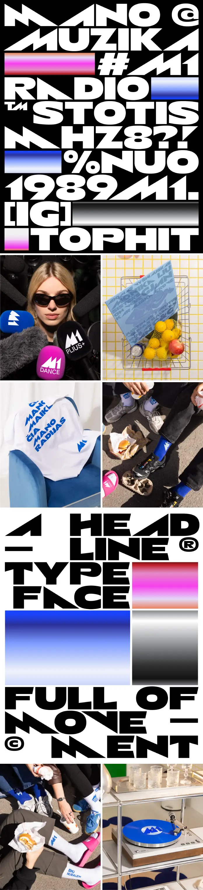
M1 Radio Speaks Through a Custom Alphabet
Typography often does the heavy lifting in branding. For M1 Radio, it became the voice. andstudio developed a custom alphabet for this project. Mykolas Saulytis led the typography design. He drew inspiration directly from the logo’s angular forms.
Observe the headlines in their new campaign. The letters share the logo’s DNA. This gives program titles a distinct voice. Furthermore, it makes day-to-day communications ownable. You know it is M1 Radio before you read the logo.
The system is disciplined. It remains clear at small sizes. Conversely, it feels assertive at large sizes. This flexibility is rare. The designers paired this with a restrained color approach. Therefore, the brand acknowledges its heritage without sliding into nostalgia. The alphabet extends the mark’s logic into layout. It also dictates motion cues. Consequently, recognition tightens across every surface.
Unifying the M1 Radio Family
A modern media company usually manages multiple channels. M1 Radio is no exception. They possess three distinct sub-brands. Previously, these might have competed for attention. Now, they exist within a single modular framework.
The system positions each sub-brand clearly. It does this without diluting the main equity.
- M1: Uses vibrant blue. This signals bold contemporaneity.
- M1+: Uses black. This signals timeless classics.
- M1 Dance: Uses pink. This signals high-energy rhythm.
The design team codified the role and tone of each. This prevents overlap. However, it preserves shared DNA. The result is a coherent family. It reads as one brand in three registers. This simplifies navigation for listeners. Creators also benefit from these clear guidelines.
How the M1 Radio Toolkit Works for Creators
Design must function practically. A pretty logo fails if the team cannot use it. andstudio built a comprehensive toolkit for M1 Radio. This toolkit spans the logo family and custom alphabet. It also includes typographic styles and color specifications.
Moreover, the toolkit defines motion behaviors. It provides on-air graphics and social templates. Even event assets are included. The components allow for rapid production. This is essential for a daily broadcaster. Content needs to go out fast.
Therefore, the identity equips M1 Radio to speak with precision. They can address contemporary audiences with confidence. The consistency is now automatic. This allows the content creators to focus on the message. The visual container is always ready.
Capturing the Spirit of 1989 Today
The project credits reveal a collaborative effort. Photography by Vincas Čygas adds a human element. Typography by Mykolas Saulytis provides structural integrity. Together, they executed andstudio’s vision.
M1 Radio started as a disruptor. It represented a new era for Lithuania. This refresh honors that legacy. It does not look back with sadness. Instead, it carries that spirit into the now. The brand feels fresh again. It invites a new generation to listen.
Successful rebranding requires bravery. You must change what people love. However, you must improve it. M1 Radio succeeded here. They proved that legacy brands can adapt. They did not lose their soul in the process.
Final Thoughts on the M1 Radio Refresh
We see many rebrands fail. They often chase trends too aggressively. Or, they become too generic. M1 Radio avoided these pitfalls. They focused on their core geometry. They built a system, not just a picture.
This project serves as a strong reference. Designers should study it. It shows how to handle cultural icons. It demonstrates the power of custom typography. M1 Radio is now ready for the streaming wars. They have the visual armor to compete.
Ultimately, good design solves problems. The problem was relevance and clarity. The solution was a modular, typographic system. M1 Radio is now visible. It is consistent. And most importantly, it is still “Radio GaGa.”
What do you think about this typographic approach? Does the custom alphabet make the brand stronger?
All images © andstudio and Vincas Čygas. Browse WE AND THE COLOR’s Graphic Design and Branding categories for more.
Subscribe to our newsletter!


