
Sustainable design frequently suffers from a serious image problem. Beige color palettes, rough textures, and moral preaching often define the sector. However, the recent Everbloom rebranding by London-based agency How&How shatters these tired tropes completely. This project treats bio-manufacturing not as a compromise, but as the height of luxury. It signals a massive shift in how we sell ecological responsibility. Designers and consumers alike should pay close attention. The work proves that saving the planet can look just as good as destroying it.
Why is the Everbloom rebranding changing the narrative?
You might wonder why a company would hide its green credentials. Traditionally, eco-friendly brands shout about their carbon footprint immediately. Yet, the Everbloom rebranding takes a radically different approach. It adopts a “Product First, Planet Second” philosophy. This strategy acknowledges a hard truth about consumer behavior. Most shoppers prioritize quality, aesthetics, and performance over sustainability.
Therefore, How&How positioned Everbloom to compete with fashion giants like Gucci or Dior. They did not position it alongside niche eco-activists. The branding suggests that this fiber is superior to silk or cashmere. Consequently, the sustainability aspect becomes a delightful bonus rather than the primary selling point. This tactical pivot mirrors successful moves by brands like Polestar and Aesop. These companies sell desirability first. Virtue comes later.
The strategy behind the visual identity
The fashion industry desperately needs a solution like Everbloom. Currently, two-thirds of the $994 billion global fiber market relies on fossil fuels. Synthetic fibers create massive microplastic pollution. Nevertheless, explaining this science can bore a general audience. The Everbloom rebranding solves this by focusing on the “how” and the “feel” simultaneously.
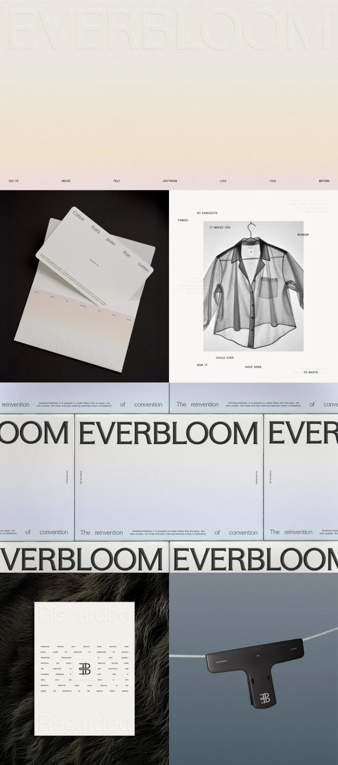
How&How created a logo that acts as a masthead for authority. It blends a refined wordmark with a symbol that is half-monogram, half-digital cursor. This clever combination signifies the intersection of textile heritage and future technology. Furthermore, the design system avoids the typical “organic” look. You will find no rounded, soft typefaces here. Instead, the team selected Haffer, a rigorous mono-spaced font. This choice communicates scientific precision and engineered quality.
Tactility in the digital space
A major challenge for digital branding is conveying physical texture. The Everbloom rebranding tackles this through extreme macro photography. The visuals incite a desire to reach out and touch the screen. Specifically, the imagery highlights the microscopic details of the regenerated fibers.

The agency decided against showing models wearing the final clothes. Instead, they celebrated the raw material itself. Threads hang delicately across the digital assets. This motif serves a dual purpose. It represents the literal fibers. Simultaneously, it metaphorically asks the audience to “hang on” to every word. This approach builds a sensory bridge between the viewer and the product.
Lessons for modern sustainable branding
We can learn much from this specific case study. The era of “guilt-marketing” is likely ending. Brands like Oatly proved that cultural relevance drives sales better than statistics. Similarly, the Everbloom rebranding demonstrates that eco-friendly products must fight for their place on the shelf based on merit.
If a product is ugly or performs poorly, its carbon footprint matters little to the average buyer. Thus, designers must elevate the aesthetic standard. We must treat recycled matter with the same reverence as virgin resources. How&How proves that “green” design does not need to look green. It can look like silver, chrome, and deep, luxurious black.
The future of material innovation
Everbloom transforms organic waste—like old pillow down—into high-performance fiber. This process is revolutionary. However, the branding makes it feel established and trustworthy. Founder Sim Gulati notes that these fibers are equal or superior to the world’s most desirable materials. The identity reflects this confidence.
It moves beyond the “startup” aesthetic. Consequently, it commands the respect of luxury fashion houses. The Everbloom rebranding provides a roadmap for future climate-tech companies. It shows that you catch more flies with honey (or high-fashion aesthetics) than with vinegar.
Final thoughts on the project
This project stands out as a benchmark for 2025. It successfully marries scientific innovation with artistic expression. The Everbloom rebranding respects the intelligence of the consumer. It assumes that we want beautiful things that also happen to be good.
Designers should view this as a call to action. We must stop designing “sustainable brands” and start designing “great brands that are sustainable.” The distinction is subtle but vital. How&How has mastered this nuance. Ultimately, they have given Everbloom the tools to change the fabric of the high-end market forever.
Any footage © How&How. Don’t hesitate to browse WE AND THE COLOR’s Graphic Design and Branding sections for more inspiring content.
Subscribe to our newsletter!


