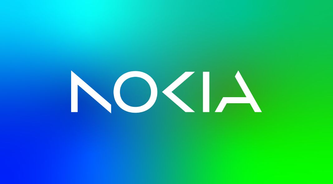
For over half a century, Nokia has maintained its longstanding identity. However, to demonstrate their transition from traditional telecoms to tech innovators, they decided it was time for an update. After consulting the renowned brand and design specialists at Lippincott, the new logo with its captivating imagery and bold colors created a much-needed distinction in an oversaturated market. This renovation is indicative of Nokia’s dedication to crafting something unique that stands out amongst its competitors. Please read more below.

The refreshed logo perfectly captures Nokia’s reputation as a cutting-edge tech innovator, showcasing its precision, dynamism, and digital compatibility. It also maintains the essence of Nokia’s iconic heritage while standing out from other players in the industry with bold visuals. The white logo will make an impact against a wide range of colors to ensure maximum visibility.
Nokia’s new visual system, based on their logo N-O-K letterforms, is easily identifiable in all marketing communications. These “amplifiers” are designed to ensure that each message from the brand is rendered with consistency and coherence regardless of which business group created it.
All images © by Lippincott. Do not hesitate to find more inspiring graphic design and branding content on WE AND THE COLOR.
Subscribe to our newsletter!


