This post contains affiliate links. We may earn a commission if you click on them and make a purchase. It’s at no extra cost to you and helps us run this site. Thanks for your support!
Classic Grotesque, a traditional font family with a modern face from foundry Monotype.
Classic Grotesque is a modern take on the good old Monotype Grotesque typeface that appeared first in 1926. In 2008, Canadian type designer Rod McDonald got the go-ahead from Monotype to work on a contemporary revision of this good old sans serif. It took him four years (with numerous interruptions) to develop the Classic Grotesque font family. The entire design process was a challenging task. After some initial drafts, Rod McDonald found the right approach by adding elements of Bauer Font’s Venus typeface and Julius Klinkhardt’s Ideal Grotesk to his design. The sophisticated result of his long work process is Classic Grotesque, a traditional font family with a modern face. You can read more below.
You can purchase this family on MyFonts.
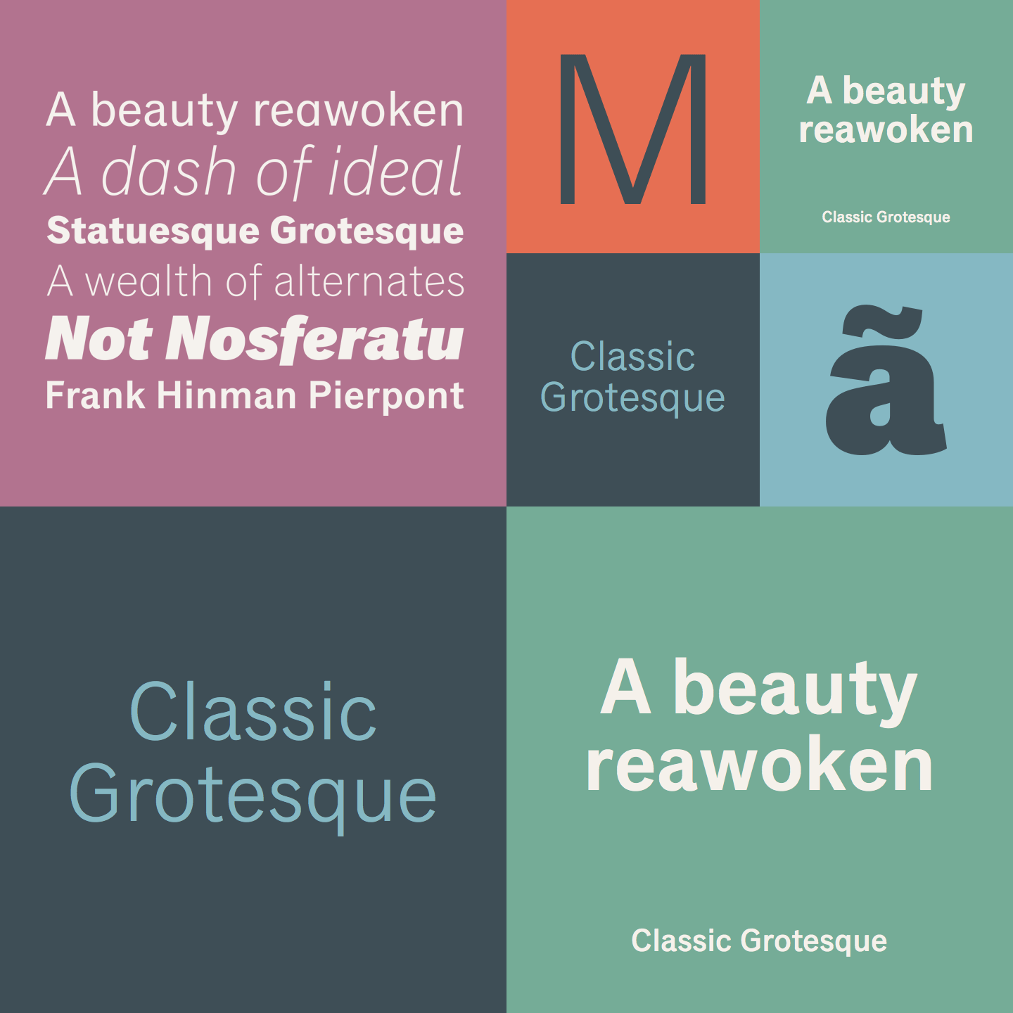
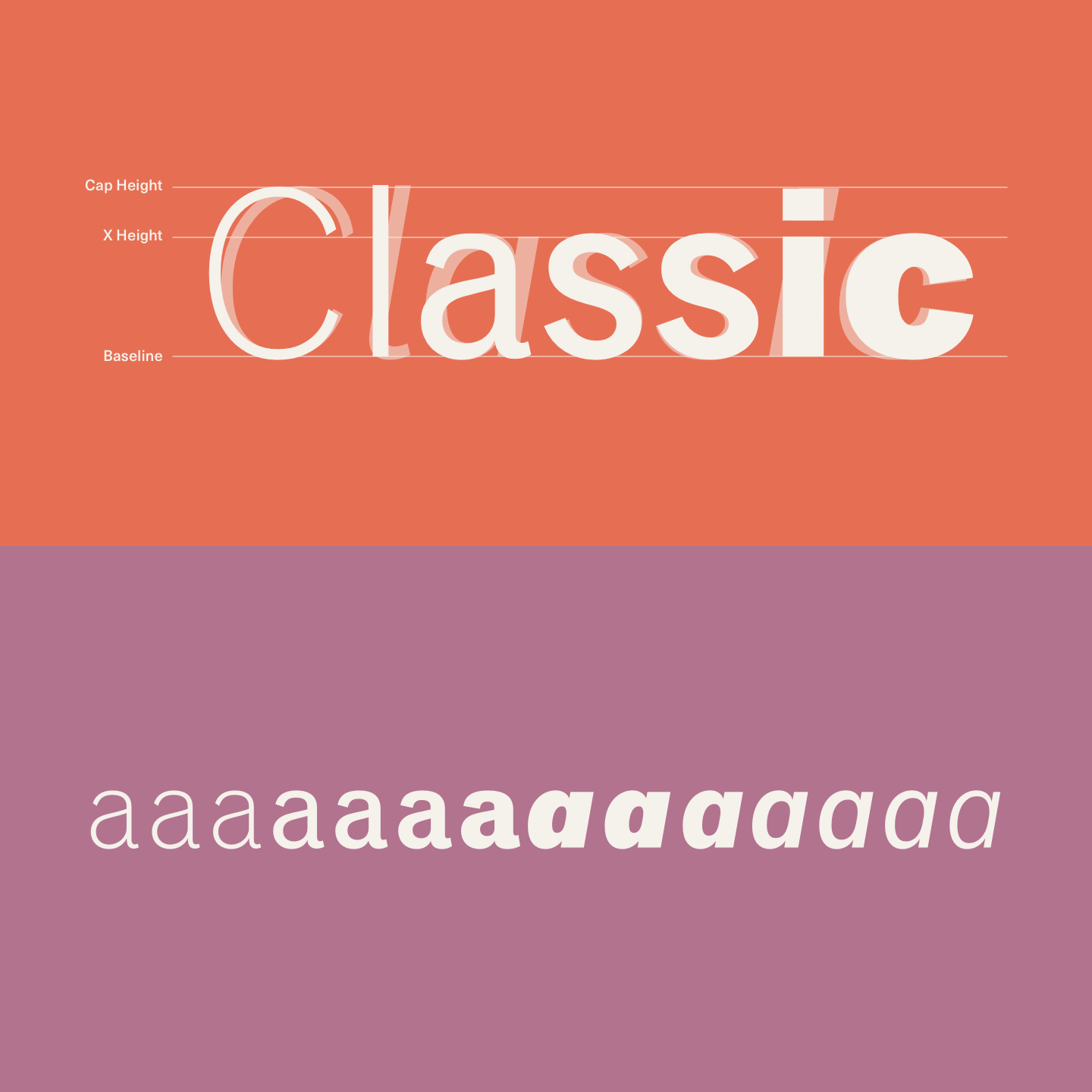
The Classic Grotesque font family refers to early sans serifs of 20th century. Its formal appearance results from a fairly uniform line width with only a few variations. The full family comes with 7 different weights ranging from a delicate Light version to a massive Extrabold weight plus true Italics for each weight. The titles of the letters ‘i’, ‘j’ and several diacritics are designed in a rectangular shape. Some of the uppercase letters offer certain variations from the standard pattern. That includes the horizontal bars of the letters ‘E’, ‘F’, and ‘L’, which have slightly bevelled terminals. Using OpenType features you can choose from a range of alternative letter shapes and other options. The set of alternates comes with a closed ‘a’ as well as a double-counter ‘g’ and an ‘e’ in which the transverse bar deviates from the horizontal line.
The Classic Grotesque font family is suitable for a wide range of applications. Its legible and well balanced design makes it a good typeface for long texts in magazines and books. Whether print of web, I’m pretty sure you will love to work with this family. For further information on all features, just follow the link below.
The family is available for purchase on MyFonts.
You can get this professional typeface here.


