
This post contains affiliate links. We may earn a commission if you click on them and make a purchase. It’s at no extra cost to you and helps us run this site. Thanks for your support!
Functionality is making a powerful return to the forefront of design. In a digital landscape often saturated with ornamental excess, a growing movement champions clarity, purpose, and efficiency. This shift towards a more deliberate aesthetic is not about stripping away personality; instead, it is about finding beauty in purpose. The Utilitarian Design philosophy, with its roots in logic and practicality, is experiencing a significant resurgence. A new design kit from Vanzyst, featuring 200 utilitarian graphics, perfectly captures this moment. It offers designers a potent vocabulary to create work that is both meaningful and visually compelling. This collection is more than just a set of assets; it is a response to the creative world’s need for directness and honesty in communication.
You can download the kit for a very low budget on these platforms:
The Essence of Utilitarian Design: More Than Just Minimalism
What exactly are utilitarian graphics? It is a common misconception to equate utilitarianism with stark, cold minimalism. While both aesthetics share a certain cleanliness, their core intentions differ. Minimalism often pursues simplicity for its own sake, focusing on subtraction to achieve an elegant emptiness. Utilitarian design, however, is driven by function. Every single element must have a clear and justifiable purpose. It is about efficiency, not absence.
You can download the kit for a very low budget on these platforms:
Think of architectural blueprints, scientific diagrams, or the instructional markings on industrial machinery. These are the historical touchstones of utilitarian aesthetics. Their beauty emerges not from decoration but from their absolute clarity and fitness for their task. Vanzyst’s kit of 200 utilitarian graphics channels this spirit. It translates these principles into a versatile toolkit for the modern creator. The collection feels less like a set of stock graphics and more like a system of visual logic.

Deconstructing the Vanzyst Kit: A Symphony of Function
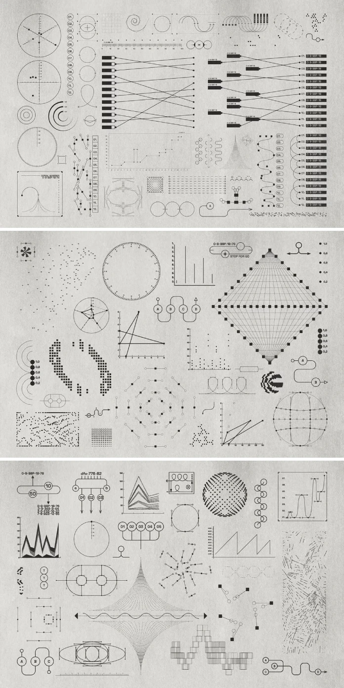
This curated collection provides a comprehensive array of 200 unique graphic assets. It is a thoughtfully assembled library of diagrams, charts, abstract shapes, and even simple lines and scribbles. What makes these utilitarian graphics so powerful is their inherent adaptability. Vanzyst provides files where you can edit the stroke weight of each element. This small detail is a significant nod to the utilitarian ethos; it gives the designer precise control over visual hierarchy and emphasis. Why is this level of control so important for designers? It allows a single shape to serve multiple functions, from a bold, attention-grabbing icon to a subtle background texture.
The inclusion of editable text within the PDF, AI, and EPS files further extends the kit’s practicality. This feature transforms generic charts and diagrams into bespoke pieces of data visualization. Designers are not merely placing a static image; they are integrating a functional, data-rich element directly into their compositions. This is a key differentiator for anyone seeking to create infographics or presentations that are both beautiful and genuinely informative.
Why Utilitarian Graphics are Dominating Visual Trends
The appeal of this aesthetic in today’s market is multifaceted. Firstly, it conveys a sense of trust and transparency. In an era of misinformation, visuals that are direct, clear, and seemingly objective resonate deeply with audiences. These utilitarian graphics are stripped of superfluous styling, which can make the information they present feel more authentic and credible. They communicate without shouting.
Secondly, this style is incredibly versatile. The clean lines and geometric foundations of the Vanzyst kit make the assets suitable for a vast range of applications. Imagine these graphics on a sleek poster design for a tech conference, adding a layer of intellectual seriousness. Consider them on custom clothing, offering a sophisticated, almost academic edge to streetwear. They are equally at home on the cover of an experimental music album as they are in a modern packaging design for an organic food brand. The assets provide a strong structural foundation that can be either the hero of a design or a subtle, supporting player.
Practical Applications for the Modern Designer:
- Branding & Identity: Build a brand identity rooted in clarity and intelligence. These graphics are perfect for tech startups, engineering firms, or any business that wants to project an image of precision and expertise.
- Social Media Content: Create social media posts that stand out from the visual noise. Use the charts and diagrams to present data in a compelling, easy-to-digest format.
- Web & UI Design: Employ the icons and shapes as navigational elements or to illustrate complex processes on a website, enhancing the user experience through clear visual cues.
- Editorial Design: Design compelling layouts for magazines and reports. The abstract shapes and lines can be used to structure content and guide the reader’s eye through the page.
How to Integrate Utilitarian Graphics Into Your Workflow
Vanzyst has prioritized accessibility and ease of use in this kit of 200 utilitarian graphics. The wide array of file formats ensures that virtually any designer, regardless of their preferred software, can seamlessly integrate these assets. The inclusion of 200 separate SVG files is a particularly thoughtful touch, making the kit perfectly compatible with popular web-based design tools like Canva and Figma.
You can download the kit for a very low budget on these platforms:
For those working in Adobe Illustrator, the common AI file is a powerful starting point, allowing for deep customization of every element. Similarly, the EPS files provide broad compatibility with other vector software like Affinity Designer or Corel Draw. For designers focused on digital, pixel-based work, the high-resolution PNG and JPG files (5000x5000px at 300dpi) offer immediate, drag-and-drop utility without sacrificing quality. This multi-format approach removes technical barriers, allowing you to focus purely on the creative application of these powerful utilitarian graphics. How could this streamlined access change the speed and quality of your design process?
Feel free to find other professional graphic design templates here at WE AND THE COLOR.
Subscribe to our newsletter!


