This post contains affiliate links. We may earn a commission if you click on them and make a purchase. It’s at no extra cost to you and helps us run this site. Thanks for your support!
Embracing Nostalgia: Unigeo Font Family Redefines Vintage Computing in Typography
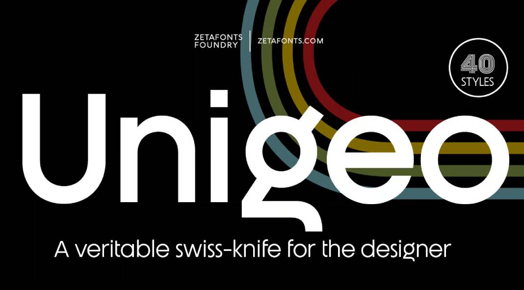
In the ever-evolving landscape of typography, where innovation often meets nostalgia, the Unigeo font family emerges as a captivating homage to the design aesthetics of vintage computing. Crafted by the skilled hands of Cosimo Lorenzo Pancini in collaboration with Francesco Canovaro under the banner of Zetafonts, Unigeo breathes new life into the geometric sans genre, infusing it with a delightful retro charm reminiscent of classic gaming systems and the vibrant era of photo-lettering.
At its core, Unigeo embodies an obsession with geometric modularity and ultra-tight tracking, harkening back to the golden age of computing design. Yet, it does not merely replicate the past; it reshapes it, infusing a rainbow-striped overload that sparks a sense of nostalgia and modernity simultaneously.

The genius of Unigeo lies in its versatility, manifested through its distinctive “memory versions”: 32, 64, and 128. The flagship variant, Unigeo 64, serves as a playground for display and logo designers. Here, one encounters signature letterforms that pay homage to vintage design elements, reminiscent of an era when photo-lettering reigned supreme. It’s a celebration of tight tracking and iconic shapes that evoke a sense of playful nostalgia.
Transitioning to the Unigeo 32 variant unveils a more contemporary approach, where the letterforms take on sleeker, modern shapes while retaining the essence of the geometric sans. This iteration excels in text use but retains the adaptability to shine in logo design and displays, courtesy of its diverse weight range.
However, the pièce de résistance arrives with the Unigeo 128 subfamily, where the familiar skeleton of Unigeo adopts a stunning striped treatment. Drawing inspiration from optical art and modernist computer logos, this variant adds a mesmerizing twist to the font, elevating it to an art form in itself.
A testament to its comprehensive design, the Unigeo font family boasts eight weights, ranging from the delicate Thin to the commanding Extrabold, culminating in 40 styles. Each style comes equipped with an extensive character set accommodating Latin, Cyrillic, and Greek glyphs, ensuring its usability across diverse languages. Moreover, embracing modernity, the font offers full OpenType features, including positional numbers, ligatures, alternate glyphs, and the convenience of a variable font version for each subfamily.
Unigeo isn’t merely a font; it’s an exploration of nostalgia, a fusion of vintage charm with contemporary functionality, meticulously crafted to meet the demands of modern design. It invites designers to embark on a journey where the essence of retro computing meets the demands of today’s creative landscape, promising versatility, and an irresistible touch of the past.
Don’t hesitate to find more recommended typefaces on WE AND THE COLOR.
Subscribe to our newsletter!

