
For decades, Les Schwab Tires has stood for dependable service, a friendly handshake, and values you can count on. It’s the place you go when you need someone you trust. But what happens when the way a brand looks no longer matches the way it feels? This was the challenge facing a true American icon. This article explores the story behind the recent Les Schwab Tires brand refresh, a brilliant strategic move by the creative agency ONE23WEST. It is more than just a new logo; it is a powerful lesson in how to honor a rich legacy while steering confidently into the future.
You see, a brand’s identity is its handshake, its promise, and its personality all rolled into one. Over the years, Les Schwab’s visual handshake had weakened. Its look had become a patchwork of different styles, feeling a bit dated and inconsistent from one town to the next. In a time when competitors were sharpening their image and customer expectations were higher than ever, Les Schwab risked its unique voice getting lost in the noise. The solution wasn’t a simple paint job. It required a return to the very soul of the brand, reimagined for today.
The Challenge Facing a Beloved Brand
Let’s be clear. The problem was never the service. The commitment to running out to greet you, the free flat tire repairs, the genuine advice—that was all still there, as strong as ever since 1952. The issue was purely visual. Imagine a favorite musician who still plays incredible music but shows up on stage in an outfit from 30 years ago. The quality is there, but the presentation feels out of sync.
This fragmentation was a real risk. When signage, advertisements, and the in-store experience all look slightly different, it dilutes the brand’s power. It creates a subtle confusion that can erode the sense of a strong, unified company. More importantly, the old look just didn’t capture the incredible energy and heritage of Les Schwab. It failed to communicate the “above-and-beyond” spirit that defines every customer interaction. What was needed was a bold change, a strategic refresh that would make the outside match the inside once again.
ONE23WEST’s Strategic Approach to the Les Schwab Tires Brand Refresh
So, how do you refresh an icon without losing what made it special? You go back to its roots. The team at ONE23WEST, a creative agency known for its smart and memorable work, didn’t just invent something new out of thin air. Instead, they looked back to the golden age of American service stations. Think of the bold, clear, and optimistic graphic design of the 1950s. That was their inspiration.
Their solution was to build a dynamic new identity system that celebrates Les Schwab’s history while making it feel completely current. This wasn’t about nostalgia for its own sake. It was a strategic decision to tap into a visual language that communicates trust, quality, and good old-fashioned service. The goal was to create something that felt both timeless and forward-thinking, a perfect reflection of the Les Schwab Tires brand refresh philosophy. By understanding the core of the brand, ONE23WEST could create a visual future that felt authentic and exciting.

The Building Blocks of a Bold New Look
Let’s break down the key elements that make this rebrand so successful. Every choice was deliberate, designed to work together to tell a cohesive story.
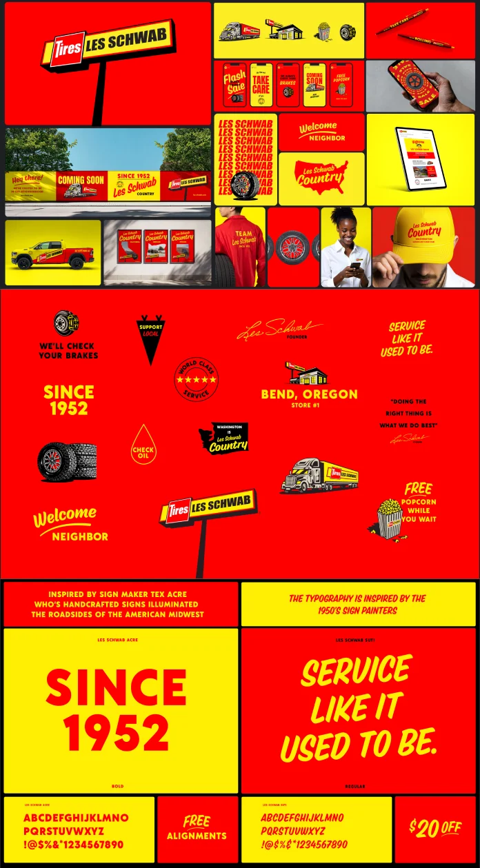
First, the logo and color palette. The refreshed logo is clean, confident, and instantly recognizable. It is paired with a high-impact color scheme of bright red and vibrant yellow. Have you noticed it on the road? It’s impossible to miss. This combination shouts energy and reliability. Suddenly, every truck, sign, and building is loud, proud, and unmistakably Les Schwab. This is a crucial part of any brand identity system: making sure you are seen and remembered.
Next, ONE23WEST developed custom typography inspired by classic roadside Americana. The lettering has character and a human touch, moving away from generic corporate fonts. It feels like it was crafted with care, just like the service you receive. To complement this, they commissioned a unique illustration toolkit from artist Pedro Oyarbide. Inspired by vintage auto parts catalogs, these illustrations are charming, clear, and help explain services and offers in a way that feels personal and direct.
The result of the Les Schwab Tires brand refresh is a visual and verbal tone that is playful yet professional. It’s direct, honest, and friendly—just like that handshake you get when you walk through the doors.
Measuring the Success of the Les Schwab Rebrand
The impact of this work is felt everywhere. The new Les Schwab identity system is a powerful reclamation of the brand’s position as a leader in service and a true local icon. Whether you encounter the brand through a digital ad on your phone, see their merchandise, pass a storefront, or spot a service vehicle on the highway, the experience is now seamless.
The new brand feels cohesive, confident, and full of life. It successfully bridges the gap between the company’s storied past and its dynamic present. It delivers on the promise of “Service Like It Used to Be,” but with a crucial addition: it’s bolder. This brand refresh wasn’t just a cosmetic update; it was a strategic alignment of the company’s visual identity with its unwavering promise of exceptional service. It proves that even the most established brands can be re-energized by looking to their heritage to find their future. Why did Les Schwab change its logo and look? To ensure that, for generations to come, their appearance would be as strong and reliable as their service.
The Creative Force: A Look at ONE23WEST
Behind every great brand transformation is a great creative partner. For Les Schwab, that partner was ONE23WEST. An independent, award-winning agency, ONE23WEST is celebrated for its bold and strategic approach to branding and advertising. Their team is composed of world-class thinkers, designers, and storytellers who collaborate with brands to create work that is not only memorable but also highly effective.
Their philosophy blends sharp creativity with smart business acumen to drive real, measurable results. Working with everyone from startups to global giants, ONE23WEST has a proven track record of building brands that cut through the clutter and make a genuine impact. The Les Schwab Tires brand refresh is a testament to their ability to understand a client’s core DNA and translate it into a compelling and modern brand experience.
Project Credits:
- Agency: ONE23WEST
- Client: Les Schwab Tires
- Creative Direction: Jeff Harrison, Mooren Bofill, Rob Sweetman, Bryan Collins, Katie Bandstra
- Design: Jeff Harrison, Claudia Deneault Robillard, Max Littledale, Katie Bandstra
- Illustration: Pedro Oyarbide
- Les Schwab Leadership: Greg Waring (Chief Marketing Officer), Katie Bandstra (Senior Marketing Director)
- Account Direction: Maurine Cardoso (ONE23WEST)
- Production: Lisa Good, Jillian Arsenault
All images © ONE23WEST. Feel free to browse WE AND THE COLOR’s Graphic Design and Branding section for more creative inspiration.


