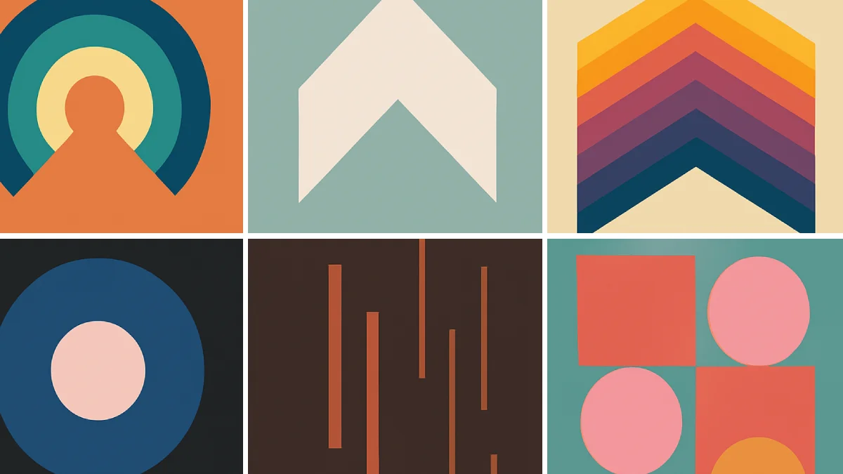
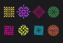
Ever stopped to think about why certain logos just feel right? Or why do particular buttons on a website seem more inviting to click? It goes beyond just pretty pictures. A huge part of it involves the shape psychology in graphic design (also known as the psychology of shapes). Just like colors whisper messages to our subconscious, the circles, squares, and triangles designers use are constantly talking to us, influencing our feelings and decisions without us even noticing.
You already know colors pack an emotional punch – we talked about that before. Now, let’s explore their fascinating siblings: shapes. Understanding the shape psychology in design is like getting a secret decoder ring for visual communication. It helps explain why some brands feel trustworthy, others exciting, and some innovative. Ready to see how these fundamental building blocks shape our perceptions? Let’s look closer.
The Silent Language of Shapes: More Than Just Geometry
Why do simple geometric forms hold such power? Our connection to shapes is ancient. Think about nature. The sun and moon are circles, suggesting wholeness and cycles. Mountains form triangles, implying strength or challenge. Flat horizons create lines, offering stability. Our brains are wired through evolution and cultural learning to associate basic shapes with specific concepts and emotions.
Therefore, when designers choose a shape for a logo, a website layout, or even a simple icon, they tap into this deep-seated understanding. It’s a non-verbal language. Mastering this language means communicating more effectively, building stronger brand identities, and even guiding user behavior. Neglecting it? Well, that might mean sending mixed signals or failing to connect emotionally. The deliberate use of shape psychology in graphic design is truly fundamental.
Circles, Ovals, and Ellipses: Embracing Community and Harmony
Think about circles. What comes to mind? Perhaps community, unity, friendship, or love (like a wedding ring). Circles have no sharp corners, no beginning or end. This continuous nature often makes them feel soft, gentle, and inclusive. They can represent wholeness, completion, and movement (like a rolling ball).
How Designers Use Circles:
- Logos: Brands wanting to appear friendly, accessible, and community-focused often use circles. Think of target-like logos implying focus, or interlocking circles suggesting partnership. The shape psychology in graphic design here leans towards inclusivity.
- Buttons/Icons: Circular buttons often feel softer and more inviting to click than sharp-edged ones. Icons for social connection frequently use circular elements.
- Imagery: Framing photos in circles can soften the subject and create a sense of intimacy or focus.
Color Combos: Combine a circle with blue, and you amplify feelings of trust and reliability (think tech companies). Use a warm orange circle, and you might evoke feelings of togetherness and vibrant energy. Doesn’t that shift the feeling instantly?
Understanding Squares and Rectangles in Shape Psychology
Now, let’s consider squares and rectangles. What vibes do they give off? With their straight lines and sharp right angles, these shapes scream stability, reliability, and order. Think of building blocks, foundations, or sturdy boxes. They feel grounded, balanced, and predictable. This makes them excellent choices for conveying professionalism, strength, and trustworthiness.
However, too many rigid squares can sometimes feel boring, restrictive, or overly corporate. The context matters immensely.
Applying Squares and Rectangles:
- Logos: Companies emphasizing strength, tradition, efficiency, and security often incorporate squares or rectangles. Think of financial institutions or certain tech brands. Shape psychology in design leverages squares for perceived dependability.
- Layouts: Grids based on squares and rectangles create a sense of order and structure on websites and print materials. They help organize information clearly.
- Frames: Using rectangular frames around images or text provides definition and a sense of containment.
Color Impact: A grey or dark blue square reinforces professionalism and seriousness. A brightly colored rectangle, however, can balance the stability with a touch of modernity or playfulness. It’s all about the combination, isn’t it?
Triangles: Energy, Direction, and Maybe a Little Danger?
Triangles are dynamic shapes. They possess energy and can point direction. Think about arrows – they guide the eye. Depending on their orientation, triangles convey different meanings.
- Pointing Up: Often suggests stability (like a pyramid), power, strength, hierarchy, or progress.
- Pointing Down: Can feel precarious, suggesting tension, risk, or instability.
- Pointing Sideways: Implies movement, direction, or advancement.
Triangles can also be associated with masculinity, science, religion (the trinity), or even law (scales of justice often use triangular elements). Because of their points, they can sometimes feel aggressive or dangerous (like a warning sign). Skillful shape psychology in graphic design means knowing which triangle to use when.
Triangles in Action:
- Logos: Brands wanting to convey motion, direction, innovation, or power might use triangles. Think sports brands, tech innovators, or automotive companies.
- Navigation: Arrows (triangles) are universally used for direction in UI/UX design (play buttons, next/previous arrows).
- Attention-Grabbers: The sharp points can draw attention to specific elements in a design.
Color Matters: A red triangle screams warning or excitement. A green triangle might suggest growth or navigation (like a “go” signal). A blue triangle could imply reliable direction or technological advancement. See how the meaning shifts?
Organic Shapes and Spirals: Nature, Flow, and Creativity
Moving away from strict geometry, we find organic shapes. These are irregular, often curved, and mimic forms found in nature – leaves, clouds, puddles, cells. They tend to feel natural, spontaneous, comforting, and familiar. Organic shapes can convey flexibility, growth, and life. Spirals, a specific type of curve, often symbolize evolution, transformation, creativity, or a journey.
Using Organic Forms:
- Branding: Companies focused on nature, wellness, food, art, or creativity frequently use organic shapes to appear more human and less rigid. The psychology of shapes in graphic design here connects directly to natural elements.
- Backgrounds: Soft, flowing organic shapes can create calming and visually interesting backgrounds.
- Illustrations: They add a touch of whimsy, personality, and uniqueness.
Color Pairings: Green or brown organic shapes strongly evoke nature. Blues can suggest water or sky. Bright, varied colors within organic forms can enhance feelings of creativity and spontaneity. Have you noticed how spas often use soft, curved shapes and calming colors?
Abstract Shapes: Communicating Uniqueness
Abstract shapes don’t directly represent recognizable objects. They might be modified geometric forms or entirely unique creations. Their meaning is less universal and relies more heavily on the designer’s intent and the overall context. They can convey uniqueness, modernity, complexity, or abstract concepts. Using them effectively requires careful consideration of the brand’s message. They offer a chance to create something truly distinct, a core goal when applying shape psychology in design.
Abstract Shapes in Design:
- Unique Branding: Perfect for brands wanting to stand out and represent a complex or novel idea.
- Artistic Expression: Often used in designs where conveying a specific mood or artistic style is key.
- Intrigue: Can pique curiosity and make viewers pause to interpret the meaning.
The Power Couple: Combining Shape and Color Psychology
We’ve touched on it, but let’s emphasize this: shapes rarely work alone. Their psychological impact is massively amplified or modified by color. Imagine a soft, friendly circle. Now color it black – suddenly it might feel ominous or sophisticated, like a void or a formal seal. Take a stable square. Color it hot pink – it instantly becomes more playful and less corporate.
Understanding the psychology of shapes in design means understanding this synergy.
- Reinforcement: Use colors that align with the shape’s inherent meaning (e.g., blue square for stable trust).
- Contrast: Use colors that challenge the shape’s meaning for a more complex or unexpected message (e.g., yellow triangle for energetic warning).
- Context: Always consider the overall design, industry standards, and target audience. What feels trustworthy in finance might feel boring in entertainment.
How does a red stop sign (octagon, close to a circle but with defined stops) feel compared to a green “go” circle? The combination sends a clear, immediate message.
Shape Psychology in Graphic Design: Branding and User Experience Implications
This isn’t just theory; it’s a practical application central to branding and user experience (UX/UI).
- Logo Design: The core shapes used in a logo become intrinsically linked to the brand’s identity. Choosing shapes that misalign with the brand’s values can create cognitive dissonance for consumers. How geometric shapes influence branding decisions is a critical consideration. Using circles in logo design to build trust is a common, effective strategy.
- Website and App Design: Shapes guide users. Rectangular containers organize content. Circular buttons might invite social actions. Triangular ‘play’ buttons prompt media engagement. The impact of shapes on user experience is undeniable – they direct attention, define interactive elements (like the best shapes for user interface buttons), and contribute to the overall feel of the interface. Think about call-to-action buttons: does a rounded rectangle feel more clickable than a sharp one? A/B testing shape variations can yield surprising results.
- Marketing Materials: From brochures to social media graphics, the shapes used influence how messages are received. Dynamic triangles might suit a sales announcement, while comforting circles might be better for a community update.
Understanding the meaning of triangles in visual communication, or how organic shapes psychology works for creative brands, allows for more intentional and impactful design choices across all platforms.
Putting Shape Psychology into Practice
So, how can you, as a designer or someone commissioning design work, leverage this knowledge?
- Be Intentional: Don’t just choose shapes because they look good. Ask: What feeling do I want to evoke? What message does this shape send? How does it align with the brand or goal?
- Consider Your Audience: Who are you trying to reach? Cultural backgrounds and personal experiences can slightly alter shape perceptions.
- Combine Wisely: Think about how shape and color will interact. Experiment with combinations to achieve the desired emotional tone. Combining shape and color psychology effectively is key.
- Observe the World: Pay attention to the shapes used by successful brands in various industries. Why do you think they made those choices? What feelings do their logos evoke in you?
- Test and Iterate: If possible, test different shape variations in your designs (especially in UI/UX) to see how users respond.
Exploring the psychology of shapes in design isn’t about rigid rules, but about understanding tendencies and using visual elements thoughtfully. It adds another layer of depth and effectiveness to your communication toolbox. What shapes are you drawn to, and why do you think that is?
Shapes Speak Louder Than You Think
Shapes are fundamental elements of visual language. They communicate complex ideas and emotions silently and instantly. By understanding the basics of shape psychology in design, from the welcoming nature of circles to the stability of squares and the energy of triangles, designers can create more meaningful, resonant, and effective work. It’s about crafting experiences that not only look good but also feel right on a subconscious level. So next time you design or evaluate a visual, remember the silent, powerful conversation the shapes are having with the audience. Make sure they’re saying exactly what you intend.
Feel free to browse WE AND THE COLOR’s Graphic Design section for more inspiring content, or try our Graphic Design AI Bot for expert tips on typography, color palettes, branding, UX/UI, and social media design.
Subscribe to our newsletter!

