This post contains affiliate links. We may earn a commission if you click on them and make a purchase. It’s at no extra cost to you and helps us run this site. Thanks for your support!
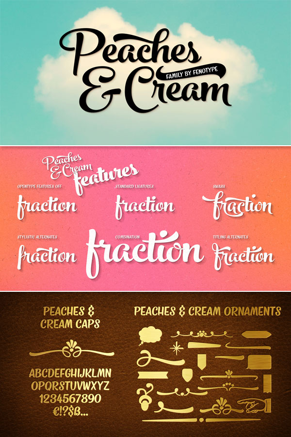
Peaches and Cream, a bold brush style script font family.
Emil Karl Bertell, a Finnish type designer and founder of foundry Fenotype created the Peaches and Cream typeface in 2014. It’s a script font family in the style of bold and soft brush strokes. The complete type family comprises three weights (Regular, Bold, Black), a stylish set of ornaments, and an all-caps font version. With the Peaches and Cream font family, Emil Karl Bertell developed a typeface that conveys a soft and friendly look, well packed in a nice vintage script style. The type family can be used for classic retro designs and typography on signage, covers, and titles that provide a cool 1960s Hippie style.
The Peaches and Cream brush script font family includes several OpenType features such as standard ligatures, swashes, stylistic alternates as well as titling alternates. If you want to activate these features, just choose them in your OpenType savvy program or manually select the characters from the Glyph Palette.
With Peaches and Cream you can create stylish headlines, cool logos or posters with a great retro feel.
You can buy the complete family on MyFonts.
The entire type family is available for purchase on MyFonts.com


