Learn how to create compelling infographics to visualize any kind of data.
In a world inundated with information, the ability to convey complex ideas succinctly is invaluable. Infographics serve as the perfect bridge between data and understanding, offering a visual feast that not only educates but also engages. In this guide, we’ll explore the art of infographic design, offering tips for creating effective infographics, delving into data visualization techniques, and showcasing examples that demonstrate the power of visual storytelling.
The Power of Infographics
Infographics are a dynamic medium that combines information, design, and storytelling. They can simplify intricate concepts, making them accessible to a wide audience, and leave a lasting impression that plain text often can’t achieve.
Creating Effective Infographics: Tips and Techniques
- Define Your Purpose: Clearly establish the purpose of your infographic. Are you explaining a process, showcasing data trends, or comparing statistics? Defining the purpose will guide your design decisions.
- Simplify Complexity: Complex data can be overwhelming. Focus on the core message and use visual elements to simplify information, making it easy for viewers to understand at a glance.
- Choose a Layout: The layout should facilitate a logical flow of information. Linear, step-by-step layouts work for processes, while comparison-based layouts suit data comparisons.
- Color Palette: Use a consistent color palette that aligns with the content and evokes appropriate emotions. Limit the palette to maintain clarity and avoid visual clutter.
- Typography: Choose legible fonts that match the tone of your infographic. Mix font styles for headings, subheadings, and body text to create a hierarchy.
- Icons and Illustrations: Visual elements like icons and illustrations can add depth to your infographic. Ensure they are relevant, clear, and stylistically coherent.
- Data Visualization: Choose appropriate chart types (bar, line, pie, etc.) to represent data accurately. Use color, size, and position to highlight key points in the data.
- Whitespace: Utilize whitespace to provide visual breathing space and prevent overcrowding. It directs the viewer’s attention and enhances overall aesthetics.
- Flow and Readability: Guide the viewer’s eye through the infographic with a clear visual hierarchy. Make sure information flows naturally, aiding easy consumption.
- Storytelling: Every infographic should tell a story. Craft a narrative that connects the different elements, leading to a clear conclusion or call to action.
Data Visualization Techniques
- Comparison: Use visual elements like bars, columns, or circles to effectively compare data points. This technique is great for showing trends, proportions, and variations.
- Hierarchy: Represent hierarchical information with treemaps or pyramids. These techniques show relationships between elements and their significance.
- Chronology: Timelines and flowcharts help illustrate processes, events, and historical sequences. They allow viewers to follow a linear narrative.
- Geographical Data: Maps and heat maps convey spatial data effectively. Use color gradients to show concentrations or variations in specific regions.
- Proportional Representation: Pie charts and donut charts display parts of a whole. Ensure they’re easy to read by labeling each segment.
Showcasing Impactful Infographic Templates
Crafting infographics from scratch can be a time-consuming endeavor, demanding design skills and creativity. This is where infographic templates come to the rescue. Designed to simplify the process, these templates offer a pre-structured framework that allows you to bypass the intricate design process. They are a boon for individuals who seek to effectively communicate data without having to start from square one. Whether you’re a marketer, educator, or business professional, infographic templates provide a ready-made canvas, enabling you to focus on the content and message you wish to deliver, rather than getting bogged down in the complexities of design. Below you can discover three infographic template collections that can enhance your communication efforts while saving you valuable time and effort.
Editable Vector Charts & Infographics
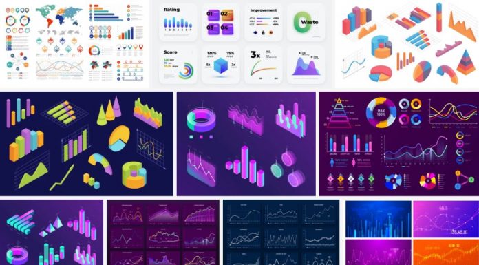
Tartila, a contributor to Adobe Stock, has crafted an impressive assortment of business charts and infographics, all of which come in the form of completely adaptable vector graphics. These graphics are perfectly suited for a diverse array of data presentation needs. In just moments, you can modify colors, dimensions, and forms to align with the specific data you intend to exhibit. The charts and infographics feature uncomplicated designs, ensuring their clarity and comprehensibility.
A Professional Vector Infographics Collection
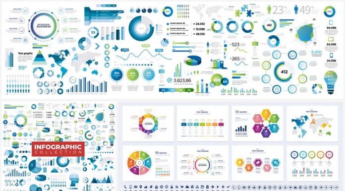
Fashioned by the skilled graphic designer and contributor to Adobe Stock, Julien Eichinger, this compilation encompasses a diverse selection of infographics presented in a variety of styles. Leveraging the advantages of fully modifiable vector graphics, every element within this collection is open to customization. Through the ease of a few uncomplicated clicks, you have the power to swiftly adjust colors and shapes to match your specific requirements.
A Business Infographic Set
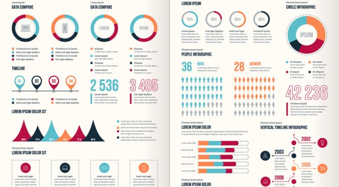
Crafted by the talented contributor to Adobe Stock, Petr, this set of professional business infographics stands as an exceptional option for pre-designed, fully adaptable templates. Employing a consistent style, color palette, and minimalist shapes, this compilation presents an ideal solution for effectively portraying data, all the while economizing on time and resources. Comprising a total of 40 design components, each exclusively in vector graphics format, this business infographic collection offers a wealth of customization possibilities. Every intricate aspect is subject to modification. The placeholder text exhibited in the preview serves a purely illustrative purpose and might not be included in the final application. You have the liberty to integrate your personal text or images into each graphic element.
Infographic design marries information with aesthetics, crafting an engaging visual experience that educates and inspires. By following the tips and techniques outlined in this guide, you can create impactful infographics that effectively communicate complex ideas. There are also plenty of high-quality online courses that can help you to learn how to create impactful infographics, just have a look here. Remember, the key lies in maintaining a balance between information and design, ensuring that your infographic not only informs but also captivates the audience’s imagination. So, armed with the power of data visualization, venture into the realm of infographic design and make your mark in the world of visual storytelling.
If you still need some creative inspiration, check out our Graphic Design category.
Subscribe to our newsletter!


