This post contains affiliate links. We may earn a commission if you click on them and make a purchase. It’s at no extra cost to you and helps us run this site. Thanks for your support!
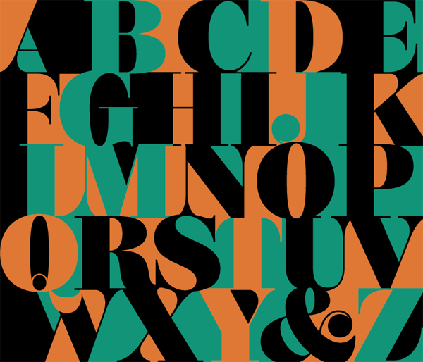
The Mastadoni typeface, a bold Didone display font family for headlines and striking titles.
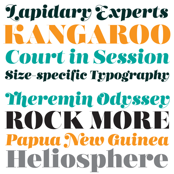
The Mastadoni font family is a new release from foundry Schizotype. Type designer Dave Rowland has created this typeface with the aim to produce a strikingly bold display serif font for headlines and titles with the high vertical contrast of Didone fonts.
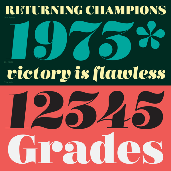
Mastadoni is a one weight family with five optical grades. Grade 1 is intended for the use in very large point sizes, while grade 5 is more suitable for smaller sizes. All five grades can be combined very easily. Mastadoni is an ideal serif typeface for decorative magazine layouts or special titles. You can also use it for logo designs and signage lettering. A big x-height and small cap-height as well as its shortened ascenders and descenders ensure a clear distinction from typical Didones.
Mastadoni offers some nice OpenType features. The family comes with standard ligatures and automatic fractions. Also case-sensitive forms are included in every font. In addition, Mastadoni is equipped with sets of contextual alternates and swashes. That’s only a rough overview. For detailed information on all typographic features, feel free and follow the link below.
You can get this family on Fontspring.
This outstanding display typeface is available for purchase on MyFonts.com
Check out more great fonts on WE AND THE COLOR. This area is packed with reviews of some of the best fonts you can find on the internet.


