.")
Today, we’re looking at the visual identity of the Leiria Film Fest‘s 12th edition, created by the Portuguese designer Paulo Graça. This identity does something truly special. It captures the essence of film not as a high-brow, exclusive art form, but as a universal language that speaks to everyone. With a beautifully illustrative and almost “naive” aesthetic, Paulo Graça has built a graphic universe that feels both nostalgic and refreshingly modern. Let’s explore how he did it.
The Soul of the Leiria Film Fest Visual Identity
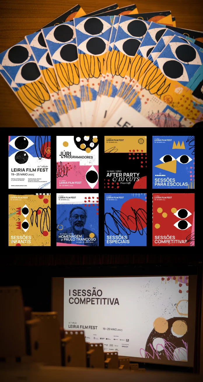
At its heart, the visual identity of the Leiria Film Fest is built on a foundation of simplicity. Think about children’s drawings. They are spontaneous, honest, and bursting with imagination. Paulo Graça taps into this very energy. He uses simple shapes and wonderfully imperfect, hand-drawn lines to create his visuals.
But there’s another layer here. These hand-drawn elements cleverly evoke the classic, tangible feel of physical film stock. You can almost feel the texture of the celluloid, the sprockets running through the projector. This beautiful duality creates a bridge. It connects the pure, uninhibited act of drawing with the imaginative act of filmmaking. Aren’t they both about bringing a story to life from a blank canvas? This handcrafted aesthetic celebrates the human touch in a digital world, reminding us that both creating and imagining are deeply personal gestures.
The Mind Behind the Magic: Who is Paulo Graça?
So, who is the artist behind this thoughtful design? Allow us to introduce you. Paulo Graça, also known as Senhor Paulinho, is a Portuguese art director, multidisciplinary graphic designer, and illustrator based in the historic city of Tomar. After graduating in multimedia design, his career has taken him through some of Portugal’s key creative hubs, including Lisbon, Leiria, Guimarães, and Porto.
If you look at his body of work, you’ll see a consistent thread. Paulo Graça’s design philosophy often centers on combining hand-drawn shapes with sharp graphic design. This signature style becomes a powerful tool for creating unique graphic identities for cultural events, stunning editorial designs for art catalogues, and memorable branding for a diverse range of clients. He is an artist who doesn’t just design; he draws, using art and culture as his ultimate wellspring of inspiration. It is this exact sensibility that makes his approach to the visual identity of the Leiria Film Fest so authentic and effective.
A Closer Look at the Hand-Drawn Charm
The design’s power isn’t just in its concept, but in its symbolic function. The goal was clear: bring children, young people, and adults closer to the cinematic experience. How do you do that? You create a visual language that is immediately accessible and emotionally resonant. You avoid cold, corporate graphics and instead offer warmth and personality.

This identity is a tribute. It’s a love letter to the mechanics of cinema—the projector’s light, the flicker of the moving image, and the collective visual memory we all share from watching films. The simple, character-like shapes feel like they could pop off the page and start moving. They are infused with a sense of play and wonder, directly reflecting the experience of sitting in a dark theater, ready to be transported to another world. This playful graphic design for festivals is a prime example of how to engage an audience emotionally.
Built for a Modern Festival: The Impact of Visual Identity on Cultural Events
A great idea is only as good as its execution. In today’s media landscape, a visual identity must be a chameleon. It needs to look just as good on a massive billboard as it does on a tiny phone screen or a festival tote bag.
The practical brilliance of this project lies in its versatility. Paulo Graça designed the visual elements to be completely scalable and adaptable. They work seamlessly across all platforms. You’ll see them on printed flyers, digital banners, festival merchandise, and the physical signage at the venues. This ensures that the festival’s communication is always coherent, impactful, and instantly recognizable. The consistent visual thread ties the entire experience together, making attendees feel like they are part of one cohesive, celebratory event. This shows the true impact of visual identity on cultural events; it’s not just decoration, it’s the glue that holds the entire brand experience together.
Beyond Promotion: Fostering a Lasting Connection
Ultimately, this work aspires to be more than just marketing. Great art direction doesn’t just sell tickets; it builds community. The visual identity of the Leiria Film Fest aims to spark curiosity and forge a genuine emotional connection with its audience. It’s a celebration of cinema’s timeless power to unite, inspire, and fire up our imaginations.
It sends a clear message: this festival is for you. It doesn’t matter your age or your background. It invites everyone to be part of a shared cultural moment that is as joyful as it is profound. The design doesn’t just announce an event; it creates a feeling of belonging.
This project stands as a powerful reminder that the most effective branding comes from a place of authenticity and human connection. It’s a beautiful example of how thoughtful graphic design can elevate an event from a simple screening of films to a memorable cultural celebration. What does this playful, imaginative design make you feel? Doesn’t it just make you want to go watch a movie?
All images © Paulo Graça. Feel free to find other inspiring graphic design, illustration, and branding projects on WE AND THE COLOR.


