
This post contains affiliate links. We may earn a commission if you click on them and make a purchase. It’s at no extra cost to you and helps us run this site. Thanks for your support!
Data visualization is a powerful tool that can help you make sense of complex data sets. In this course, you’ll learn how to turn data into beautiful and easy-to-understand infographics.
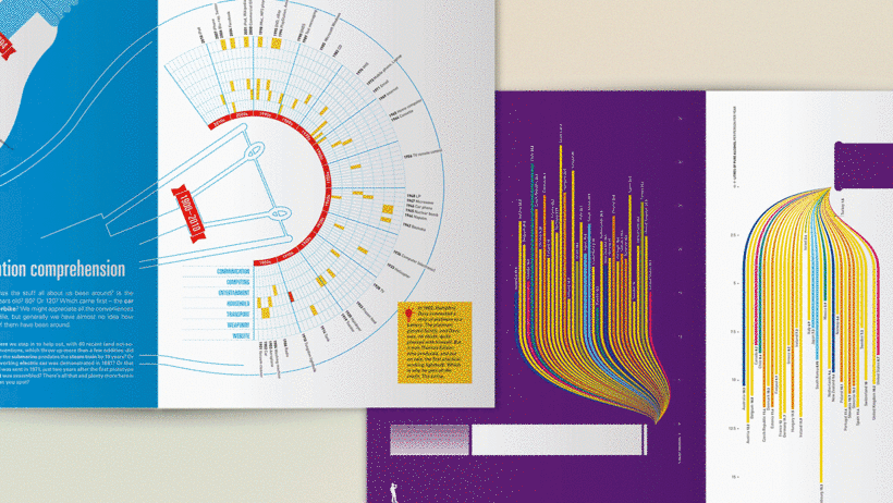
As writing and storytelling, data design is an integral way to communicate information in a digestible, visually-appealing way that encourages the viewer to learn more. Valentina D’Efilippo is an accomplished data designer and creative director who has worked with well-known companies such as Siemens, The Guardian, BBC, The Economist, Scientific American, and Harper Collins. She has also done projects for renowned organizations like the United Nations.
In this online course, Valentina will show you how to transform numbers and figures into captivating infographics from start to finish using Adobe Illustrator. Please read more below or click on the following link to take the course.
This is what you will learn in this online course.
In this course, you will be meeting Valentina D’Efilippo – designer and creative director. You will get to hear about her journey into the world of infographics as well as learn about what inspires her work. In addition, you will take a closer look at data visualization and receive an overview of the process behind gathering information and designing an infographic interpretation.
Valentina will take you through the process of data gathering and work with you on putting that information into a format that can be easily managed in Google Sheets. You will learn how to create a story based on numbers and flesh out design ideas by sketching a visual lexicon. Then, Valentina shows you how to bring your sketches to life by creating a digital prototype.
By the end of this course, you’ll know how to build the skeleton of a visualization, lay out all its components, add illustrations, and refine color and typography. You’ll also learn some tips on presenting your project for maximum impact and get some final advice on working collaboratively.

What project will I be completing in this course?
Find a multi-layered dataset and use it to create an infographic that is both creative and clear.
Who is this online course for?
If you want to do more than the default with numbers and statistics— if you’re a visual thinker, content strategist, marketing expert, developer, or designer—then this course is perfect for you.
Requirements
It would be advantageous to have some understanding of Adobe Illustrator prior to enrolling in this class. Although, if you don’t regularly use it, Adobe Illustrator offers a free trial period.
Do not hesitate to find more online courses on WE AND THE COLOR.
Subscribe to our newsletter!


")


