This post contains affiliate links. We may earn a commission if you click on them and make a purchase. It’s at no extra cost to you and helps us run this site. Thanks for your support!
Beyond the Paper: Unpacking GraphyPix’s Interactive Resume Template
Imagine a resume that doesn’t just sit there, a static piece of paper. Instead, picture it as an engaging, interactive experience, almost like a mini-website dedicated to showcasing your unique skills and personality. That’s exactly what GraphyPix has designed with this impressive digital resume template. Forget the standard, predictable Word document – this is a whole different ballgame. It’s a shift from the traditional to the dynamic, designed for the modern professional, especially those in creative fields. This template isn’t just about listing your qualifications; it’s about telling a story, and that story, through its structure, is designed to engage the viewer from the very first moment. Now, does that shift in perspective make you think differently about resumes?
Please note that this template requires Adobe InDesign installed on your computer. Whether Mac or PC, the latest version is available on the Adobe Creative Cloud website—take a look here.

This template is more than just a simple layout; it’s a thoughtful, carefully constructed tool that aims to make a lasting impression. It’s designed to make the resume process feel less like a chore and more like an opportunity to truly showcase one’s abilities. The template is designed to let users put their best professional foot forward, combining visual appeal with functional design. What do you make of that goal?
It encourages a more visual approach to presenting professional information. It makes a statement about the user’s ability to think outside the box, a subtle nod to the innovative nature of creative professions. This makes one really start to consider, whether is the resume a simple piece of paper anymore. It’s meant to be a platform to express your unique professional brand. Now, isn’t that an intriguing concept?
What Makes It Tick?
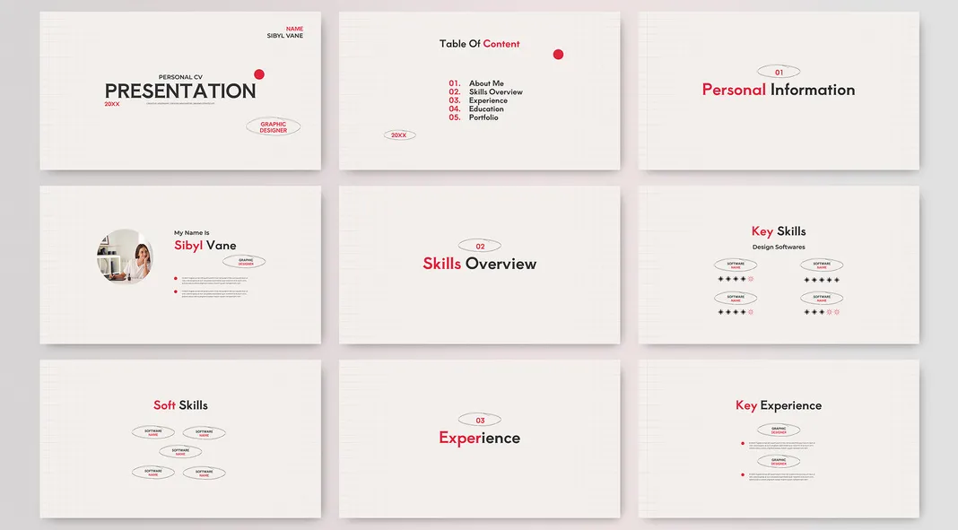
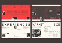
The template rocks a clean, modern vibe. Think lots of white space. This makes it easy on the eyes. There is a structured grid layout. It provides a sense of order. The pops of red add a nice visual punch. It draws attention to key areas. What do you think of that design choice?
A Multi-Page Story
This isn’t a single-page affair. It’s a journey through 22 pages. Each has a clear purpose. You will find sections for personal info, skills, and experience. There’s even space for your portfolio! Do you think this approach is beneficial?
Tailored for Creatives
The look screams “creative.” Think marketing experts and designers. The design really fits that mold. It is stylish and engaging. It’s not your standard corporate layout. Do you see how it would attract a particular kind of employer?
Customization is Key
Everything is editable. You can change all images and text. It’s made in Adobe InDesign. People familiar with that program can dive right in. This makes it super flexible. Are you someone who likes having that much control?
Visual Appeal
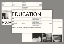
The pages use images sparingly. The images present are thoughtfully placed. It gives off a professional tone. There are a few photo placeholders. These show how you can present yourself. There are also image areas for your projects. These are great for showcasing work. Do you notice how the images help with the overall feel?
Functional Layout
The resume is structured into different sections. This helps create organization. There are slides for “About Me”, “Skills Overview”, and “Experience.” It also offers project pages. This is ideal for displaying design work. There are sections for education and language skills. Even a “thank you” page is included. There is a page for contact information. Did you catch the variety of elements it covers?
The Font Choice
The font is clear and sans-serif. This helps with readability. It is modern without being trendy. The headings use a more bold font. This helps separate them from the main text. Can you see how fonts affect the overall impression?
Designed for Screens
It is 1920 x 1080 px. This makes it perfect for screen presentations. It can also work for online job applications. It looks clean on any display. Think of how different this is from traditional paper resumes.
A Few Things to Note
The template uses a grid system. This helps create a sense of balance. It’s not just a bunch of elements thrown together. Each page feels intentional. All texts are just placeholders. This lets the user know how their content will look. It is all set to be easily adapted. Are you starting to visualize how you would use it?
This resume template lets you create a dynamic presentation. It blends function and aesthetics. It is ideal for those in the creative world. Do you agree? I think it’s a pretty effective option!
All images © by GraphyPix. What other things do you notice about it? I’m curious to hear your thoughts! You can find more trending graphic design templates in the reviews on WE AND THE COLOR.
Subscribe to our newsletter!

