This post contains affiliate links. We may earn a commission if you click on them and make a purchase. It’s at no extra cost to you and helps us run this site. Thanks for your support!
The Futura font family by Paul Renner.
Futura is one of the best-known sans serif fonts. The typeface was created by German font designer Paul Renner and initially published by Bauer Type Foundry in 1928. Futura’s look originated from the Constructivist orientation of the Bauhaus movement in Germany.
Paul Renner sketched the original drawings based on simple geometric shapes such as circles, triangles, and squares. With the help of the Bauer Type Foundry, Paul Renner turned these sketches into a sturdy and functional sans serif font family. Over the years, various optimizations resulted in an even more legible type family. Long ascenders and descenders are very characteristic for this typeface. A large number of weights and styles make it a very versatile family for both headlines and texts.
The Futura font family is timeless in every sense. At its launch in 1928, the typeface was considered as strikingly new as well as tasteful and radical. Nowadays, it’s still one of the most popular sans serif typefaces, which is often used for elegant and clear typography.
This publication by foundry Linotype includes a web font and desktop version of the entire family.
You can buy the complete type family on MyFonts.com
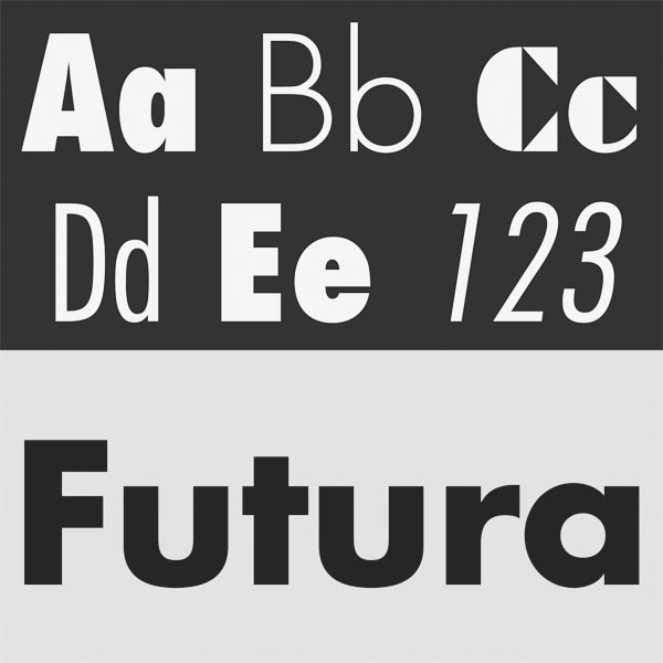
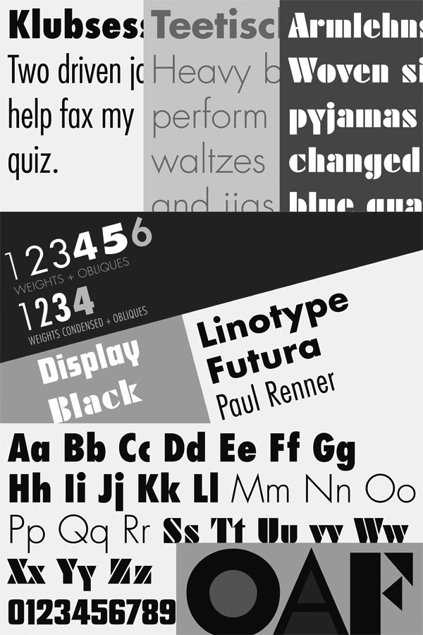
The complete Futura font family is available for purchase on MyFonts


