This post contains affiliate links. We may earn a commission if you click on them and make a purchase. It’s at no extra cost to you and helps us run this site. Thanks for your support!
One thing upfront: dopamine decor can look pretty cheap if you get it wrong. Buyers often grab ten bright objects and park them around a gray sofa. Then they wonder why nothing sings. Color without hierarchy reads as clutter, and clutter lifts nobody’s mood. This guide fixes that with a four-part system I call the Joy Stack.
Here is my position. Dopamine decor is a real method, but most of what retailers sell under the name is shopping, not design. The timing makes this a good moment to say so. Pantone named a white, Cloud Dancer, its color of the year for 2026. Paint brands pushed espresso and khaki. Yet dopamine decor kept spreading anyway.
What Is Dopamine Decor, Exactly?
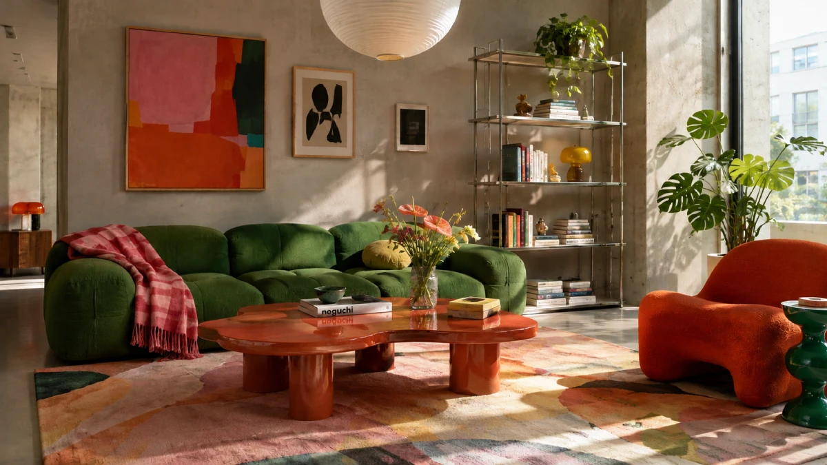
Dopamine decor is a decorating method that chooses color and objects by the feeling they trigger at the door. Match comes second. Mood comes first.
The name borrows from dopamine dressing, the fashion idea that bright clothes lift your mood. The interior version spread on TikTok, where #dopamineroom collected millions of views. By 2026, every big retailer had a dopamine decor edit.
Maximalism describes how much sits in a room. Dopamine decor describes why each piece sits there. A maximalist room can feel joyless. Likewise, a quiet room can follow the method if one chosen object makes you smile every morning.

Does Dopamine Decor Actually Change Your Brain Chemistry?
The name oversells the science. Dopamine drives wanting and anticipation more than pleasure itself. No paint chip injects it. I know of no study that measured dopamine release from a painted wall.
Research on color and mood is mixed, and it leans on personal association. That actually helps dopamine decor. It rewards you for choosing what you love instead of what a chart prescribes.
Why Is Dopamine Decor Still Growing in October 2026?
Look at the paint aisle first. Pantone announced Cloud Dancer (PANTONE 11-4201, #F0EEE9) on December 4, 2025. It is the first white the program has ever picked. Benjamin Moore chose Silhouette AF-655, an espresso brown. Sherwin-Williams chose Universal Khaki SW 6150. The industry sold calm.
Meanwhile, social feeds kept voting for color. I call this the Cloud Dancer Paradox. Quiet walls and loud objects rise together, because a calm backdrop makes a bold piece readable. So the white trend and the dopamine decor trend are partners, not rivals.
Numbers back the mood. One UK poll of 2,000 homeowners found that 57 percent believe their interiors affect their mood in winter. Another 46 percent said they are bored with white, gray, and beige schemes. Treat the poll with care, because a wallpaper brand commissioned it. Still, the direction is hard to ignore.
Here is the irony. Trend fatigue should kill dopamine decor. Instead, the look survives because it asks for a personal object, not a trending one.

The Joy Stack Gives Dopamine Decor a Hierarchy
The Joy Stack splits any room into four layers by visual weight. The ratio is 40/30/20/10. Field takes 40 percent, Rest 30, Pulse 20, and Anchor 10. You do not need a tape measure. Squint at the room and judge the proportions by eye.
Field (40 Percent): The Dominant Color
Field is the biggest block of color. Usually that means walls. Sometimes it means a sofa or floor-to-ceiling curtains. Pick one hue and stay loyal to it. Cobalt (#0047AB) and tangerine (#F28500) both work. Rainbow Fields look like a toy aisle.
Prep matters more than the color itself. Saturated yellows and oranges hide poorly, so apply a gray-tinted primer first. Then expect three coats. Choose eggshell, because flat marks too easily and gloss exposes every wall flaw. A 12-by-14-foot room with 8-foot ceilings takes about two gallons for two coats.
Rest (30 Percent): The Quiet Layer
Rest is where the eye stops. Warm white works best. Cloud Dancer (#F0EEE9) is the obvious pick, and I will defend it against its critics. Paint stores sell near matches, such as Benjamin Moore Simply White OC-117 and Sherwin-Williams Alabaster SW 7008. Oak and linen also count as Rest.
Critics mocked Cloud Dancer as bland. They missed the point. Bland is the job description. A loud room with no Rest feels like a shop window.
Pulse (20 Percent): Repeating Accents
Pulse is the secondary color and pattern layer. Cushions, vases, lampshades, and rugs live here. The governing law is the Rule of Echo. Every strong color must appear at least twice, at two different heights. A cobalt vase on a shelf needs a cobalt stripe near the floor.
Patterns follow scale. Pair one large pattern with one small pattern. A third pattern needs a middle size. Two patterns at the same scale read as a mistake.
Anchor (10 Percent): The Object That Leads
Anchor is the one object you chose with your gut. It could be a lacquered 1970s armchair. It could be a shelf of ceramic faces. Choose the anchor first, then pull the field from its color. Reverse the order, and the room feels like a catalog.
Anchors work because they carry a story. A secondhand Murano glass lamp tells you where you found it, who sold it, and what you paid. A new lamp tells you nothing. Stories do not wear out, which matters later in this guide.
Run a simple test. Imagine moving across town with only what fits in your arms. If the object makes the cut, it is your Anchor. If three objects make the cut, pick the one that annoys your decorator friends most.
How Loud Should Dopamine Decor Get in Each Room?
Use the Volume Dial. It runs from 1 for a whisper to 5 for a shout. It is my own scale, so treat it as a starting point.
- Entry hall and bathroom, Volume 5. Small rooms forgive intensity, and you spend little time there.
- Kitchen and living room, Volume 4. These rooms host people, so the color should talk.
- Home office, Volume 3. Bright Pulse works, but a saturated field behind your monitor tires the eye.
- Bedroom, Volume 2. Sleep needs a lower setting.
Dopamine Decor Bedroom Ideas for Light Sleepers
Put Pulse on bedding you can swap. Keep the wall behind the bed deep and low in chroma, such as bottle green or plum. Skip lemon and tangerine on bedroom walls. Finally, choose warm 2700K bulbs, because dopamine decor in a bedroom should follow the dusk.
Dopamine Decor for Renters Who Cannot Paint
Start with the biggest textile you can take with you. A 5-by-8-foot rug sets the field in one afternoon. Next, add removable wallpaper on one wall. It peels off cleanly from most painted drywall, though you should test a hidden patch first.
Then swap lampshades and curtains. Finally, change the bulbs. Use 2700K LEDs with a CRI of 90 or higher, so saturated colors look true instead of muddy. Cool 4000K bulbs flatten warm hues and make chartreuse look harsh.
Which Dopamine Decor Colors Work Best This Fall?
Autumn pulls the palette toward richer, layered tones. Burnt orange (#CC5500) and deep plum replace last spring’s lemon and hot pink. Add one acid note, chartreuse (#DFFF00), for tension. Keep it small. One chartreuse lamp does the work of ten lime cushions.
Bottle green and cobalt also hold up in low autumn light. So the classic dopamine decor colors still apply. They just run deeper now.
The Spike-and-Fade Problem With Dopamine Decor
Here is my sharpest criticism. People adapt to new stimuli quickly, and psychologists call this hedonic adaptation. A neon cushion delivers a spike on day one. Within weeks, it fades into the furniture.
I call the pattern Spike-and-Fade. Bought novelty gives a quick lift, then decays, and that pushes buyers to purchase again. The cycle feeds retailers, not rooms. A matched set of eight neon accessories sold as dopamine decor contradicts the method it advertises.
The remedy is boring and effective. Buy fewer objects, and buy ones with stories. Hunt flea markets and your own closets. Anchors outlast cushions because you remember where you found them.
Where Is Dopamine Decor Heading in 2027?
These are forecasts, not facts. I stand behind each one.
- Single-hue rooms will beat multicolor rooms. Drenching a space in one color is easier to get right.
- Warm white will become the default rest layer in Cloud Dancer or its cousins.
- Collections will replace kits. Expect shelves of personal objects to dominate feeds.
- The phrase “dopamine decor” will splinter into narrower terms, while the Joy Stack logic stays.
Dopamine Decor at a Glance
| Term | Meaning | Rule of thumb | Example |
|---|---|---|---|
| Dopamine decor | Choosing color and objects by the feeling they trigger at the door | Mood first, match second | A cobalt wall with a thrifted lamp |
| Joy Stack | Four layers split by visual weight | 40/30/20/10 | Field, Rest, Pulse, Anchor |
| Field | The dominant color block | One hue only | Tangerine #F28500 walls |
| Rest | The quiet layer where the eye stops | Warm white, about 30 percent | Cloud Dancer #F0EEE9 |
| Pulse | Repeating accents in color and pattern | Rule of Echo: twice, at two heights | A cobalt vase and a cobalt rug stripe |
| Anchor | The one object chosen by gut | Pick it first, and build the palette from it | A lacquered 1970s armchair |
| Volume Dial | Room intensity from 1 to 5 | Bedroom 2, hallway 5 | Plum bedroom wall, tangerine hallway |
| Spike-and-Fade | Bought novelty that decays within weeks | Buy fewer objects with stories | A flea-market lamp |
| Cloud Dancer Paradox | Calm walls and loud objects rise together | Quiet backdrop, loud piece | White walls and an orange sofa |
Common Questions About Dopamine Decor
What is dopamine decor?
Dopamine decor is a decorating method that chooses color and objects by the feeling they trigger at the door. It favors saturated hues and personal objects over matching sets.
Is dopamine decor the same as maximalism?
No. Maximalism describes how much sits in a room. Dopamine decor describes why each piece earns its place. A maximalist room can feel joyless, and a restrained room can follow the method.
Does dopamine decor really boost dopamine?
Probably not in a measurable way. Dopamine relates to anticipation and motivation, and I know of no study that tracked its release from decor. The mood benefit comes from color and from personal meaning.
What are the best dopamine decor colors?
Cobalt (#0047AB), tangerine (#F28500), deep pink (#FF1493), and chartreuse (#DFFF00) anchor the classic palette. Fall adds burnt orange (#CC5500) and deep plum. Pick one as your Field and keep the rest as Pulse.
Is dopamine decor still in style in 2026?
Yes. It is growing this October, even though Pantone picked a white. Expect it to splinter into narrower terms through 2027.
How do I start dopamine decor in a small apartment?
Buy a 5-by-8-foot rug in your Field color. Then swap every bulb for a 2700K LED with a CRI of 90 or higher.
Browse WE AND THE COLOR’s Interior Design category for more.
Subscribe to our newsletter!