This post contains affiliate links. We may earn a commission if you click on them and make a purchase. It’s at no extra cost to you and helps us run this site. Thanks for your support!
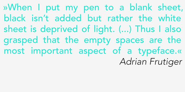
The Avenir font, a sans serif type family.
Avenir is a classic sans serif font family designed in 1988 by the legendary Swiss font designer Adrian Frutiger (Type Foundry: Linotype). The French word “Avenir” means “future” and refers to the similarity to the Futura family. But Avenir is not a purely geometric font. Its vertical strokes are thicker than the horizontals, the “O” is not a perfect circle, and the ascenders are slightly shortened. These makes Avenir a very legible font that you can use for both headlines as well long and small text. This linear grotesk type family consists of 6 weights plus matching italics and is available as Webfont and Desktop font.
Other well-known fonts by Adrian Frutiger are for example: Univers, Frutiger, Linotype Didot, and Glypha.
Buy the Avenir font family on MyFonts.com


The Avenir type family is available for purchase on MyFonts.com
Check out more recommended fonts here.


