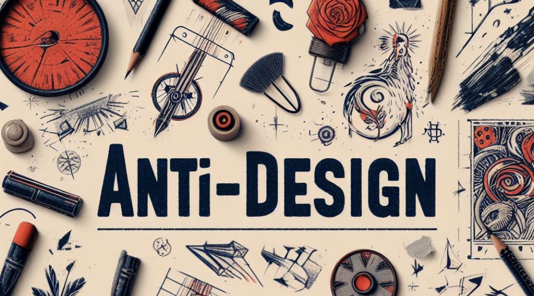
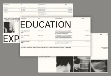
In design, where sleek minimalism and pixel-perfect aesthetics often reign supreme, there exists a rebellious movement that defies convention. This movement is known as anti-design—a celebration of imperfections, chaos, and unfiltered creativity. Let’s delve into the fascinating world of anti-design, where torn edges, hand-drawn elements, and rebellious layouts take center stage.
What Is Anti-Design?
At its core, anti-design is a deliberate departure from the polished and predictable. It rejects the notion that design must adhere to rigid rules, symmetry, and flawless execution. Instead, it revels in the messy, the unexpected, and the imperfect. Here are some key characteristics of anti-design:
- Imperfections as Features: In anti-design, flaws are not flaws—they’re features. Crooked lines, smudges, and rough edges become part of the design language. These imperfections inject personality and humanity into the work.
- Chaos and Spontaneity: Anti-design thrives on spontaneity. It’s as if the designer threw caution to the wind, allowing ideas to flow freely without overthinking. The result? Unconventional compositions that surprise and engage the viewer.
- Raw Authenticity: Anti-design rejects the glossy veneer of commercialism. It favors authenticity over pretense. Whether it’s a hand-scrawled font or a collage of found objects, the rawness speaks volumes.
- Torn Paper and Collage: Torn paper edges evoke memories of childhood crafts. In anti-design, torn paper isn’t a mistake—it’s deliberate. Collages made from disparate elements—magazine cutouts, fabric scraps, old photographs—create visually rich narratives.
- Hand-Drawn Elements: Precision gives way to the organic. Hand-drawn illustrations, doodles, and scribbles infuse warmth and intimacy. These elements remind us that a human hand was behind the creation.
- Rebellious Layouts: Forget the grid. Anti-design layouts defy alignment. Text may overlap images, and whitespace becomes a playground. It’s a rebellion against the rigid confines of traditional design grids.
Why Anti-Design Matters
- Authentic Connection: In a world saturated with cookie-cutter visuals, anti-design stands out. It invites viewers to look closer, to engage with imperfections, and to connect on a deeper level. Authenticity resonates.
- Breaking the Mold: Anti-design disrupts the status quo. It challenges established norms and pushes boundaries. By doing so, it sparks conversations and inspires other designers to think beyond the expected.
- Embracing Unpredictability: Life isn’t perfect, and neither should design be. Anti-design acknowledges the messiness of existence—the happy accidents, the scribbles, the torn pages. It celebrates the beauty in chaos.
- Human-Centric Design: Anti-design reminds us that design serves people, not the other way around. It’s a celebration of our humanity, quirks and all. When we see imperfections, we see ourselves.
How to Incorporate Anti-Design Elements
- Start with Intention: Embrace imperfections intentionally. Tear paper, scribble, and experiment. Let go of the need for everything to be flawless.
- Mix Media: Combine digital and analog elements. Scan hand-drawn sketches, incorporate textures, and layer them in your designs.
- Play with Typography: Experiment with irregular fonts, overlapping letters, and unconventional alignments. Let the text breathe.
- Break the Grid: Push elements off-center. Create asymmetry. Surprise your audience.
- Celebrate the Unfiltered: Use found objects, old photographs, and textures. Let the rawness shine through.
Anti-design isn’t about chaos for chaos’s sake—it’s about embracing the messy, the real, and the beautifully imperfect. So, the next time you design, channel your inner rebel. Tear that paper, scribble freely, and create something authentically human. After all, imperfections are what make us interesting, both as designers and as individuals.
Remember: In a world of glossy perfection, a little anti-design goes a long way. 🎨✂️🖋️
Feel free to find other inspiring design topics on WE AND THE COLOR.

