Graphic Design Grids: Why Modular Grids Still Matter in Contemporary Design
Grids are one of the most misunderstood tools in graphic design. Many outside design education view them as rigid frameworks that restrict creativity. Yet inside design schools and professional studios, grids are taught as the silent architecture of a layout. They create rhythm, coherence, and meaning. Among them, the modular grid remains one of the most powerful, though it is rarely discussed outside academic circles.
Why is this relevant now? Digital platforms, from responsive web design to variable typography, demand systems that adapt without losing clarity. Designers are rediscovering the value of modular grids not as relics of Swiss modernism but as adaptable structures for today’s flexible media landscape.
What Is a Modular Grid in Graphic Design?
A modular grid divides a page or screen into consistent horizontal and vertical modules. Unlike simple column grids, modular grids form a matrix of squares or rectangles that can hold text, images, or graphic elements.
Think of it as scaffolding: the grid organizes information, but it does not dictate the final form. Designers can stretch across modules, combine them, or leave them empty to create dynamic white space. This flexibility makes modular grids ideal for magazines, complex websites, and design systems where hierarchy and order must coexist with variety.
Why Modular Grids Are More Than Alignment Tools
Most casual guides reduce grids to alignment devices. In practice, they are much more.
- They establish rhythm. By repeating units, modular grids create visual tempo that guides the eye.
- They ensure hierarchy. Designers use different module combinations to emphasize or downplay content.
- They balance freedom with control. A designer can break the grid deliberately, but the underlying system ensures cohesion.
- They adapt to responsive design. Modules scale more elegantly across devices than rigid column structures.
The modular grid is not about creating sameness. It is about building relationships between elements, so the reader moves through a page with clarity and confidence.
How to Build a Modular Grid Step by Step
Many designers encounter modular grids for the first time in design school. The process is methodical but surprisingly intuitive once understood.
1. Define the Format
Start with the dimensions of the medium — print page, poster, or screen resolution. Every grid begins with boundaries.
2. Establish Margins and Gutters
Margins frame the content area. Gutters separate modules. The proportions here affect how open or dense the layout feels.
3. Subdivide the Page
Divide the content area vertically and horizontally into equal modules. The number of divisions depends on the complexity of the project. A magazine spread might use a 12 × 12 module grid, while a simple poster could work with 4 × 4.
4. Test Content in Modules
Place headlines, body text, and images into modules. Combine multiple modules for larger elements. Test several variations.
5. Break the Grid Intentionally
After mastering alignment, consider breaking it. A headline spilling over modules, or an image shifted off-center, gains power because the system makes the disruption noticeable.
Why Breaking the Grid Works Only With a Grid
A critical insight often missed: breaking a grid only has impact when the grid exists in the first place. Without an underlying structure, a “freeform” design looks chaotic. With a grid, disruption becomes a statement.
This principle explains why so many influential layouts — from early Bauhaus experiments to contemporary editorial design — succeed. They are grounded in order, yet they carry energy through strategic imbalance.
Modular Grids in Digital and Responsive Design
Today, modular grids extend far beyond print. Web and app designers rely on them for consistency across devices. CSS frameworks such as Bootstrap or Tailwind essentially apply modular grid thinking, though often without naming it.
Why does this matter? Because responsive design requires scalable systems. A column-only approach often collapses awkwardly. Modular grids allow designers to think in flexible blocks, which adapt more gracefully to screens from phone to desktop.
This adaptability makes modular grids especially relevant for design systems, where branding must remain coherent across hundreds of touchpoints.
Expert Commentary: Why Modular Grids Still Matter
Some argue that modern design software makes grids obsolete. Auto-layout tools, AI-assisted design, and algorithmic composition reduce the need for manual structuring. Yet this perspective misses the essence of grids.
Grids are not about software efficiency. They are about design thinking. They teach visual discipline, spatial awareness, and typographic sensitivity. These skills remain indispensable, even if AI tools become more advanced.
From a personal standpoint, modular grids are one of the few methods that consistently improve a designer’s work. They force decisions about proportion, rhythm, and negative space. They also reveal the difference between decoration and structure. A design without a grid may look appealing, but it rarely holds up under scrutiny or across variations.
Practical Tips for Designers Exploring Modular Grids
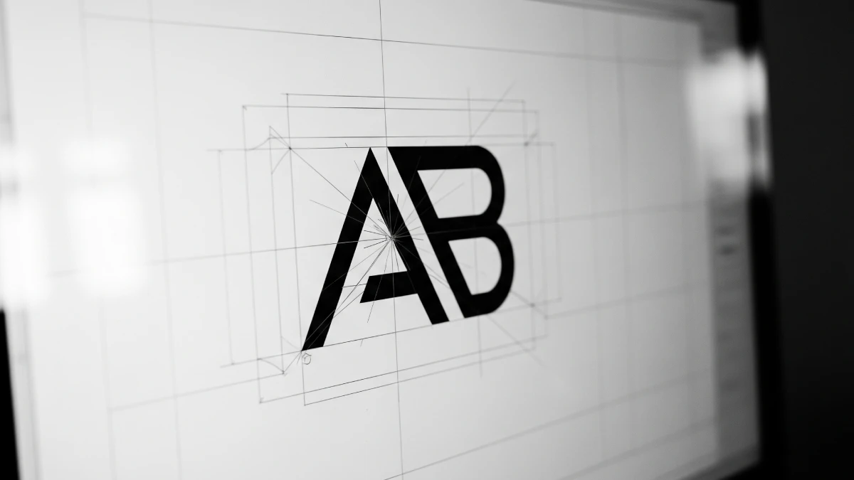
- Start with sketching. A pencil and paper often reveal grid logic faster than software.
- Experiment with ratios. Not all modules must be square. Play with rectangles based on the golden ratio or other proportions.
- Use emptiness. Leaving modules blank strengthens rhythm and prevents clutter.
- Build systems, not layouts. Think of grids as reusable frameworks, not one-time solutions.
The Grid as a Living Framework
The modular grid is not a relic of 20th-century modernism. It is a living framework that continues to shape contemporary graphic design. Whether in print or digital, grids provide clarity while allowing space for experimentation.
For designers seeking to refine their craft, mastering the modular grid is essential. It sharpens perception, trains discipline, and creates systems that endure. When used thoughtfully, it transforms layouts into experiences that feel structured yet alive.
Feel free to browse WE AND THE COLOR’s Graphic Design section for more inspiring topics.


