Let’s have a look at 8 graphic design trends in 2019.
With every passing year, design changes and evolves. And if you want to bring a fresh, innovative perspective to the table (whether you’re a designer, a creative, or just someone who loves design) you need to stay on top of the graphic design trends that are making waves in the design world.
But what will those graphic design trends look like? What will the theme of new and evolving design be in 2019? As it turns out, it seems that graphic design trends for 2019 are following a pattern of contradiction. Trends from across the map—different time periods, different design styles, different ends of the visual spectrum—are making their presence known, lending a distinctive feel to designs across multiple mediums.
Everything in 3D
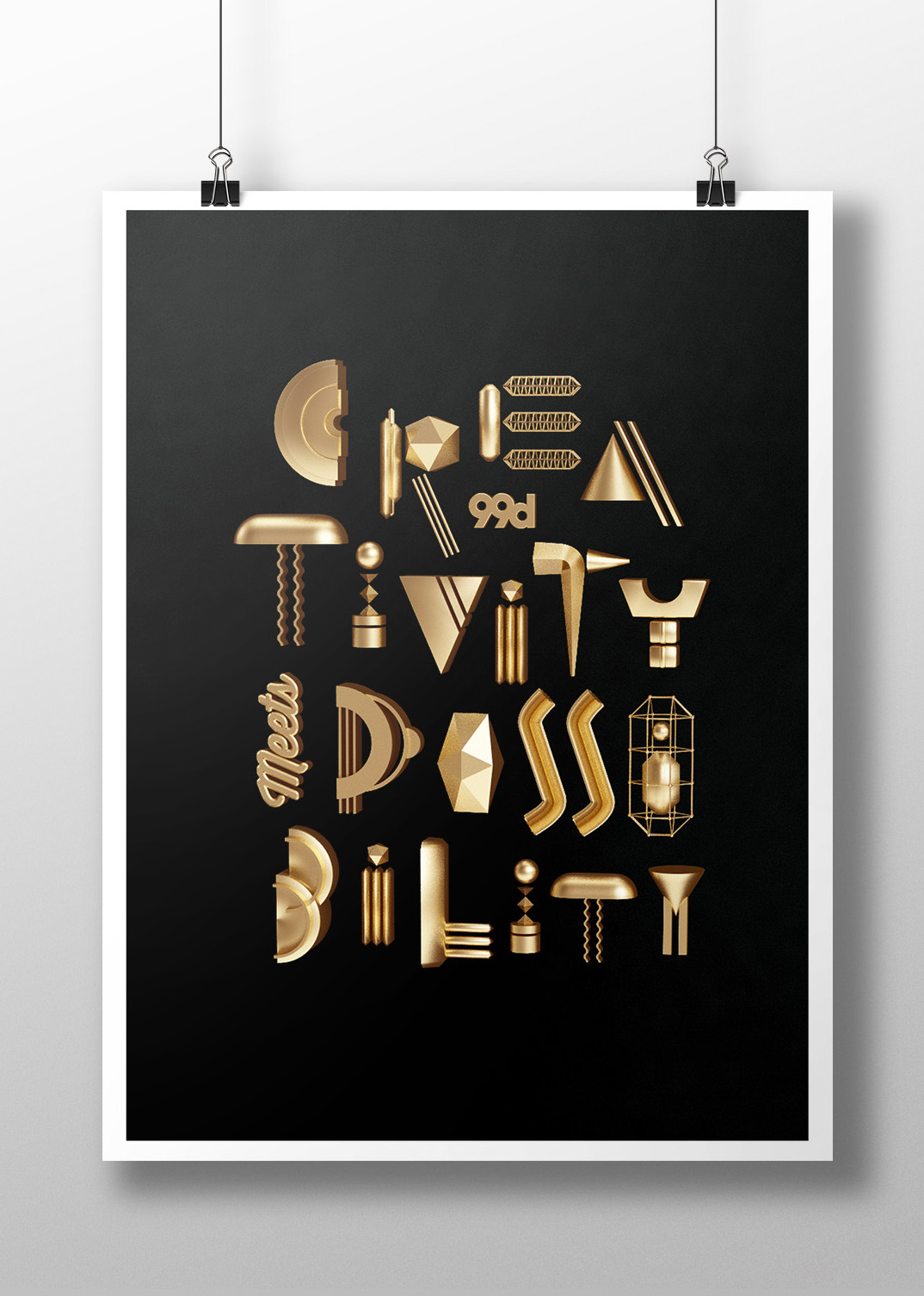
Flat design certainly had its moment—but in 2019, it’s all about bringing things into 3D. Typography, in particular, is seeing a major shift from flat designs to fonts that look as though they’re about to jump off the page. Designers are embracing 3D typography because it’s versatile; this trend is equally effective with bold or skinny, serifs or sans serifs, scripts or graphics—any font can be rendered (and rendered effectively) in 3D.
But typography isn’t the only place 3D is making an appearance. Compositions offer designers a place to experiment with different 3D elements, creating stunning visuals that seem ready to come alive. Designers are leveraging different textures (like Issey Miyake’s work for Pleats Please, which combines images of food and textiles), techniques (like the papercut illustrations by Eiko Ojala), and design elements (like Pinch Studio’s technicolor pop art) to create truly unique 3D designs that make it impossible to look away.


Asymmetrical layouts
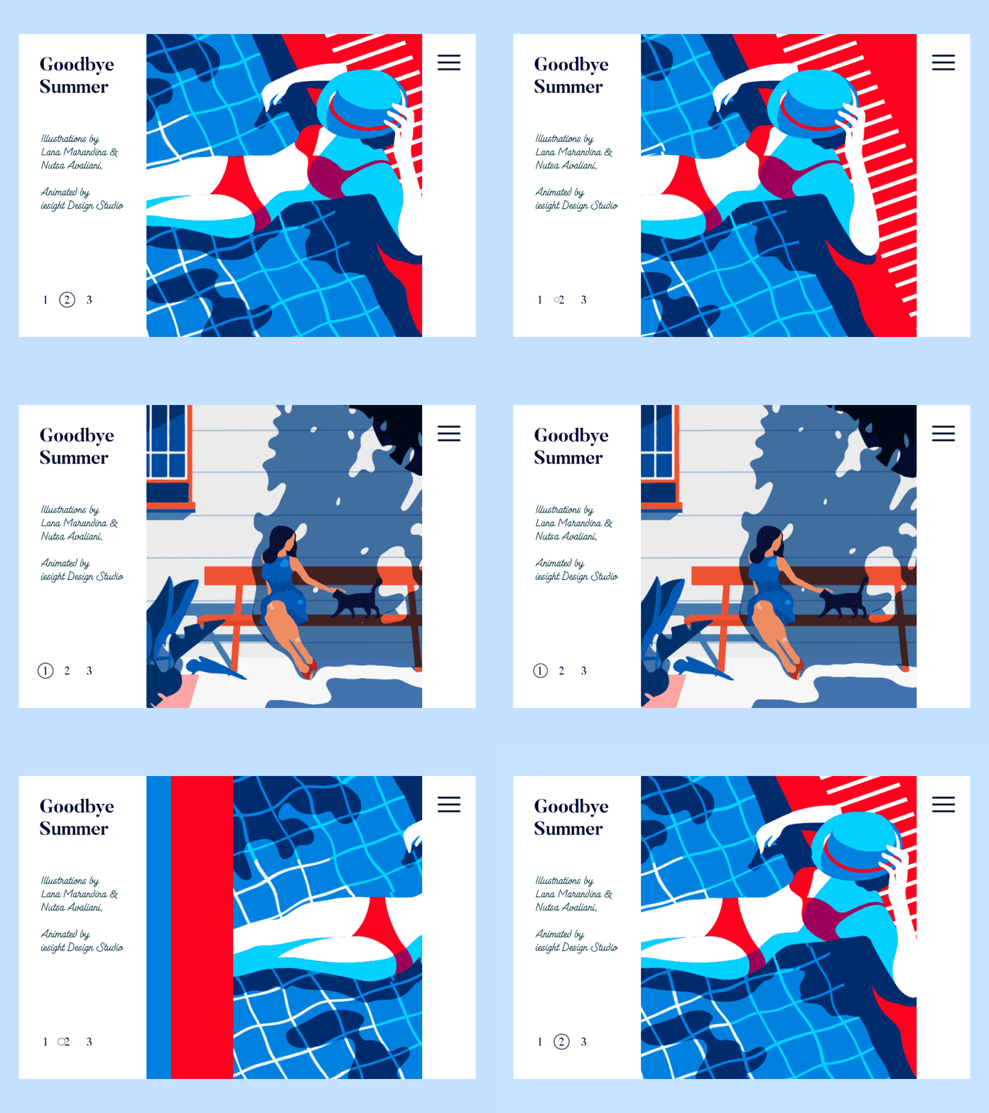
Thanks to template-based design sites like Squarespace and Canva, a rigid, grid-based design format has become the standard over the past few years. But it seems as though designers have had enough of working in these strict confines—and in 2019, they’re looking for a way to create products that feel more distinctive, different, and unique.
Asymmetrical layouts offer designers to move away from the rigid (and predictable) grid to create more distinctive designs that better capture energy and movement. These designs are unexpected; whether users are interacting with it in an app, on a website, or in a design composition, asymmetrical layouts grab their attention and spark a level of curiosity that’s hard to capture with grid-based designs. Asymmetrical layouts also give designers more freedom to arrange different design elements and information in way that feels authentic to their vision—which makes the entire process more creatively fulfilling.

The resurgence of art deco…
Art deco is as synonymous with the roaring twenties as flappers and prohibition—but this highly ornamental and glamours design style is set to experience a major resurgence in 2019.
Expect Gatsby-inspired metallics; narrow and leggy sans-serif that look like they’re straight from a classic Cassandre poster design; and the embracing of all things opulent and luxurious in designs, from texture to color to font styles—a stark contrast to the rustic, country-inspired work that’s taken center stage the past few years.


…and Mid-century modern
Interestingly, Mid-Century Modern—which, with its clean lines and stripped-down look, is widely considered the design world’s functional response to the flashiness of the Art Deco period—is also seeing a renaissance in today’s design landscape.
This trend is especially prominent in the illustration world. The iconic illustrations that were embraced by the advertising world in the post-War era are now being embraced by start-ups and small companies. Custom illustrations with soft, vintage color palettes are popping up everywhere from print to web to advertising—a trend we expect will continue well into 2019.

The duotone gradient
Gradients were arguably the most visible design trend of the 90s. But gradients (sometimes rebranded as “color transitions”) have been experiencing a serious resurgence over the past few years—and it looks as though that trend is going to continue well into 2019.
While you can expect to see more traditional gradients in the upcoming year (especially in logo designs), the most interesting way it’s set to be used? With duotones. Thanks to Spotify’s now-iconic playlist covers—which combine the parallel duotone and gradient trends—2019 is shaping up to be the year of the duotone gradient.

Moody, vintage color palettes
Saturated, bold duotones are definitely a trend—but, because 2019 is the year of the contradiction, so are moody, vintage tones.
This year’s color palettes have a muted, retro feel—reminiscent of the days when screens and cameras couldn’t capture deep, saturated colors (think the low-fi photography of the 70s, the vintage camcorder footage of the 80s, or the current day Stranger Things phenomenon). The hottest color palettes of 2019 will incorporate a certain amount of black into each color, creating a warm, wistful, nostalgic vice that neons just can’t compete with.

Open compositions
For years, boxes and frames have encased every element of designs, with each part visible and easily accounted for. But this year, designers are leaving more things to the imagination—and embracing a more open approach to compositions.
Open compositions are the designs you look at and feel like you’re only seeing a piece of the puzzle; that you’re only seeing a small part of the world the designer has created—and that world actually stretches far beyond the confines of the page.
These compositions don’t worry about clear hierarchy. The elements can feel chaotic and haphazard, but they’re anything but—each element (including whitespace) is strategically used in a way to contributes to the openness and freedom of the composition.
Isometric design
Open compositions spark creativity in the user, leaving an entire off-the-page universe to the imagination. Isometric design does the opposite, composing entire universes in tiny spaces.
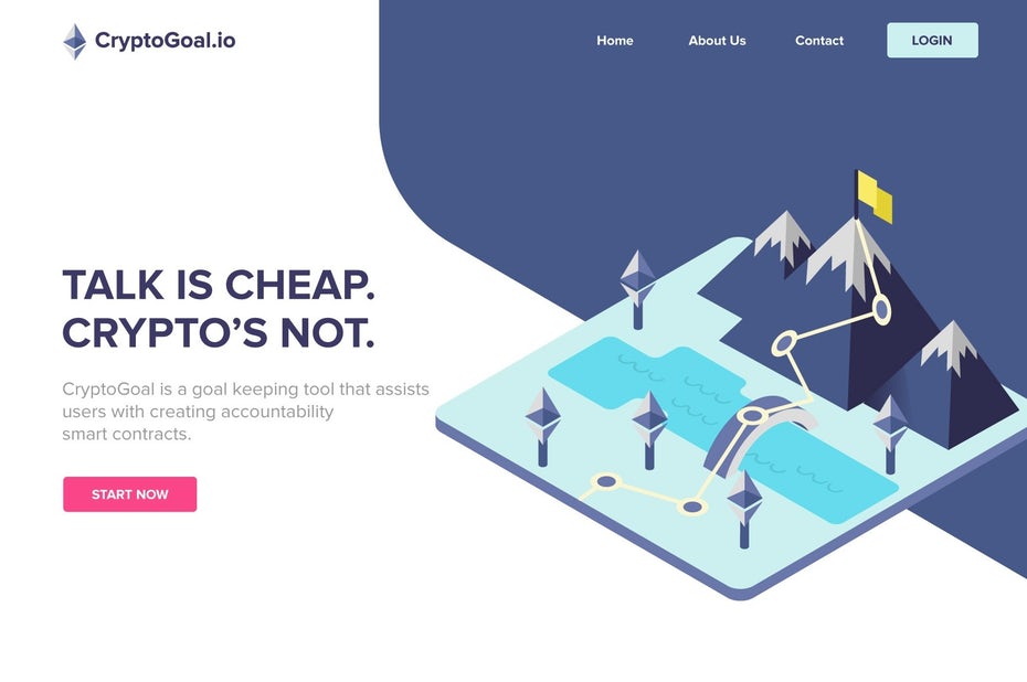
Isometric design sounds complex, but it’s a simple method of drawing a 3D object in two dimensions—which creates a depth that you won’t find in flat design.
Not only does this simple and clean drawing style lend a vibrant, lively feeling to designs, but it also saves to a much smaller file size than 3D—making it a popular trend for icon designs looking to get all the bang of a three-dimensional design without the lag time.
Embracing the graphic design trends of 2019
2019 is shaping up to be an interesting and innovative year in the world of graphic design. With so many contradictions taking center stage—art deco flashiness and mid-century functionality, duotones and vintage color palettes, open compositions and isometric designs—designers will have the opportunity to flex their creative muscles and create truly one-of-a-kind designs.
If you’re a designer, there’s plenty of design inspiration headed your way in the upcoming year. If you’re a company, hire a designer so you can take advantage of these design trends. And if you’re just someone who loves all-things-design? Let’s just say you have a lot to look forward to in 2019. In addition, you can find plenty of premade design assets in our recommended Templates category.
Update: Check out the top 10 graphic design trends of 2025.




Nice selection! This web slider is looking really great!