Typography is a fundamental aspect of graphic design that profoundly influences how your message is perceived and understood. The fonts you choose, the way you use them, and the spacing and alignment of your text can greatly impact the overall design and readability of your project. Here are five essential typography rules that every graphic designer should keep in mind to create visually appealing and effective designs.
1. Choose Fonts that Suit Your Purpose and Audience
Fonts have personalities, moods, and associations that can either enhance or hinder the intended message. For instance, serif fonts exude tradition and elegance, while sans-serif fonts convey modernity and simplicity. Script fonts can add a touch of creativity or romance, while display fonts bring in a sense of fun or drama. It’s crucial to select fonts that align with the style, tone, and expectations of your project and resonate with your target audience.
2. Limit the Number of Fonts You Use
Avoid the temptation to use a multitude of fonts in a single project. Overuse of fonts can clutter your design and create a chaotic and unprofessional look. Stick to a maximum of two or three fonts per project. You can achieve contrast and hierarchy by varying sizes, weights, styles, or colors within the same font family. Alternatively, pair fonts that complement each other to maintain a cohesive and visually pleasing design.
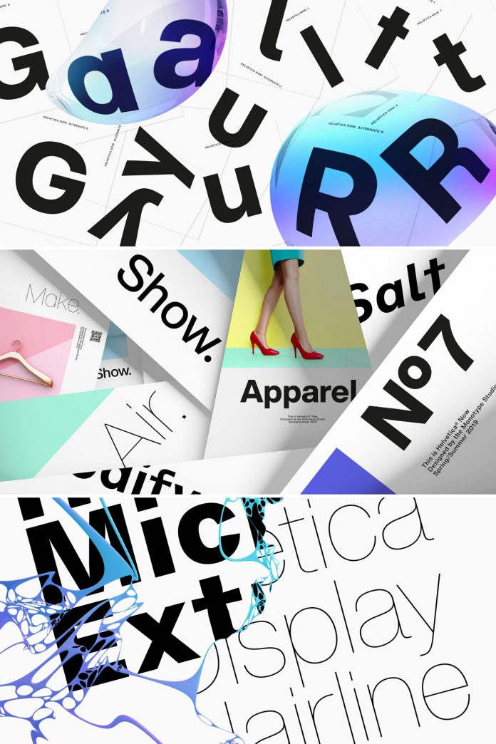
3. Adjust Spacing for Readability and Aesthetics
Proper spacing is vital for enhancing the readability and aesthetics of your text. There are three main types of spacing: kerning, tracking, and leading. Kerning adjusts the space between individual letters, ensuring a balanced and harmonious look. Tracking controls the overall space between all letters, maintaining a consistent density and texture. Leading adjusts the space between lines of text, providing a comfortable reading experience.
4. Align Your Text Properly
Text alignment is a crucial typographic element that significantly influences the design’s visual appeal. There are four main types of alignment: left-aligned, right-aligned, centered, and justified. Each alignment type conveys a different visual impact. Left-aligned text creates a ragged right edge, adding dynamism. Right-aligned text forms a ragged left edge, offering contrast. Centered text provides a balanced and harmonious look, while justified text offers order and formality with even margins.
5. Use Hierarchy to Organize Information
Implementing a clear hierarchy is essential for guiding readers through your content seamlessly. Utilize different sizes, weights, styles, colors, or positions of text to signify varying levels of importance. Headlines, subheadings, and titles should be larger and bolder, while body text and captions should be smaller and lighter. Utilize italic or underlined styles for emphasis or links, different colors for categories, and distinct positions for labels or quotes.
In conclusion, understanding and applying these five fundamental typography rules will empower you to create designs that effectively convey your message, resonate with your audience, and elevate your graphic design projects to a professional level. Mastering typography is a key step towards becoming a proficient graphic designer.
Feel free to find the perfect typeface for your next design project in the Fonts section on WE AND THE COLOR.
Subscribe to our newsletter!

