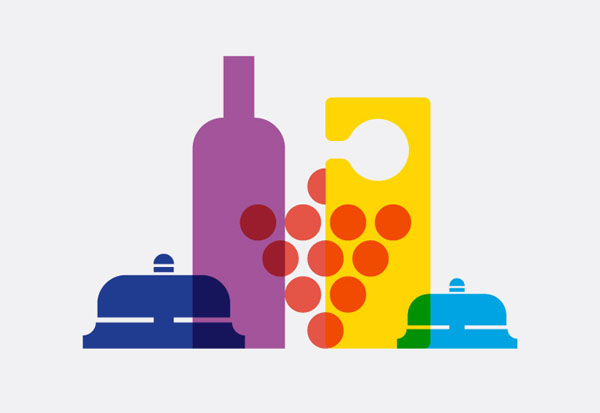
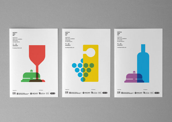
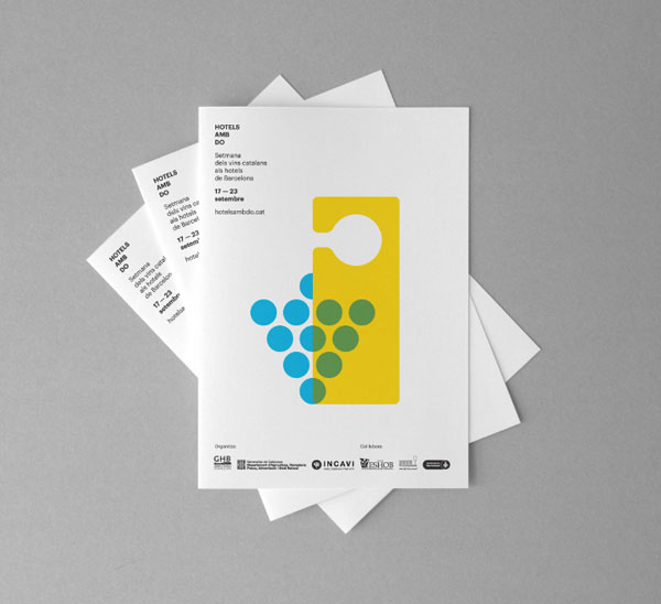
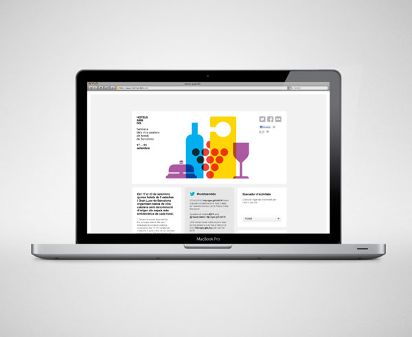
“Less is more”

The well known quote often used by designers was probably the principle for the identity design of Hotels amb DO, a Catalan wines week in the hotels of Barcelona by the Institut Català de la Vinya i el Vi in cooperation with the Barcelona Hotels Association. The creative team of studio Atipus reduced the design to essentials and created a graphic identity based on simple graphics.

Hotels amb DO - Visual Identity by Atipus

Hotels amb DO – Visual Identity by Atipus

Hotels amb DO - Identity Design by Atipus

Hotels amb DO – Identity Design by Atipus

Hotels amb DO - Marketing Material by Atipus

Hotels amb DO – Marketing Material by Atipus

Hotels amb DO - Web Design by Atipus

Hotels amb DO – Web Design by Atipus

Connect to WE AND THE COLOR
If you like the stuff we post, don’t forget forget to follow us on Facebook, Twitter, and Tumblr or subscribe to our RSS Feed. WE AND THE COLOR is also on Pinterest, Google+, Flickr, Vimeo, and StumbleUpon.

BUY ART PRINTS OF THE WE AND THE COLOR POSTER COLLECTION IN OUR SHOP