This post contains affiliate links. We may earn a commission if you click on them and make a purchase. It’s at no extra cost to you and helps us run this site. Thanks for your support!
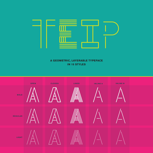
Teip, a geometric layerable typeface system in 15 styles.
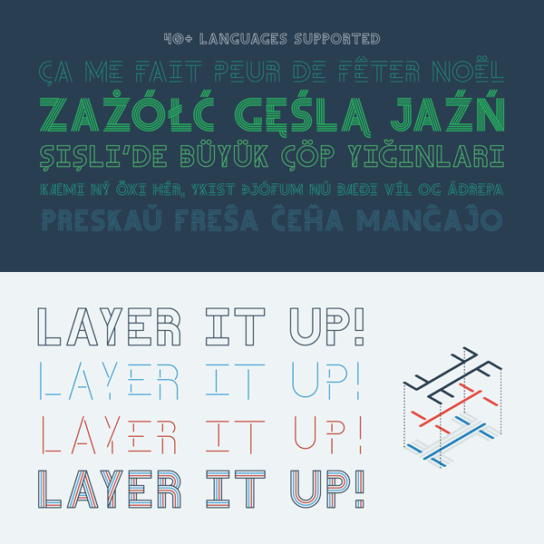
Graphic designer Alex Jacque has created Teip, a layerable typeface system in 2014. It’s a geometric font collection of layered fonts, which are intended to use them together and create numerous layered styles. The Teip font system is inspired by overlapping tape where an over and under as well as foreground and background combination creates a stylistic effect. Alex Jacque designed the uppercase characters with a more vertical orientation in the foreground, while the lowercases have offer a horizontal orientation in the foreground. Because of that, upper and lowercase letters can be mixed easily in order to develop a more random and natural feel.
All styles and weights of the Teip font system share exactly the same glyph widths and kerning. This makes it very easy to layer one style on top of another. You will love to mix all the 15 styles to create countless colorful typographic effects.
The layerable Teip font system is available for purchase on MyFonts.


The layerable Teip font system is available for purchase on MyFonts.
Check out more font recommendations here.


