
This post contains affiliate links. We may earn a commission if you click on them and make a purchase. It’s at no extra cost to you and helps us run this site. Thanks for your support!
As we delve deeper into 2024, exciting color trends are bubbling up, ready to reshape the visual landscape. Whether you’re a graphic designer, web developer, or simply a color enthusiast, staying ahead of the curve is key. Here, we explore the top color palettes that promise to dominate 2024, along with inspiring examples of their effective use.
1. Nature’s Embrace: Earthy and Organic Hues
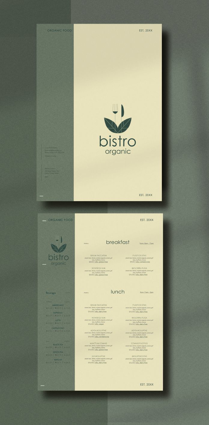
Seeking solace and grounding in nature’s tranquility? This palette embraces the beauty of the outdoors with a blend of rich browns, calming greens, and pops of terracotta. Imagine deep forest green paired with a sandy beige and a vibrant rust orange – a combination that evokes feelings of stability and growth.
Example: This eco-friendly brand’s packaging utilizes a nature-inspired palette, with the earthy green base conveying a commitment to sustainability (think recycled materials). The terracotta accent adds a touch of vibrancy, reflecting the brand’s commitment to innovation.
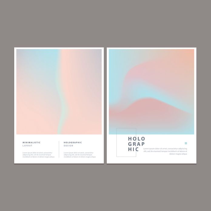
2. Digital Glamour: A Playful Fusion of Tech and Luxury
The digital age meets high fashion in this exciting palette. Think chrome, pearlescent white, and unexpected pops of neon. Imagine a sleek chrome background paired with a shimmering white text and a neon pink accent – a combination that exudes futuristic elegance.
Example: A tech startup’s website leverages the digital glamour palette. The chrome background conveys a sense of innovation, while the pearlescent white text ensures readability. A subtle neon pink accent button adds a touch of playfulness and encourages user interaction.

3. Serene Escape: Tranquil Blues and Soft Pinks
In today’s fast-paced world, the need for peace and serenity is paramount. This palette offers a calming refuge with soothing blues, soft pinks, and touches of lavender. Imagine a gentle baby blue paired with a dusty rose and a hint of lavender – a combination that evokes feelings of tranquility and relaxation.
Example: A meditation app’s interface adopts the serene escape palette. The baby blue background creates a calming atmosphere, while the dusty rose text adds a touch of warmth. A hint of lavender in the progress bar reinforces the app’s focus on mindfulness and well-being.
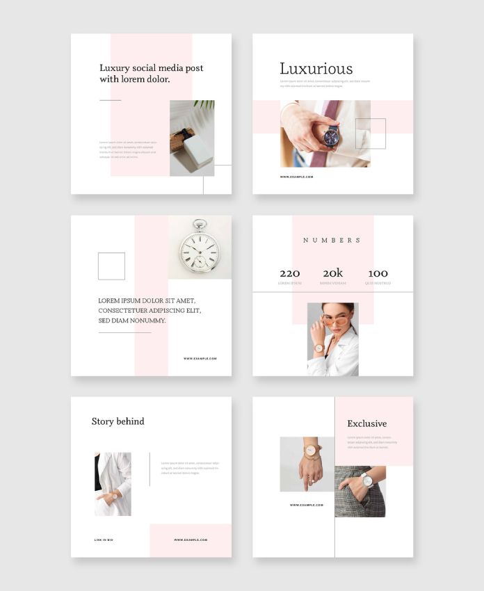
4. Regal Brilliance: Bold Blues and Dazzling Accents

Embrace a touch of opulence with this palette that exudes confidence and sophistication. Imagine a luxurious navy blue backdrop paired with regal purple text and a gold accent – a combination that evokes feelings of grandeur and authority.
Example: A high-end jewelry brand’s marketing materials utilize the regal brilliance palette. The deep navy blue background creates an air of sophistication, while the royal purple text highlights the brand’s premium quality. A touch of gold in the logo reinforces the brand’s focus on timeless elegance.
5. Retro Revival: A Blast from the Past with a Modern Twist
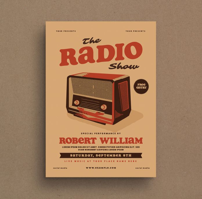
Embrace nostalgia with a vibrant palette inspired by classic design trends. Imagine a bold mustard yellow background paired with a burnt orange text and a deep teal accent – a combination that evokes a sense of fun and playfulness with a touch of vintage charm.
Example: A restaurant’s branding incorporates the retro revival palette. The mustard yellow background adds a burst of energy, while the burnt orange text creates a welcoming atmosphere. A deep teal accent in the menu design adds a touch of sophistication and complements the vintage theme.
Stay Inspired and Experiment!
These are just a few of the color palettes poised to make waves in 2024. Remember, the beauty of color trends lies in their adaptability. Don’t be afraid to experiment and personalize these palettes to suit your unique needs and creative vision. Don’t hesitate to read about the top 10 graphic design trends in 2024 on WE AND THE COLOR.
Header image by Adam via Adobe Stock. Don’t hesitate to browse through WE AND THE COLOR’s Graphic Design section for more creative inspiration.


